Why We Use “Checks” in Checkboxes and Radio Buttons

Checkboxes and radio buttons are honestly used pretty sparingly in elementary OS, and even more sparingly together. When they are used, it’s fairly obvious from context whether it’s a multi-select or exclusive-select situation. Further, with radio buttons it can be unclear in some contexts what exactly a circle with a dot in it (what we used to do for radios) means, whereas a circle with a check is a common metaphor throughout the OS.
See this example of radio buttons in the Wi-Fi menu:
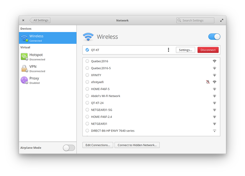
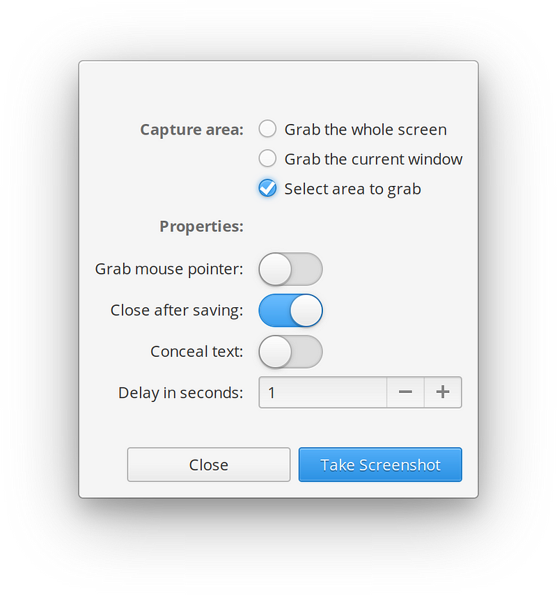
Having a sole dot there at the top might not be super clear that you’re currently connected to the “QT-KT” network. But with a check, it’s more obvious and consistent with other affirmative iconography. It’s also really not unclear when it’s used in context in a more traditional list, like in Screenshot:
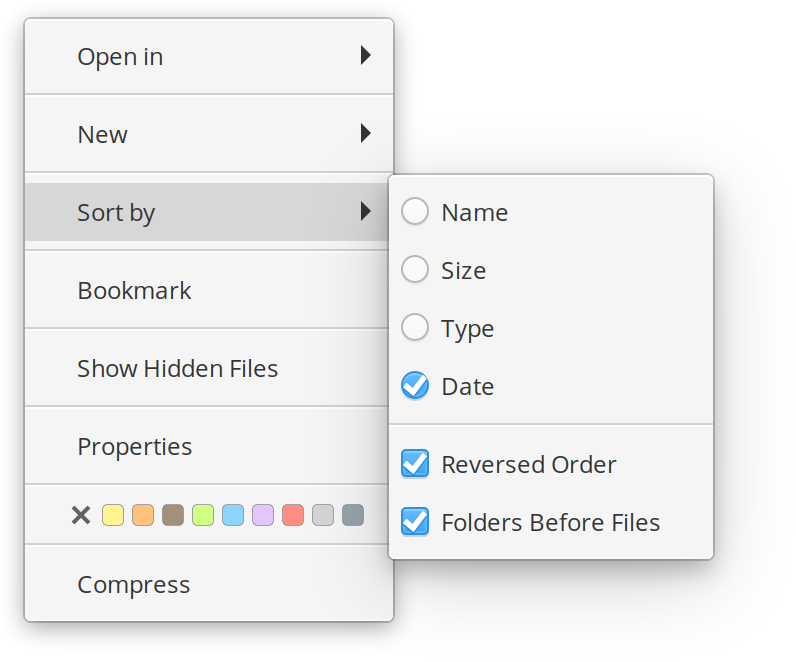
…or even when used in mixed places like in a context menu:
So to sum up, we use checks in both places because they’re very similar controls with very subtly different behaviors, the square and circle shapes still provide historical differences for those subtly different behaviors, context rules when it comes to expectations of the controls, and finally: checks provide a consistent and more clear “affirmative” confirmation in many contexts.
Thank You
Thanks to all of our supporters, backers, and customers! Your contributions make elementary possible. If you’d like to help build and improve elementary OS, don’t hesitate to Get Involved.
We’re accepting limited sponsors for the elementary Blog. View our public analytics and learn more if you are interested.


