Look & Feel Changes Coming to elementary OS 6
Visual design updates that are more than skin deep

When a new major version of some piece of software is released, there is often an immediate focus put on visual changes. If there aren’t a ton of new and shinies, social media will inevitably be filled with words like “stale,” “old,” and “outdated.” This has become especially true for elementary OS, whose visual design hasn’t really changed all that much over the years. At elementary, we tend to avoid making changes for the sake of change. We’re very skeptical about design trends, and do our best to create things that feel a bit more “evergreen.” After all, “Good design is long lasting” and this allows us to focus more on refining than constantly reinventing. We also have a third-party developer community to think about, and making sweeping visual changes means that the nearly 200 apps in AppCenter will have to be updated and tested to make sure they still look as intended. So, when we decided to work on the look and feel for elementary OS 6, we wanted to approach things with a lot of intentionality, avoiding trends and focusing on setting the stage for the next several years.
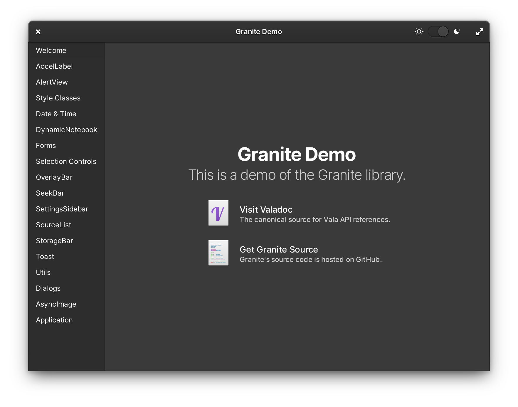
Toolkit & Libraries
App developers rely on pre-made widgets to do a lot of the heavy lifting and provide good default styles when making their apps. In addition to the widgets provided by GTK, we also ship our GTK companion library Granite that makes replicating common elementary design patterns a breeze. In elementary OS 6, we’re also making heavy use of Handy—a library that was originally developed by Purism for mobile interfaces but has now become a core part of the GNOME app development platform on the desktop. Thanks to Handy, we have two major, obvious visual design improvements that developers can adopt.
We’ve long had plans to modernize the Granite Avatar widget. A continual problem we’ve faced is that many people just don’t set an avatar for their user account. As a consequence, we need a more meaningful fallback design that allows avatars to be distinct and useful in apps like Mail or in System Settings. As it turns out, the folks behind Handy had the same thoughts and the work was largely already done. Alexander Mikhaylenko was very helpful and gracious in implementing changes in Handy to achieve the exact style we wanted, and I’m happy to say that we now have much more colorful interfaces in elementary OS 6 thanks to Handy Avatar, even if people don’t set avatar images.

The other obvious change is more rounded bottom window corners. This seems like something that would be simple, but is actually not possible in vanilla GTK3. In elementary OS 5, we used clever workarounds for specific cases to give dialogs and other flat windows rounded corners all the way around. But in elementary OS 6, we can now have rounded bottom corners even in complex cases like Camera, thanks to Hdy.Window. It’s a small thing, but it definitely makes the whole UI feel just a bit more polished.

Typography
The default typefaces in elementary OS have also been changed for the first time since our initial brand work. Instead of Open Sans with Raleway for headers, we’ve unified on Inter: a new, modern typeface specifically designed for use in user interfaces on computer screens. The designer, Rasmus Andersson, actively updates Inter and has been very responsive on GitHub. He’s even weighed in on our use of Inter in elementary OS, and his feedback has led to changes in the weights we use for various headers.
We’ve also revisited the default font rendering settings, opting for grayscale anti-aliasing over RGB; this addresses some issues we’ve seen with ghosting/leaking of colors around text, especially visible when using transparency. You’ll find that in general, text is bolder, higher contrast, and more legible in elementary OS 6.
Iconography
The visual style for our icons has remained largely unchanged, with more focus put on internal consistency. You’ll notice subtle improvements such as a more consistent use of our color palette, plus more gender-neutral depictions of a “user” in places like System Settings.

A long outstanding issue has been wrangling all the different styles of arrows that we’ve used over the years. There are hundreds of arrow icons in the elementary icon set, used across many different contexts. We provide both full color and flat, symbolic icons and in a range of different sizes. There are even different kinds of arrow tails depending on context, or no tail at all. In elementary OS 6, we have one new shape to rule them all and we’ve given arrows more rounded corners.

In arrows with curved tails, such as in Mail tool icons, the area under the curve is larger, making the shape more recognizeable at small sizes or for folks with less acute vision. We’ve also reduced busy overlap and improved separation in symbolic icons, which now match their full color counterparts much more closely.
We’re rounding out corners and using bolder shapes in other places as well. The new media controls icons for example feel much more weighty, and the lightning bolt symbol used on power icons is more distinct. Historically, going into more detail hasn’t been as important on LoDPI displays, but the new shapes really shine on displays with more pixels available.
Stylesheet
One recurring bit of feedback that we’ve received is that in general, the stylesheet in elementary OS 5 is somewhat low contrast. Low contrast can make it hard to read text for visually impaired users, but it can also be a large problem on lower quality displays. Contrast between widgets and their backgrounds can also help clearly define different parts of an application, and especially which of those parts are interactive. Addressing these concerns is part of our larger project to make elementary OS 6 more accessible by default, which we’ve written about previously.

To ensure we achieve the desired contrast, we created a design system built on UI levels. With a little bit of Sass magic, we can style widgets by picking a background level—such as 0 for inputs or 4 for toolbars—and then overlaying a white gradient and adding a shadow—which also comes in various levels. The overall result is a style that is a bit flatter on the surface of each layer, but overall more consistent in its use of depth, and with much more consistent and expressive use of shadows between layers.

Another place for more clear differentiation is in widget states. Interfaces are interactive: they can be selected, disabled, focused, or pressed. We started some work towards more clearly differentiated states in elementary OS 5 when we redesigned checkboxes, and in elementary OS 6 this work has extended to other interactive widgets like text entries and buttons. Disabled widgets, for example, are much more obviously darker than the default UI level, and are intentionally lower contrast than enabled widgets.

Something we knew we needed to consider from very early on was a path towards making elementary OS feel more personal without breaking custom styles in apps. We know that many of our users are currently using custom CSS, but that it often leads to breakage and disappointment. In elementary OS 6, we provide 10 possible accent colors to choose from. Combined with the dark style, you can get a much more unique look for your operating system without having to worry about apps behaving incorrectly. The dark style follows all the same principles as outlined above including UI levels, using higher contrast, etc. And we’re still exploring more ways to expose your chosen accent color in ways that feel fun and personal.
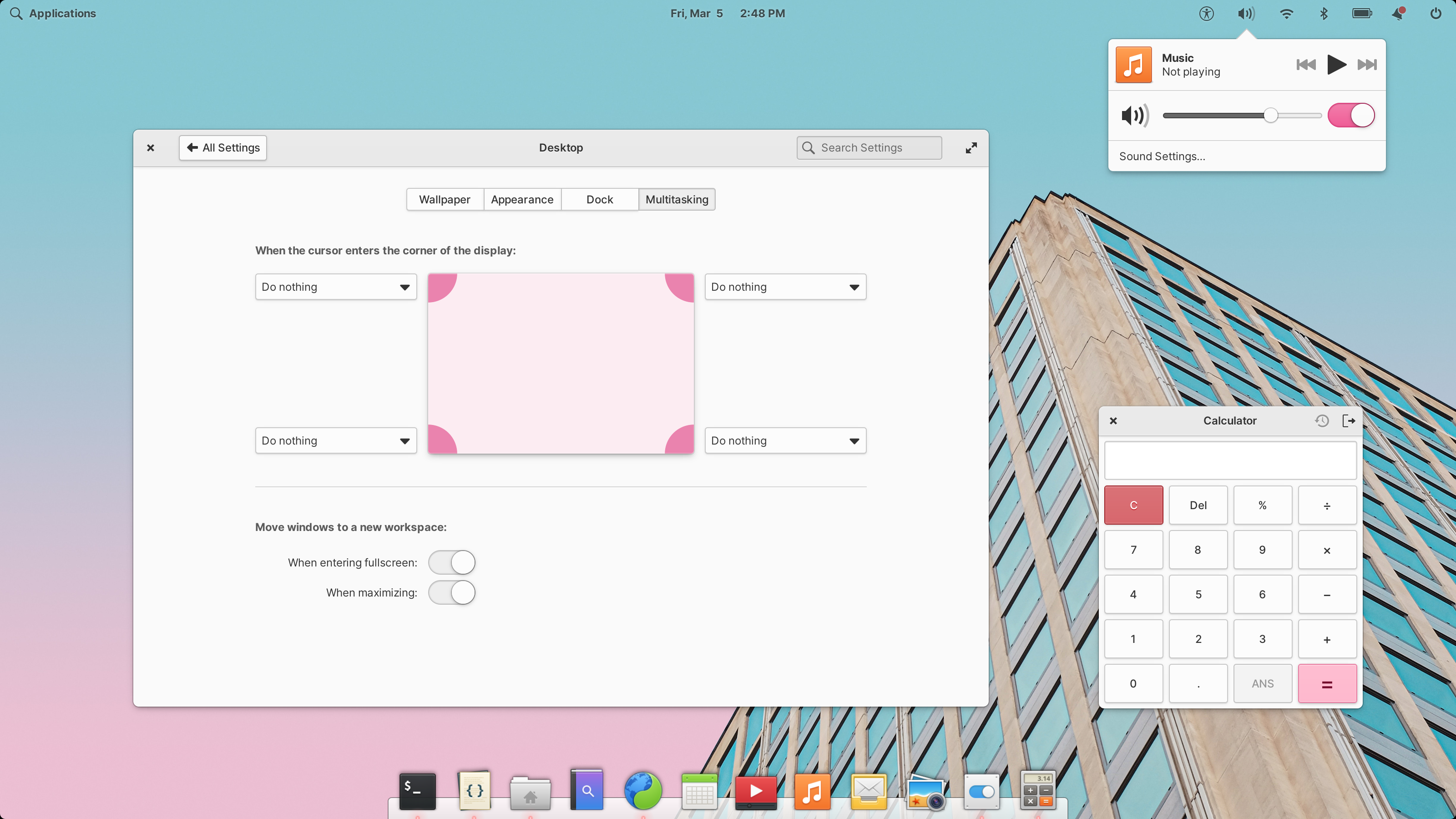
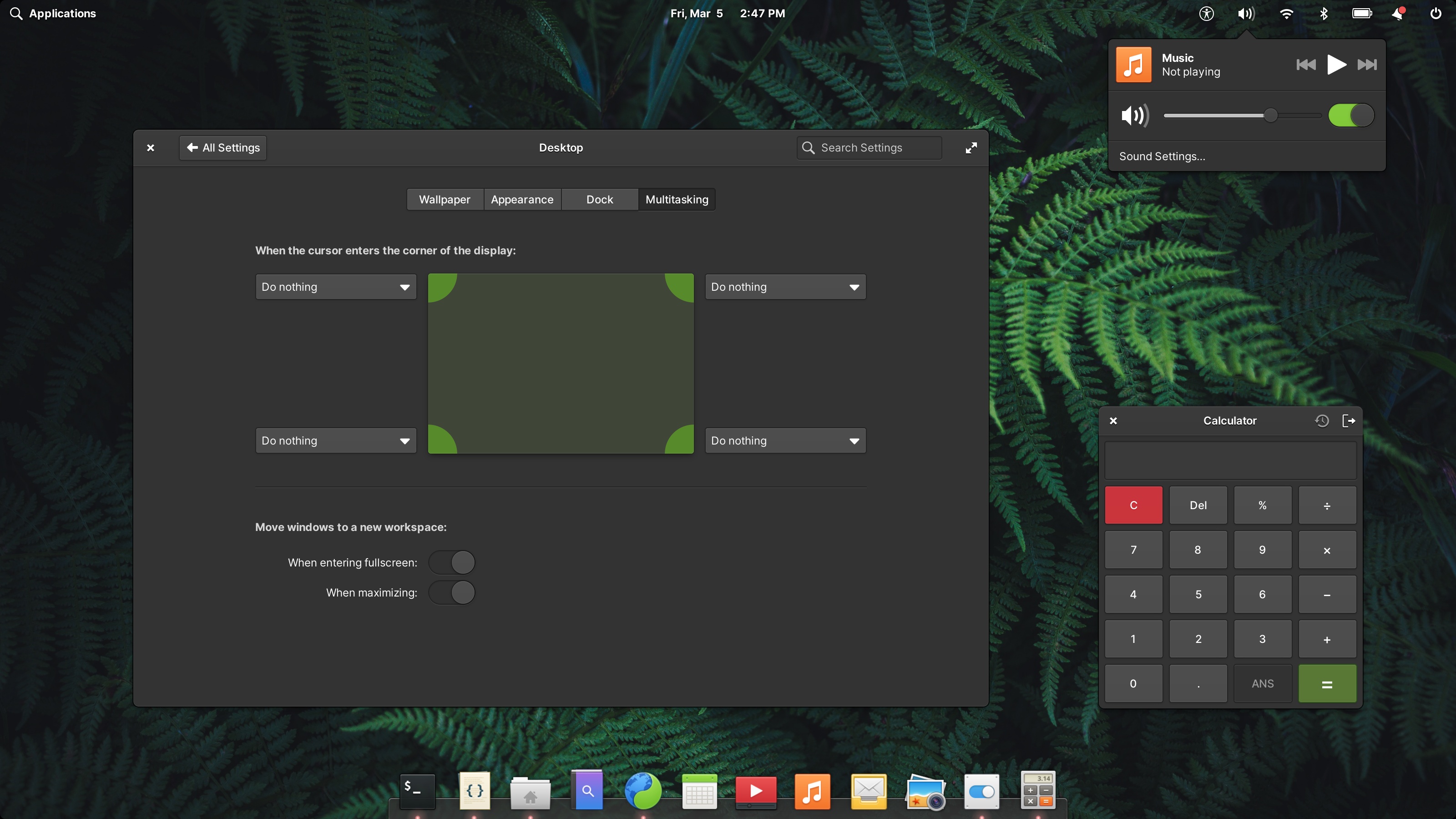
Left: A light desktop with the Bubblegum accent color | Right: A dark desktop with the Lime accent color
Focus styles are still a work in progress, but the goal here is to make much more bold use of color and to make the keyboard focus location much more obvious. We’ve also revisited selected states and suggested action button styles to make sure that we’re clearly differentiating between someone’s strawberry accent color and destructive action buttons. Instead of using white text on a colored background, we now use a much subtler style that is ultimately higher contrast as well. It also works much better for accent colors, custom brand colors in apps, or other places where we want to use color such as Calendar events.


Left: A dialog with a suggested action | Right: A dialog with a destructive action
We also hear regularly from users who have displays that sit in that uncomfortable zone between 1× and 2× UI scaling. While we’re still not offering traditional fractional scaling in elementary OS, we have been working on an improved scalable UI solution. In elementary OS 5, people who opted to change the default text size were left with an awkwardly spaced UI with large text, but small controls. In elementary OS 6, we now scale default widgets spacing, corner radii, etc. with text size, eliminating a lot of that awkwardness. It’s not quite perfect, but it will make elementary OS much more legible for more people without incurring the performance penalty associated with traditional fractional scaling. And we’re happy to have a more first-class experience for those who need larger text.


Left: A dialog with the default scale | Right: A dialog with a larger scale
Get Early Access
If you’re excited by what you read here and want to get your hands on the developer preview of elementary OS 6, you can! GitHub sponsors at the $10/mo or above tier get access to our daily builds server where you can test the latest and greatest experimental builds, including builds for Pinebook Pro. Subscribing helps us fund the development of elementary OS and brings us that much closer to delivering the final product.
Thank You
Thanks to all of our supporters, backers, and customers! Your contributions make elementary possible. If you’d like to help build and improve elementary OS, don’t hesitate to Get Involved.
We’re accepting limited sponsors for the elementary Blog. View our public analytics and learn more if you are interested.


