Get Settled into elementary OS with Onboarding
Designed to improve the first-run experience

We’ve never provided a tutorial or “welcome” on your first run of elementary OS before; our Human Interface Guidelines state that users “should be able to get down to business as quickly as possible,” and that “if configuration is not absolutely required for the first use, they should not be required to configure anything.” We also generally believe that if you need a tutorial, your product is likely too difficult to understand and may lead to long-term dissatisfaction. It’s like being given all of the information you could possibly need for a new career in an five-minute lecture, and then being expected to be a master of your profession; it’s both unrealistic and overwhelming!
Instead, we lean into progressive disclosure and teachable moments throughout elementary OS. We provide tooltips wherever possible that help you learn icons and features at your own pace. We disclose keyboard shortcuts throughout the OS so that—if you’d prefer—you can use more efficient keystrokes when you’re ready. Overall, we have found that this teach versus tell approach has made elementary OS a better product and one that is lauded for its user experience and ease of use.
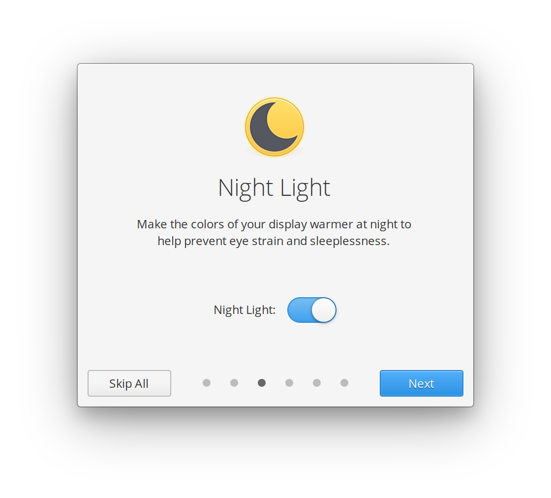
However, there are several important features we’ve added over the years, and exposing those to users while ensuring they understand their implications has become more difficult. For example, while the Night Light feature we introduced in Juno is incredibly helpful, you’re not likely to discover it on your own unless you read extensive release announcements or like to dig around in your Display settings. For these cases, we’ve built Onboarding.
Where Onboarding Fits In
An upcoming change to the first-run experience of elementary OS is as follows:
- Install elementary OS (if it didn’t come on your device already)
- Create a user
- Optionally set some important and useful features up
Each of these steps is handled by a separate, modular piece of software. Technically the first two can exist without the third, and vice versa. Since the third step is standalone and doesn’t require as much testing and integration as the first two, we’re releasing it to users today as the new Onboarding app.
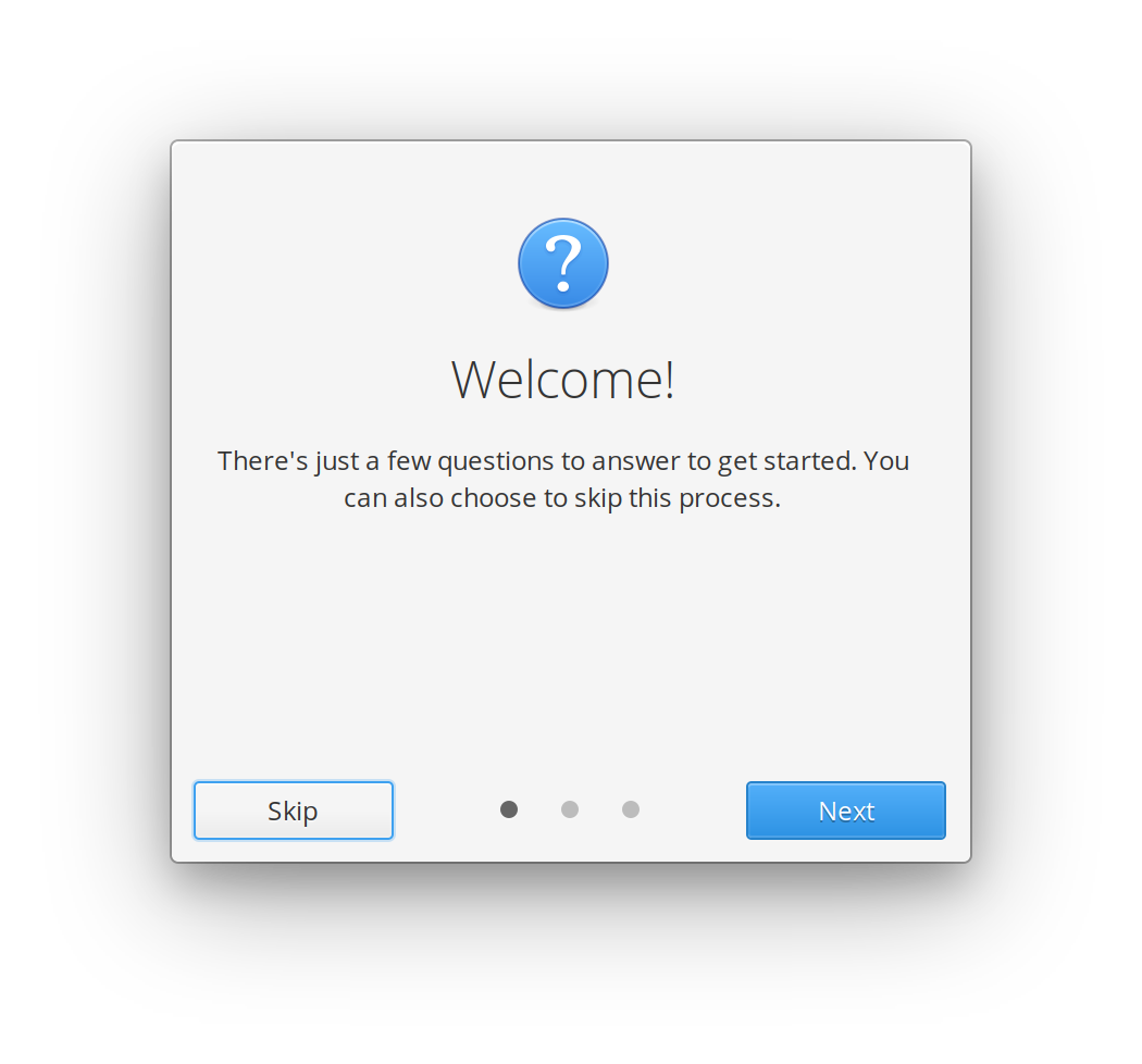
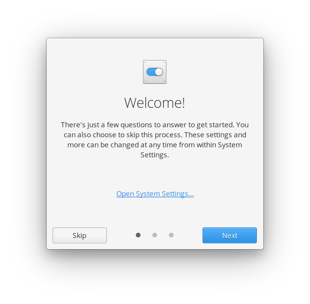
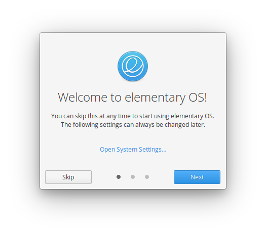
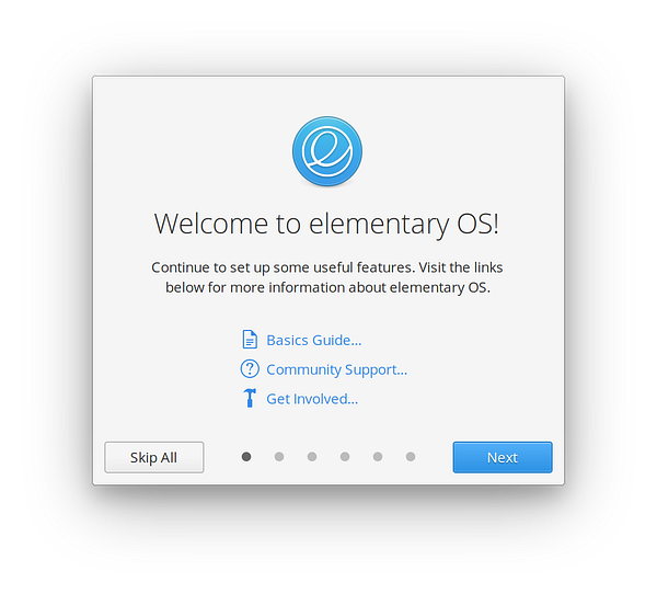
Onboarding launches the first time you log into your user account on elementary OS (or, if you’re already running elementary OS today, it will run the first time you log in after it arrives via an update). Here’s a look at it today:
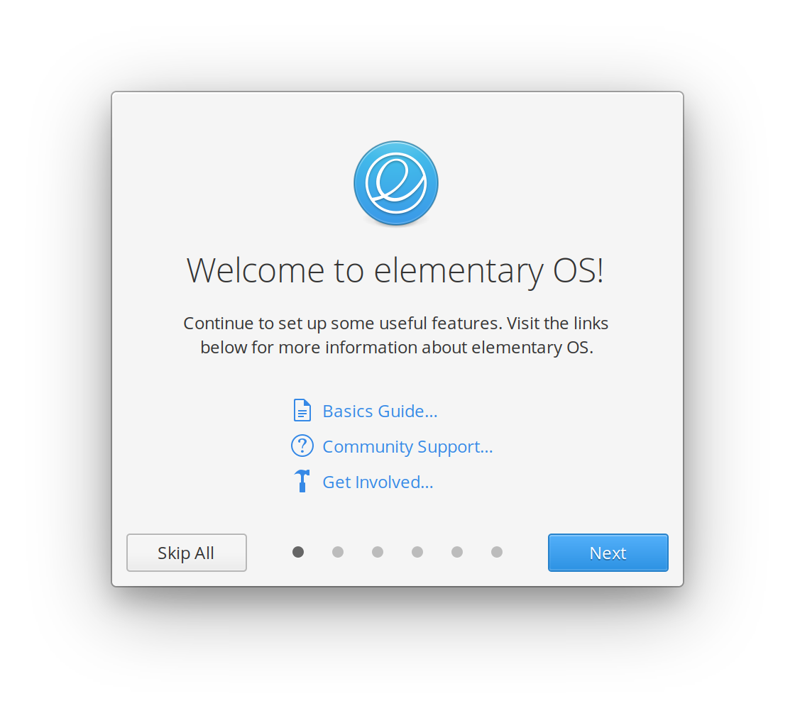


That’s it! That’s the entirety of the process, and you can jump around as you’d please, or skip it at any time. We’ve designed it to be to the point and only handle one useful feature per view. We also linked to some existing resources right up front instead of trying to recreate them in the app. Lastly, we remind you that you can configure any hardware or change any of these settings from System Settings.
Updates
Okay, I may have fibbed a bit when saying that was all. During the design and development process, we separately started discussing how we could introduce users to a major new feature if it were to ship mid-cycle or even after a version-to-version upgrade. Rather than building this introduction elsewhere, we realized we could utilize Onboarding: brand new users would see this new feature alongside the other important ones in Onboarding, while upgrading users could be shown a version of Onboarding that just exposes the new feature.
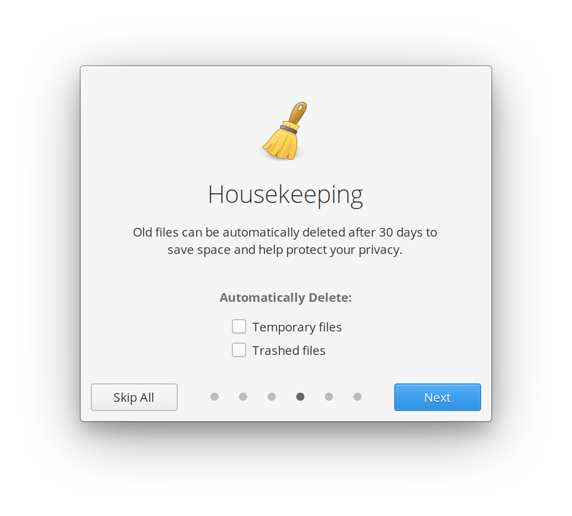
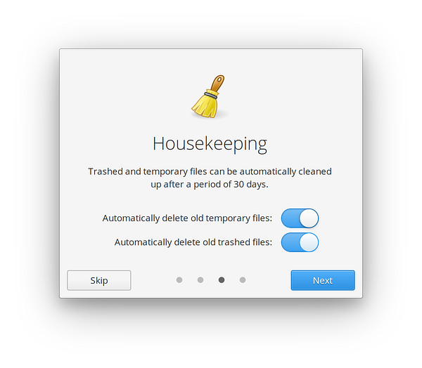
For example, if we introduced Housekeeping as a major new feature, users could be greeted with this slimmed down version of Onboarding:


This is modular and should work for any new major features we decide to add, so long as we deem them important enough to alert users—a very high bar.
What’s Next
Onboarding is rolling out to existing users in the coming week; make sure you pop open AppCenter and install updates when they’re available! And stay tuned, we’ll have more to share about the other two components (Installer and Initial Setup) soon.
That’s it for user-facing information! If you’d like to hear more about the design and development process of Onboarding, read on.
Design Process
Landing here wasn’t a one-and-done development; like most things in elementary OS, it was an iterative process from multiple designers and developers that spanned several weeks.
Initial Design
Right off the bat we had to decide what the overall layout would be. Early ideas (that I can’t find sketches or screenshots of…) were more like the side-by-side layout of the Installer or Initial Setup apps:
However, we decided that this was much too large and felt too heavy for the lightweight first-run experience we wanted. In the Installer we need to support much more copy, richer widgets, and more complex situations like selecting a disk from a list of many. For Onboarding, we wanted it to be one single action per view if possible.
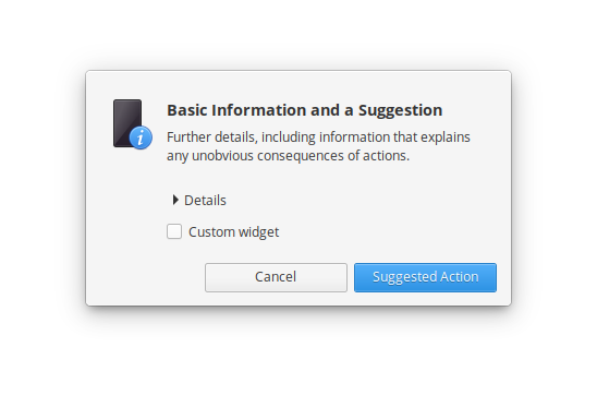
We also considered a standard dialog-style layout, with a 48-pixel icon, bold text, and explanatory text down below. However, this didn’t give us the rich visual interest that we wanted, and felt too constrained.
Eventually, we settled on a more vertical layout with larger title text and everything neatly centered. This gave us more comfortable room for control widgets down below, and allowed us to experiment with a “pager” design, allowing users to jump between steps with the dots below. We also tried different icons and icon sizes until we settled on the elementary OS logo to more clearly associate Onboarding with the OS as a whole. We added a link to System Settings to let new users know where to go to get to these settings again (since we aren’t making Onboarding re-launchable). Lastly, we chose 64-pixel icons to let the iconography have more weight and give the dialog a bit more visual interest:
Since longer blocks of text are harder to read when centered, one requirement of this layout is that the supplemental copy is very short—one to two lines in English, ideally. A lot of the design and testing work went into finessing that copy for each view while testing it with potential users for clarity.

Adding & Refining Views
Once we settled on the general design, iterating went relatively quickly. We added a Night Light view, but the generic display icon didn’t feel right, and we realized we didn’t have an existing full-color icon for Night Light. Daniel crafted one, and we added the view:
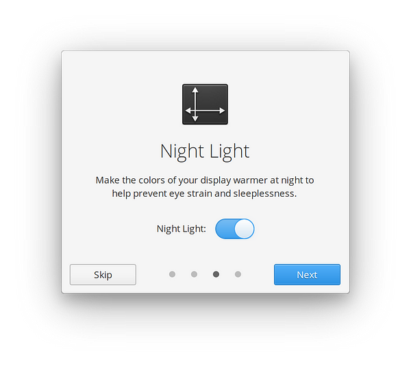
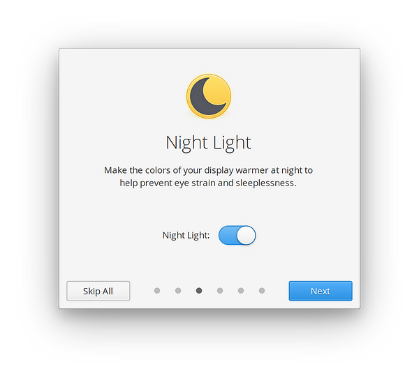
Left: Initial Night Light view | Right: Current Night Light view with new icon
For Housekeeping, we initially copied the general layout from System Settings. However, it didn’t feel right in the much smaller space we had in Onboarding, and the copy felt really redundant.
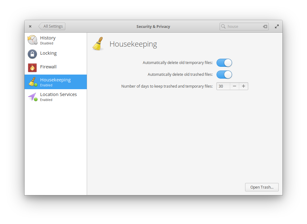
We also didn’t have a distinct icon for Housekeeping, and had previously been using a too-small version of the edit-clear icon. Dan resolved this with a redrawn and properly-hinted Housekeeping icon, and we reworked the copy and layout to be less repetitive:
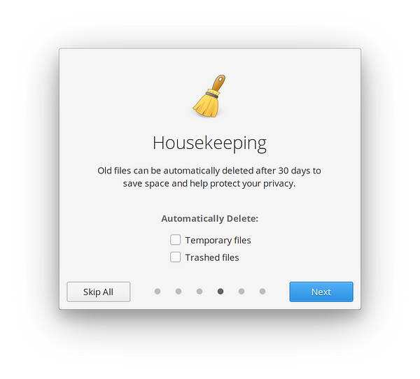
Left: Initial Housekeeping view | Right: Refined Housekeeping view
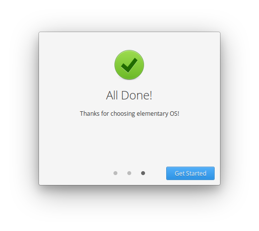
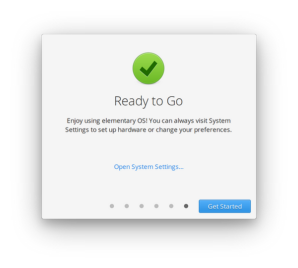
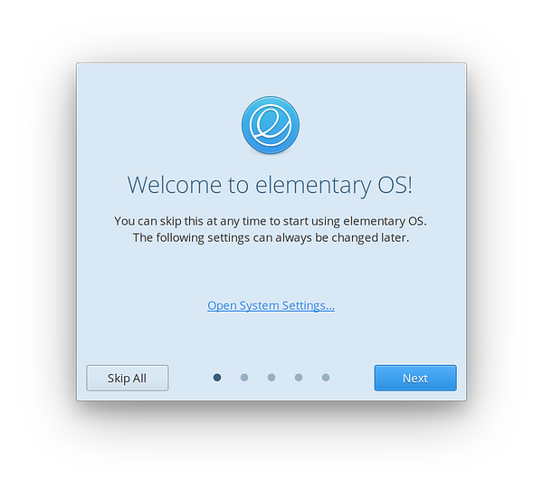
Welcome and Finished Views
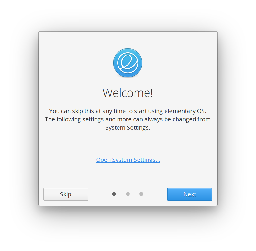
Having a mostly-blank “All Done!” view wasn’t the most helpful thing, but we wanted a landing point for “Skip” instead of just closing—this way, the user could at least go back to a previous view if they wanted to. So initially we added some common links users might want when first using elementary OS: our Learning the Basics guide, Support page, and Get Involved page.

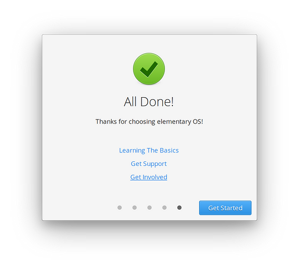
At some point, we realized that rerouting people to System Settings right off the bat was not the most helpful thing, and that if someone wanted more information about elementary OS, up front would be more helpful than after they’d spent time stepping through Onboarding. Plus, opening System Settings was a more natural jumping off point once you’ve seen some of the settings and features you can use.
So we swapped the contents of the Welcome and Finished screens, and refined their copy to better explain the contents. We also added icons as sort of bullet points to the Welcome links to make them more distinct and visually interesting:
You might also notice that at some point during all of this iterating, we changed “Skip” to “Skip All” to be more clear that you’re not just skipping a single view, but all the Onboarding views.
(Currently) Unused Experiments
During the iterative process, you typically end up with unused concepts or experiments—and Onboarding is no exception. Here are some things we briefly explored, but aren’t currently implementing:

A unique color for each view. It could work, but ends up being difficult when views’ icons would share the same color or don’t have a natural accent. Plus we weren’t in agreement whether or not we liked the sort of pastel palette needed to retain high contrast.
A more AppCenter-branded button. I initially wanted to do something more interesting for this button, but it ended up distracting too much from the “Next” button, and meant we had two strong calls-to-action.
Matching accent colors. We considered using an icon-matching accent color for the “Next” button, plus widgets like switches and check boxes on each view. It had similar issues to the colored-background, where some views don’t have an obvious or pretty accent color to use.
Making it Reusable
One reason we make elementary OS as modular as possible is in hopes that individual pieces might be useful to other OSes or open source projects. For example, other OSes are free to use our Captive Portal login, keyboard Shortcut Overlay, Initial Setup process, OS Installer, top Panel, Screenshot tool, etc. We wanted the same to be true for Onboarding.
OS Name and Support URL
One way we do this is by using the OS name and support URL, as provided by the OS-release FreeDesktop specification. So if you were to run Onboarding as-is on “Foo OS,” you’d get a welcome screen saying, “Welcome to Foo OS! Continue to set up some useful features. Visit the links below for more information about Foo OS.” The included support link will take you where you’d expect. Right now we also add our own links (Basics Guide and Get Involved), but we’re interested in cooperating with any dowstreams who would like it to be more configurable.
Only Show Views When They Make Sense
Another way we make Onboarding reusable by other projects is by making sure the different views only show up when they would actually be usable. For example, we check to make sure AppCenter exists before creating the AppCenter view. We also make sure the OS has the required Location Services settings before creating the Location Services view.
Settings URL Schema
We also make sure to use the System Settings Schema Spec for launching any related settings panes, like we do throughout the rest of elementary OS. This means that any environment that implements the spec will have the correct settings app open up to the correct place, without having to patch Onboarding to hardcode a different app—in fact, neither app has to even know about the other!
Styling
Lastly, we use our standard Granite style classes in Onboarding; any other OS or environment that implements support for them (like Pop!_OS) will get a great, native Onboarding app that fits in with the rest of the system.
Onboarding with the Pop!_OS GTK stylesheet and icons
All together, this means that Onboarding can be a great starting point for other projects, and we look forward to seeing what people come up with.
Thank You
Thanks to all of our supporters, backers, and customers! Your contributions make elementary possible. If you’d like to help build and improve elementary OS, don’t hesitate to Get Involved.
We’re accepting limited sponsors for the elementary Blog. View our public analytics and learn more if you are interested.


