GNOME’s New App Icons Drop Pixel-Precision and Hinting
What it means for elementary OS

Jakub taking photos on an outing from the GNOME London UX Hackfest
This week Jakub Steiner, a designer at GNOME—and a friend of mine!—announced “The Big App Icon Redesign” for GNOME. In his blog post, he covers a set of problems that GNOME icons have had, and then lays out a new design system that should help solve those problems for GNOME.
I was asked what my thoughts on the matter were, so here we are. In a nutshell, I think this is a great effort for GNOME but doesn’t have a strong effect on elementary OS as we already use a different design system, set of Human Interface Guidelines, and user interface conventions compared to GNOME.
I do think that the new icon style is far more reasonable than the 3D renders GNOME used to do, but Tango was a very good and well-considered iconography style. While the GNOME icons may have felt dated and stagnated, elementary has used and adapted the Tango style over the years, retaining crisp, pixel-perfect icons while staying fairly modern.
It feels to me like GNOME values “fitting in” with random cross-platform, non-native apps and their flat icons more than having crisp, versatile icons. But let’s dive into the problems they are aiming to solve.
Note: It’s important to remember throughout this piece that when I refer to px, I mean virtual pixels—pixels divided by the scaling factor. So on a 2× HiDPI display a 16px icon is rendered at 16 virtual pixels, or 32 physical pixels. Rather than just using the 32px icon, elementary OS renders the 16px SVG out over the 32 physical pixels, meaning the level-of-detail and metaphors stay the same across displays, but that shapes are drawn more crisply.
The Problems
Jakob laid out six problems with the previous GNOME icons. However, most of what they’re trying to solve just isn’t true for elementary OS:
Icon Sizes
“Many of the sizes aren’t being used anywhere in the OS, and haven’t been for the better part of a decade. Since we use either large sizes or symbolics in most contexts, the pixel-hinted small sizes are rarely seen by anyone.”
This is not true for elementary OS. We use a wide variety of sizes throughout the OS, and being pixel-hinted is super important there. We also don’t use or encourage symbolic app icons anywhere in the OS.
We use every size (16, 24, 32, 48, 64, and 128px; rendered at 2x on HiDPI) throughout the OS depending on context. Many of these sizes are constants in GTK itself for good reason, and are actively encouraged for use throughout the OS and apps.
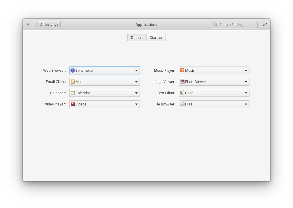
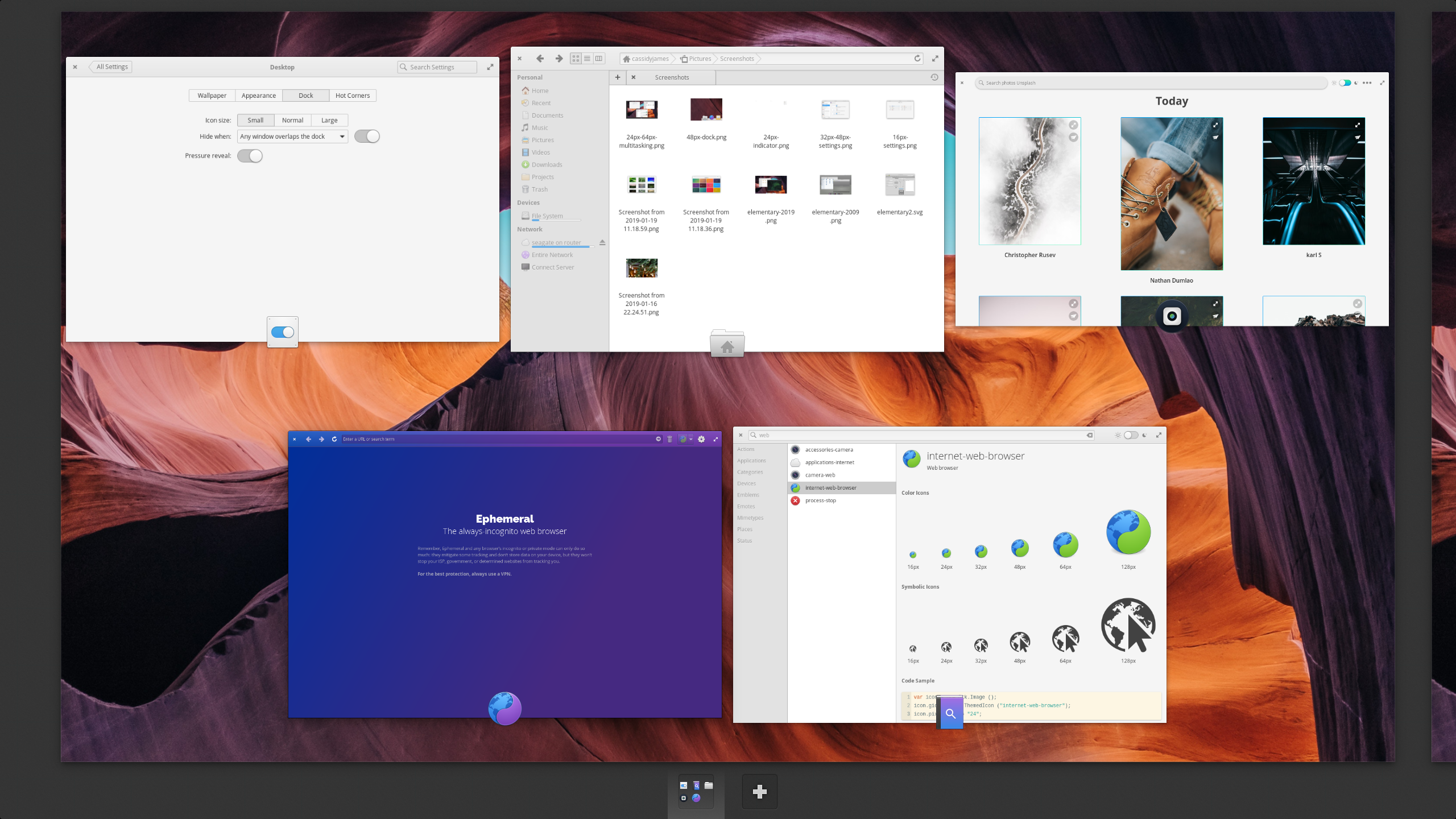
16px used in places like System Settings and Multitasking View
In elementary OS, we use 16px app icons in context menus and comboboxes, like when picking an app to open certain files. They’re also used in Multitasking View when there are many apps on one workspace.
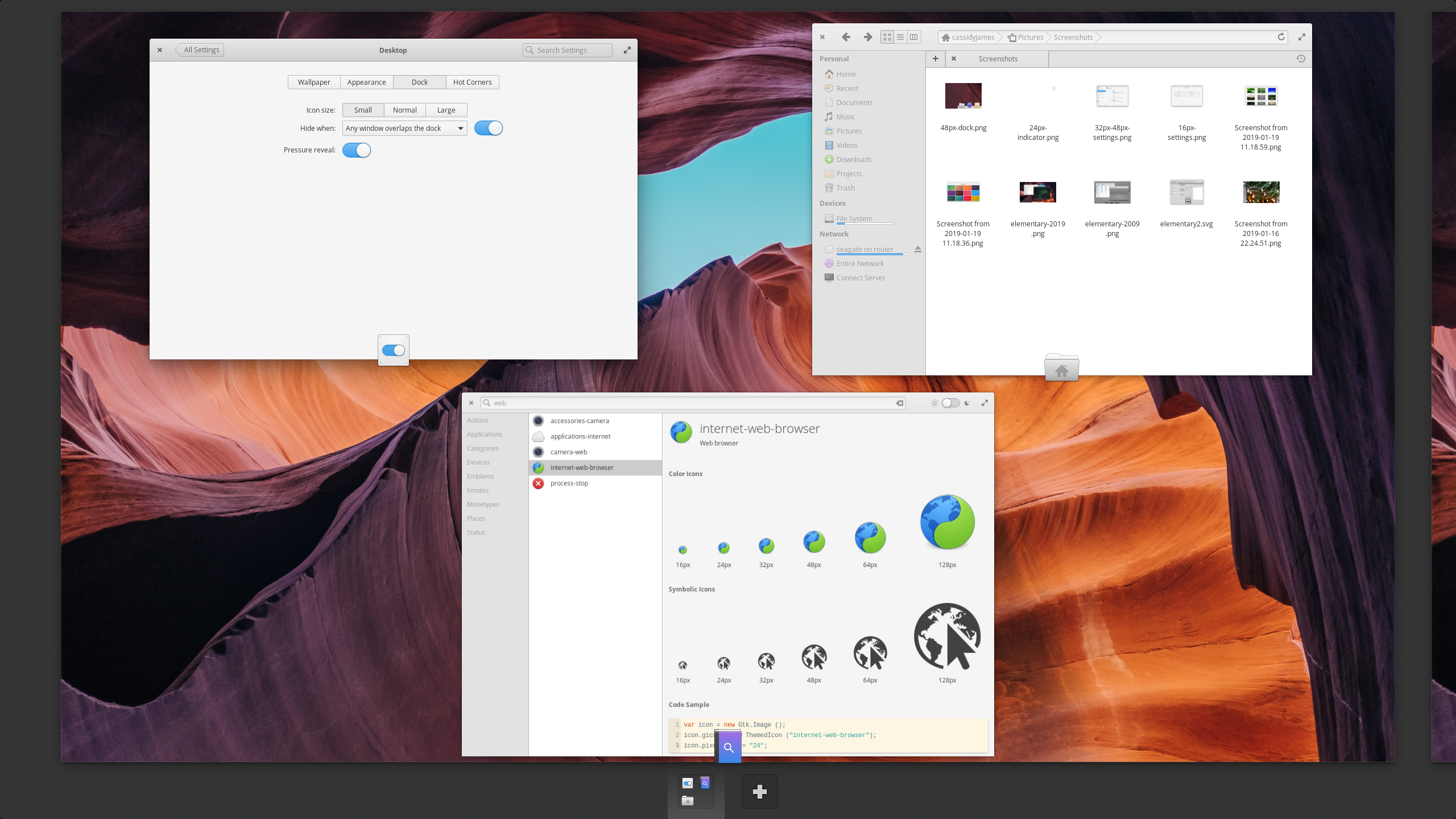
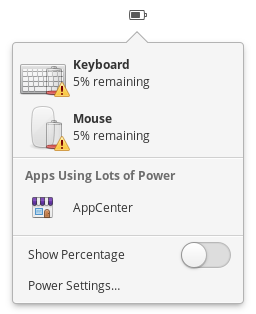
24px used in Multitasking View and Power Indicator
We use 24px in popovers like our Power Indicator, as well as in Multitasking View depending on the number of apps on a workspace.
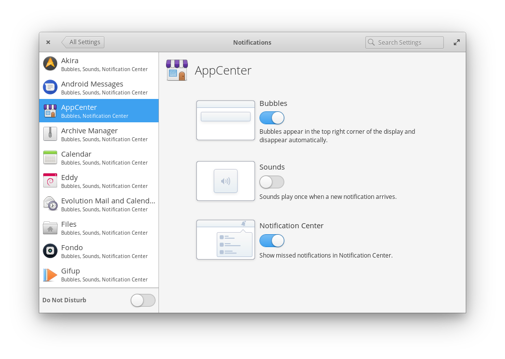
32px and 48px used in System Settings
We use 32px in places like settings sidebars where we want a relatively large and recognizable icon balanced with showing other details, and as a small dock size.
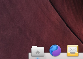
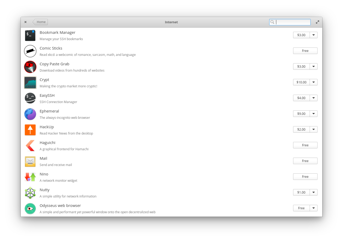
48px used in the Dock and AppCenter
We use 48px icons in the dock by default, plus in larger lists like AppCenter categories, and when icons stand more on their own like in settings detail panes.
We use 64px icons on the AppCenter homepage, to badge apps in Multitasking View, and as a large dock size. Lastly, we use also 128px icons to showcase apps in AppCenter.
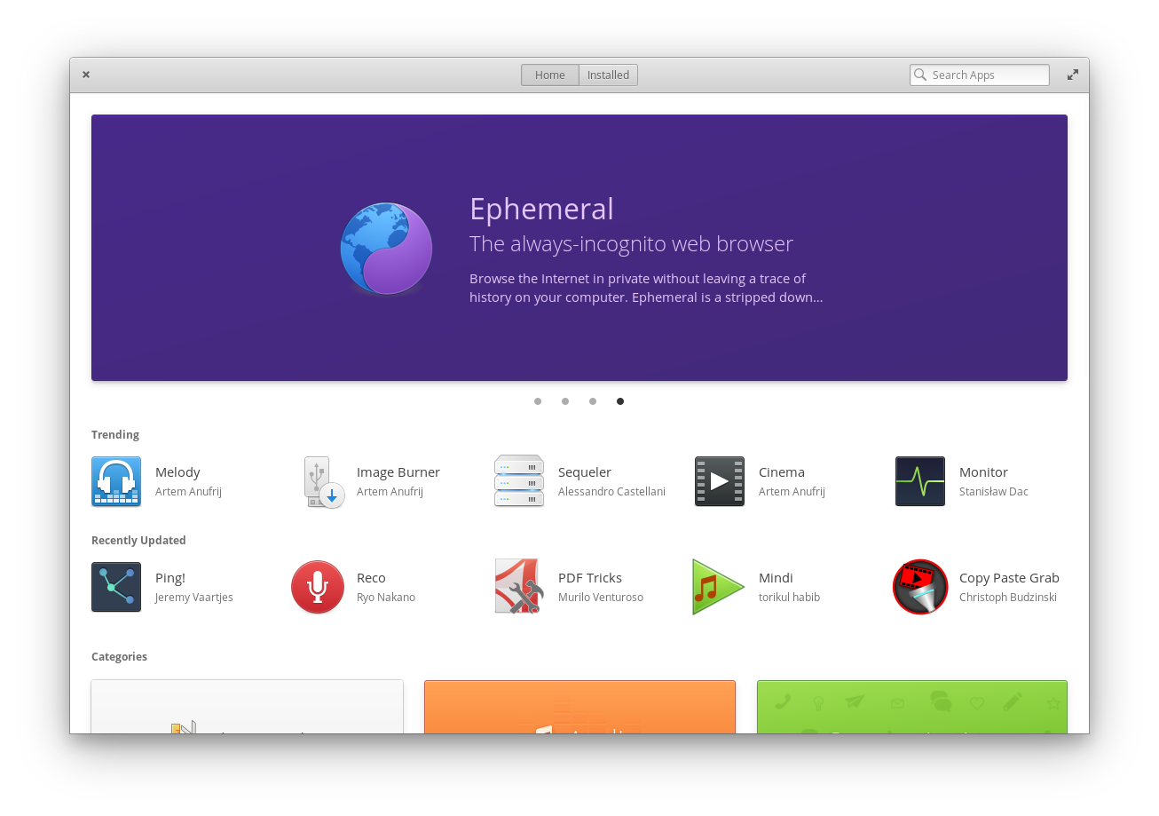
128px and 64px icons used together in AppCenter
While we could reduce the number of sizes used in the OS, each and every one of these sizes is well-considered based on the context: i.e. 16px feels a bit too small in popovers, but 24px is a bit too big in context menus. By ensuring all elementary app icons and third-party icons are provided hinted at each of these sizes, we can be more flexible and creative in our design, and ensure that icons are always as crisp and pixel-perfect as possible in every context.
Stagnant Icons
“Only a handful of people have the skills to draw icons in this style, and it can take weeks to do a single app icon. This means that iterating on the style is very hard, which is one of the reasons why our icon style has been stagnant for years.”
While icon design is definitely a unique skill, our icons in elementary OS have not been “stagnant” at all. Each release of elementary OS sees massive icon updates and improvements, whether it’s tweaking to better align with palette colors, adding new icons for developers, using better metaphors, or something as mundane as reflecting more modern hardware. Plus we constantly update and improve the icons throughout the OS release as well, meaning icons are always-up-to-date and always getting subtly better.
Barrier to Entry
“Very few third-party apps are following the guidelines. Our icons are simply too hard to draw for mere mortals, and as a result even the best third-party GNOME apps often have bad icons.”




GNOME’s hyper-realistic 3D icons made for beautiful artwork, but poor icons
I think this has a lot more to do with GNOME previously encouraging complicated hyper-realistic 3D renders than with pixel hinting to specific sizes. These 3D renders were beautiful, expertly-crafted pieces of art. But they were extremely difficult for newcomers, and they didn’t scale well. Consequently, community and third-party app developers were expected to be experts in 3D rendering plus include a variety of pixel-hinted icons on top—or more likely to convince a GNOME designer to do the work for them (addressed in the next problem).
However, every single first party app in elementary OS has great hinted vector icons across all sizes. At the same time, all apps submitted to AppCenter must have the required icon sizes, and the majority of third-party apps have icons that follow the guidelines. We lead by example here but also enforce it at the app ecosystem level.
First-Party Bandwidth
“We (GNOME Designers) don’t have the bandwidth to keep up with icon requests from developers, let alone update or evolve the style overall.”
This doesn’t apply to elementary OS. We don’t design icons for third parties, and all of our apps are designed and developed in-house. If a new first-party elementary app is coming, it gets an icon from our default set or a bespoke one designed, depending on the type of app. But we also don’t develop a million different community apps under one umbrella; everything we do is shipped as part of a cohesive OS.
I do know some folks (hi, Micah Ilbery!) do help out third-party app developers with icons on their own time, but it’s not something elementary has ever formally done or been expected to do.
Dated Look
“The wider industry has moved on from the detailed icon styles of the 2000s, which gives new users the impression that our software is outdated.”
Again, this problem seems self-created and is more about that hyper realistic 3D rendering GNOME style than pixel and size hinting. Pixel precision isn’t somehow magically outdated: physical pixels still exist, and the level of detail that can be drawn across those pixels varies on the number of them that exist. elementary OS will continue to respect pixel precision and varying levels of detail to ensure pixel-perfect icons everywhere.
Other platforms—especially the web—have gotten more lazy over the years, but that doesn’t mean we should stoop to their low standards.
Cross-Platform Apps
“Cross-platform apps tend to ship with very simple, flat icons these days. The contrast between these icons and our super detailed ones can be quite jarring.”
This is largely a philosophical difference between GNOME and elementary. Consequently, this is not a concern for elementary OS; we don’t ever cater to cross-platform, non-native apps that make no effort to run on elementary OS. Our vision has always been an excellent ecosystem of bespoke apps, and with AppCenter, we’re well on our way. We understand that non-native apps will always exist, and users will sideload them. But that doesn’t mean that we should change the elementary OS icon style to look like a generic mis-mash of trendy non-native icon styles, either.
The New Style


The new app icon style Jakub reveals is an improvement over the previous GNOME app icons. It has shape guidelines, a color palette, and constraints. Head over to Jakub’s blog post and/or the new GNOME HIG entry to read more in detail.
However, this is also something we’ve already done for elementary OS. The Iconography section of our Human Interface Guidelines similarly go over shape and color, along with metaphors and pixel-hinting.
The Effect on elementary OS
So, how does GNOME’s icon redesign effort affect elementary OS? It doesn’t, really. Users of GNOME apps on elementary OS may start to see updated icons for those GNOME apps. They may lose pixel-hinted icons for those apps, if the apps even provided them before (many did not). But both first-party elementary apps and third-party apps in AppCenter will continue to deliver the same pixel-perfect experience users have come to expect from us.
At the toolkit level, GTK still supports pixel-perfect sizing and hinting of icons. Remember, GTK is not just relevant to GNOME, but is relied on by elementary OS, the ever-growing ecosystem of third-party apps developed for AppCenter, and other desktops like XFCE. A GNOME-specific design initiative should have no bearing on the underlying toolkit and its capabilities that other platforms depend on.
The Effect on GNOME
Overall, I think this will have a net positive effect for GNOME! A lower barrier of entry for their community-developed apps may well help them offer a more cohesive ecosystem, and the new style is certainly trendy.
However, I mourn the loss in flexibility and crispness that eschewing pixel-hinting will bring for GNOME and downstreams like Pop!_OS and Ubuntu.
I do hope GNOME downstreams regroup and shed the rebranding and app icon themes that have always been an issue, instead shipping app icons as the app developers designed them. And with a new GNOME-wide effort for icon styles, these downstreams should start to feel more cohesive than if they dropped the rebranding and app icon themes in the past.
Bonus reading:
Thank You
Thanks to all of our supporters, backers, and customers! Your contributions make elementary possible. If you’d like to help build and improve elementary OS, don’t hesitate to Get Involved.
We’re accepting limited sponsors for the elementary Blog. View our public analytics and learn more if you are interested.


