The Need for a FreeDesktop Dark Style Preference
It’s time for the FreeDesktop to catch up
In the past year or so, macOS, Windows, Android, iOS, Chrome OS, Safari, Chrome, and Firefox have begun testing or released a user-set dark style preference that developers can opt into. It’s time for the FreeDesktop to catch up.
OS-wide dark styles are hard. For ages you’ve been able to forcibly change out the system style on GTK, KDE, Android and Windows with something that’s dark by default instead of light, but this causes issues when apps don’t expect it (since the default is typically light). For a time, GNOME even provided a hack via Tweaks that overrode an environment variable to force the dark variant on apps, as if the apps themselves had opted in. This had the same issues. Accessibility features that invert the whole display have existed, but they’re not pleasant to use.
Consequently, dark styles have typically been relegated to the app’s decision — if it’s a media app, made for dark environments, etc, then it can choose to ask for a dark style. Users who wished to override the system-wide stylesheet in an effort to save their eyes or better match their environments were either out of luck or left with a mess of broken apps.
However, there’s a groundswell for user-determined dark style preference across platforms and experiences. Many apps designed for Android, iOS, and elementary OS today already ship their own built-in light/dark style toggle, but with the latest OS releases, there is a new expectation that this is a standard, user-togglable preference of the OS, propagated to apps and even the web.
Note: I’m explicitly using the language “Dark Style Preference” for a reason! As you’ll read further on, it’s important that this is treated as a user “preference,” not an explicit “mode” or strictly-enforced “setting.” It’s also not a “theme” in the sense that it just swaps out some assets, but is a way for the OS to support a user expressing a preference, and apps to respond to that preference.
Research
In my time contributing to elementary and GNOME, I’ve become familiar with pleas from users to implement official support for arbitrary themes — while that itself is a large and controversial topic, I have been working over the past few years to better understand the why behind these requests. In addition to listening to folks across the elementary, Pop!_OS, and GNOME issue trackers, social media, and in-person at hackfests, meetups, and conferences, I also decided to conduct a study to see if I could identify patterns in the data; over 1,500 users of various OSes and environments like Android, GNOME, Ubuntu, and macOS (and dozens more) participated, giving me a decent look into this group of users. I wanted to look into behaviors and opinions around three distinct areas of user interfaces: custom styles, dark modes, and night light modes.
A longer-form writeup of the study is available here, but in summary, I found that an overwhelming majority (88%) of respondents said they sometimes or always use a dark style when given the choice, and 81% of that group are using dark modes to address factors outside of their device like getting headaches, combating eye strain, or working in a darker office. The study also dove into night light and some other interesting findings, but this is the most relevant bit to me regarding a dark style preference.
Clearly there’s an accessibility and usability angle here. And as with other accessibility efforts, it’s important to not relegate a dark style preference to a buried “Universal Access” or “Accessibility” feature, as that makes it less discoverable, less tested, and less likely to be used by folks who could greatly benefit, but don’t consider themselves “disabled.”
Prior Art
Luckily for us, other platforms have settled into strikingly similar implementations of dark style preferences, meaning we don’t have to guess what both users and developers who have used or developed for any other major platforms might expect.
macOS
macOS implemented a system-wide dark style in two phases. First, the system UI (like the dock and panel) followed a user-settable dark preference. Second, Apple implemented it in their first-party default apps and opened it up to third party apps.
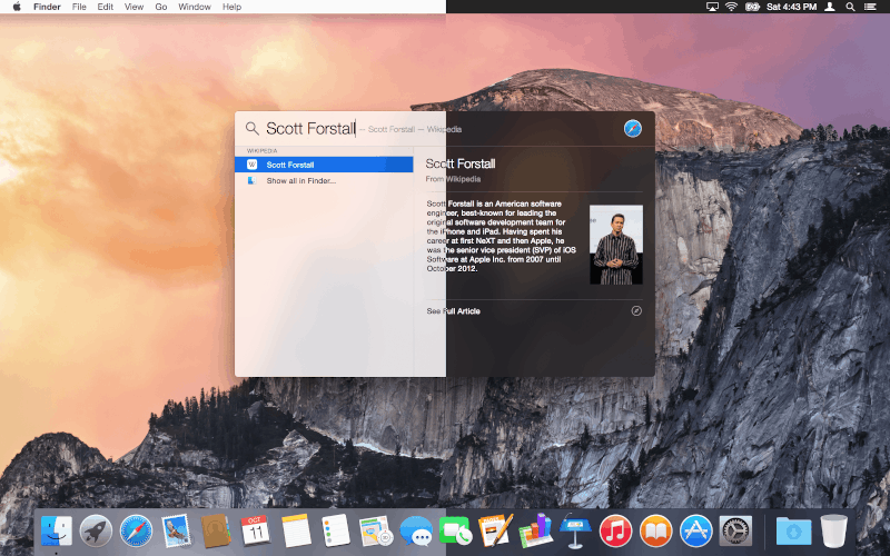
“Dark menu bar and Dock” setting in macOS Yosemite; screenshot from 512 Pixels
The first phase in macOS Yosemite made sense to cater to users of “pro” apps that already use a dark UI style by default, like Photoshop or most video editors. This meant that users of those apps had a less jarring experience between their primary app UI and the system UI. It was a nice step, but was only the start.
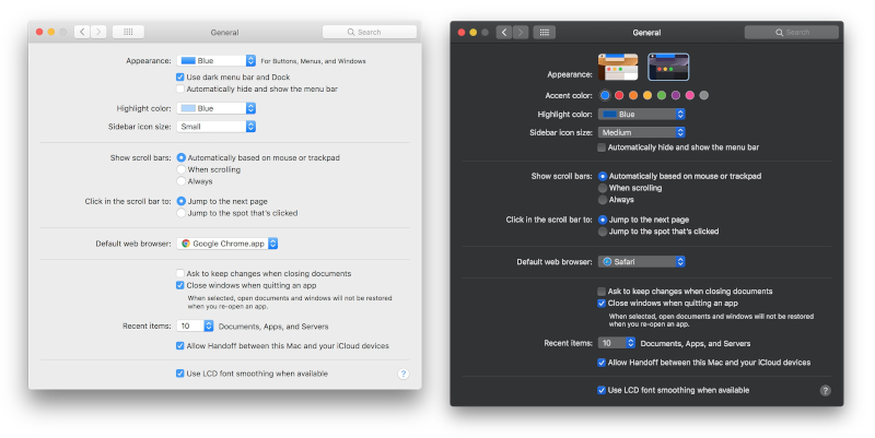
Appearance preference added in macOS Mojave; screenshots from 512 Pixels
The second phase in macOS Mojave opened up the API for the preference to all apps, and Apple made a point of implementing it in all of their default apps. This also helps that “pro” use case where their file manager no longer blinds them when switching apps, but also means other apps from third parties can follow suit and help make a more accessible, environment-matching, and aesthetically consistent experience for users.
macOS does not force a dark style on any apps by automatically switching out the system theme rendering underneath existing apps—instead, app developers are expected to build their apps against the latest libraries which has automatic dark style support, or to respond to the setting and manually alter their app UI as they see fit. Technically apps could completely ignore it, but user pressure encourages developers to support the latest features and not blind users when switching apps.
It’s also important to note that macOS doesn’t currently do anything around a schedule for dark style, but they do ask new users during initial setup which style they’d like to use and make it accessible under the standard system preferences.
The end result on macOS: a very consistent system with a few standout light third-party apps, but those are quickly disappearing as developers get on board and build their apps against the latest version of macOS. Light web content is a larger issue, but Apple is working to help resolve that with new web standards that are being implemented in Safari, Apple Mail, Chrome, Firefox, and underlying web engines like WebKit, Gecko, and Blink.
Windows
Windows 10 looks a bit messier than macOS due to its wide use of multiple toolkits, but the idea is largely the same to macOS. A user can set a dark style preference, and that’s enabled in the system UI plus “modern UI” apps by default (since it was a supported feature of that toolkit from day one).
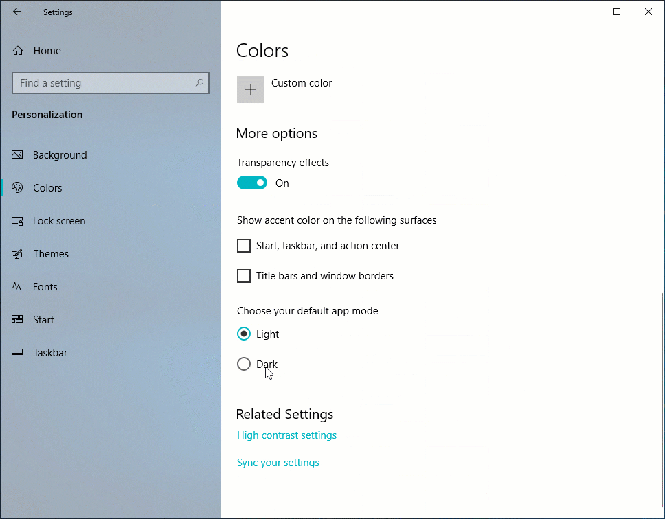
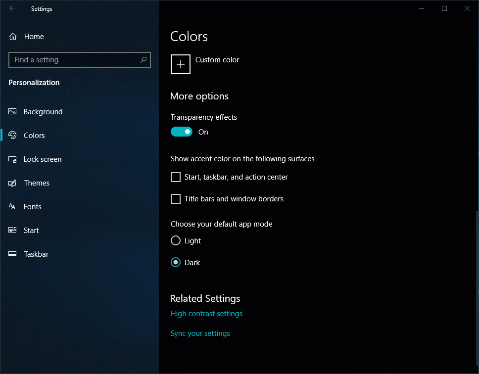
Light or dark “app mode” in Windows 10 settings; screenshots from Windows Experience Blog
Some apps with the older Windows toolkit (like Explorer, their file manager) also hook off that preference and render themselves in a dark style. Other apps like Firefox, Chrome, and Edge also hook off of that preference and—just like on macOS—use the new web standards to let web pages render in a dark style as well.
Android
Similar to macOS, Android implemented a dark style in two phases: first the system UI, then opening up the API to apps.
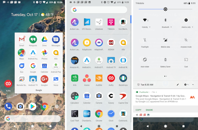
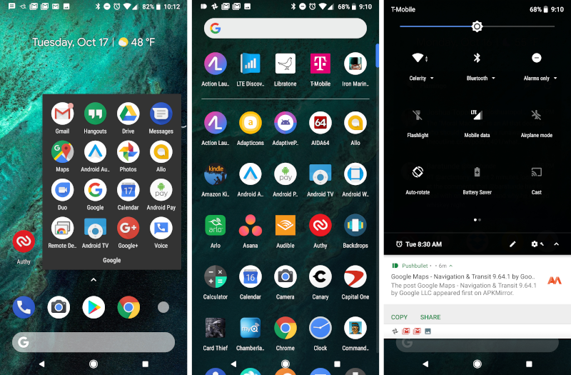
Light or dark style in Android 9 Pie; screenshots from Android Police
In Android 9 Pie, Google introduced a user preference for a dark style (by default based on the wallpaper, but also user-togglable) that set some parts of the system UI to a darker style. Some first-party apps like the dialer and Messages also followed this style, while other apps like the keyboard and Google News would switch to their own dark style when Battery Saver was on to save power on OLED screens.
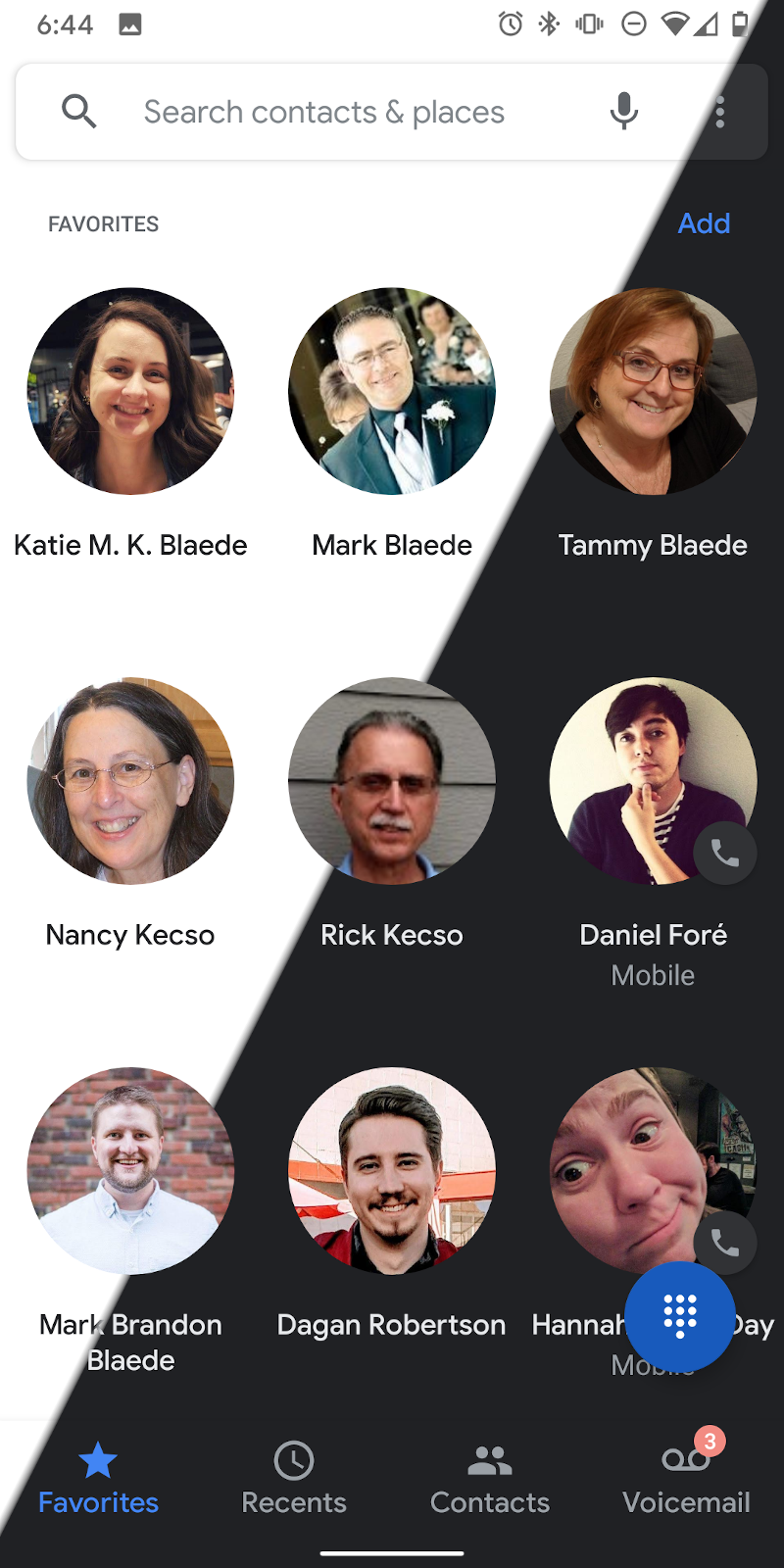
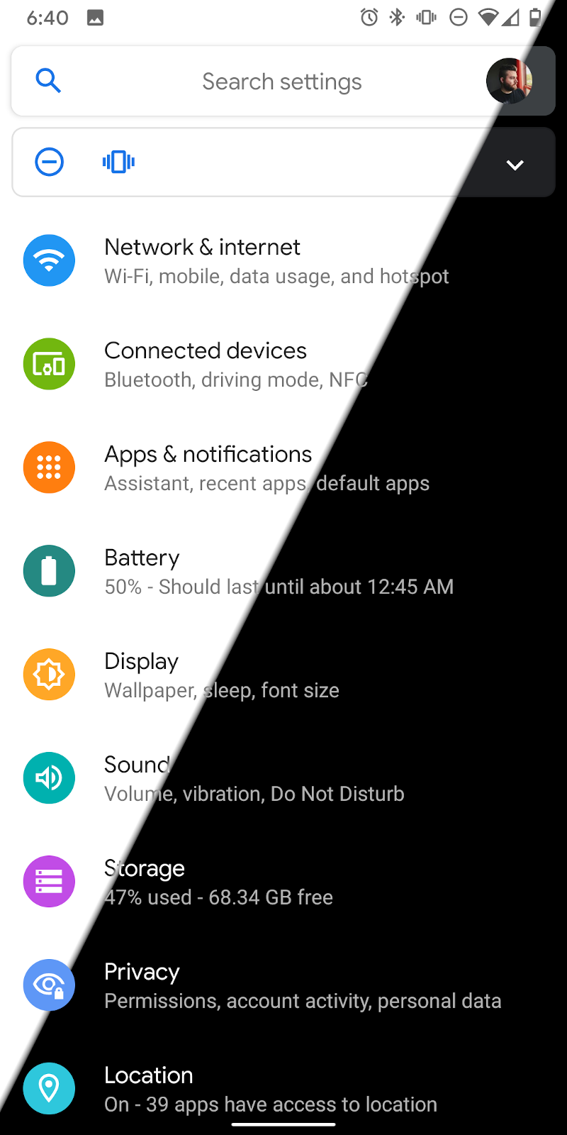
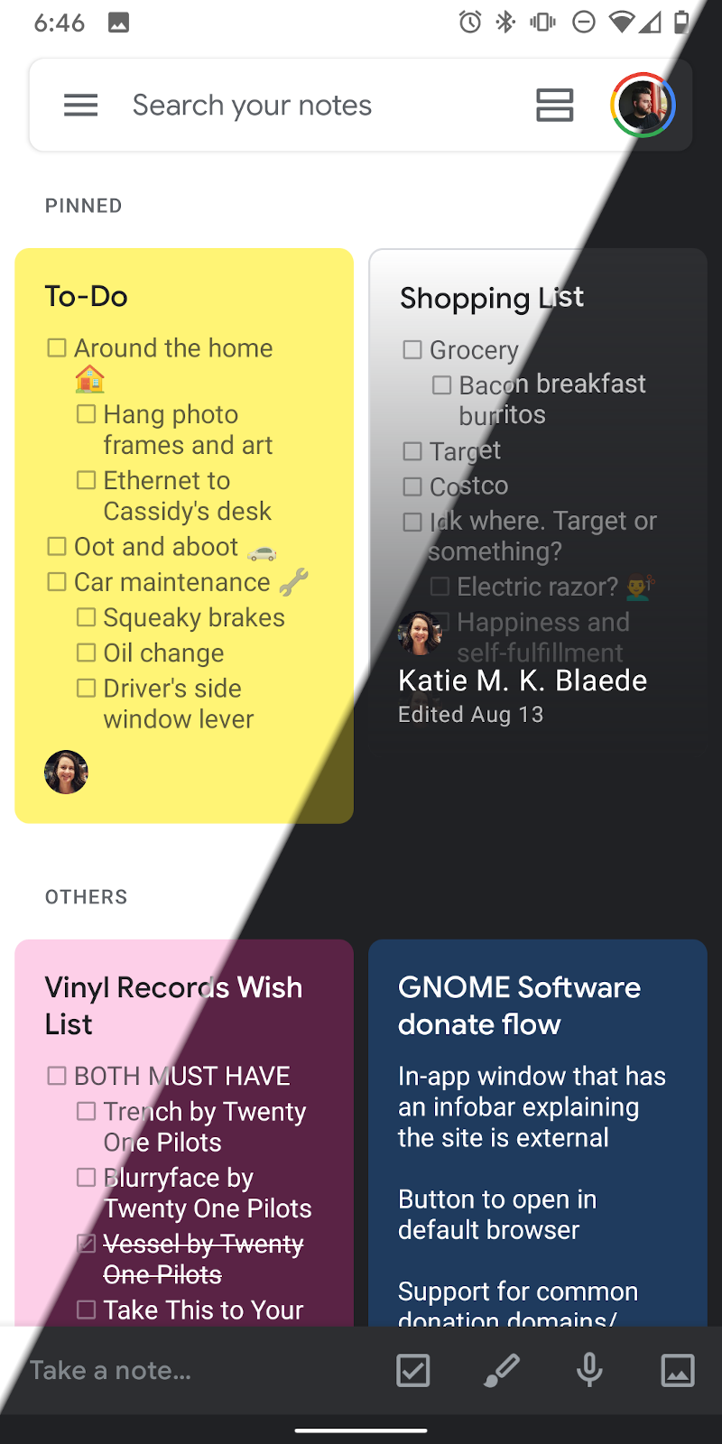
Various apps following the system “Dark Theme”
In Android 10 Q, Google is shipping this much more prominently as a user-togglable “Dark Theme,” along with extensive guidelines for app developers on how to support it. It’s now a quick toggle (just like turning on/off WiFi or Night Light), and those apps plus almost all aspects of the OS all respond accordingly. OEMs can also choose if Battery Saver automatically toggles the Dark Theme on (i.e. for power saving on OLED displays), and Google does so on the flagship Pixel line of phones. This means apps don’t have to try and support both cases—if they support Dark Theme, they’ll go dark for Battery Saver as well. Developers are heavily encouraged to listen to this preference, and respond accordingly. They can opt into using the toolkit’s built-in dark style and build off of it with their own custom styling.
Android also includes a sort of “smart invert” option in the toolkit that inverts the brightness but not colors or images, and developers can use that as a starting point for their own dark style if they choose.
iOS
Much like macOS before it, iOS 13 introduced its own dark style preference, called “Appearance.” It behaves much the same as on macOS with the system UI getting a darker tint. Apple also ships some wallpapers with light/dark appearance support.
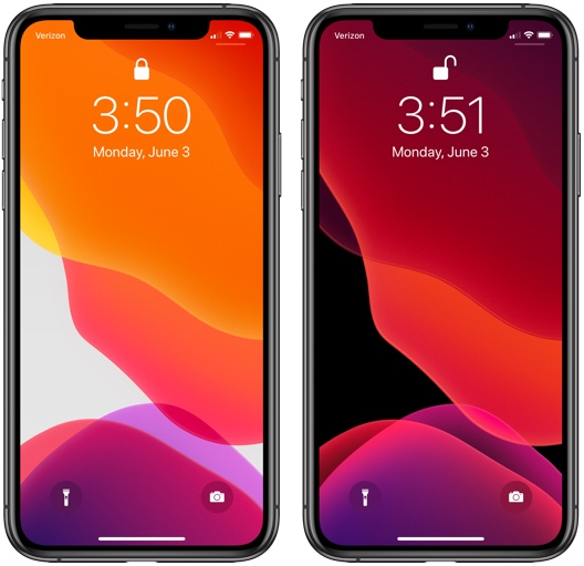
Wallpapers following the “Appearance” settings in iOS 13; screenshots from MacRumors
Apps are encouraged to build against the latest iOS and use system controls when possible for automatic dark style support, but to also extensively test and adapt their apps where needed for both light and dark styles.
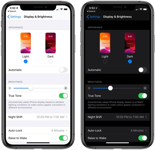
Light and Dark “Appearance” settings in iOS 13; screenshots from MacRumors
Interestingly, iOS 13 also includes an automatic schedule feature for the dark style.
Web
Dark style support—not just for app UI but also websites—is shipping or coming soon across upcoming versions of all major browsers on macOS, Windows, Android, and Chrome OS.
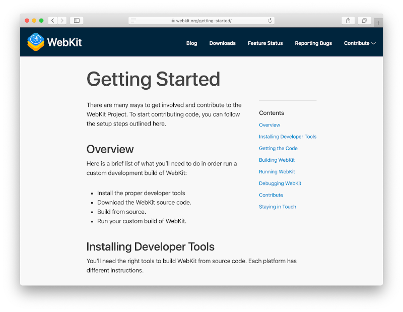
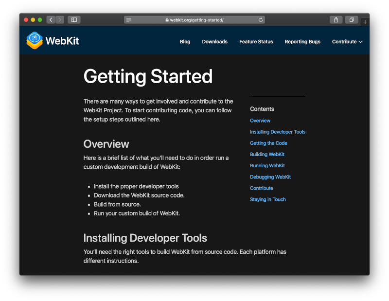
WebKit.org in Safari; screenshots from WebKit.org
If the browser is requesting a dark style (because the OS is), and the website has expressed support for a dark style, then the browser provides dark-styled standard widgets like buttons and text entries, and the website uses its dark styles as defined in a CSS media query.
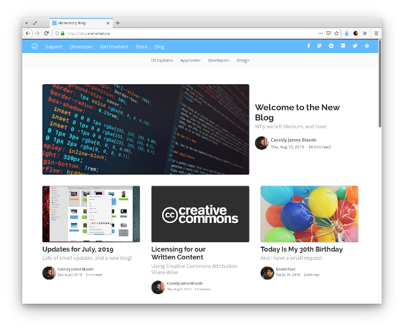
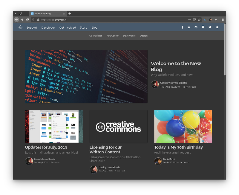
We’re currently supporting this on the blog with pure CSS, but web developers can also hook off this media query using JavaScript and do pretty much whatever they want to cater to a dark UI.
Key Requirements
Across all implementations, there are several commonalities that both developers and users will be getting used to regarding a dark style preference. These form the basis of the key requirements for a FreeDesktop implementation:
Desktop-Wide Preference
If the user is typically in dark environments or uses apps that are primarily dark, they want their software to match that experience as much as possible. Thus, a desktop-wide preference is required to signal to apps that the user would like a dark style to be used if supported. Per-app toggles can still be used for certain tools where there may be a strong user preference to go against the desktop-wide preference, but in most cases, apps should listen to and respect the desktop-wide preference.
By making it a desktop-wide concern (and not per-app or per-toolkit), there is also a natural place for the system UI and app UI to be kept in sync, as well as implementations across toolkits and desktop environments.
Developer Opt In
Apps can’t be expected to just work when swapping out their underlying styling. Developers must opt their apps in, as we see on macOS, Android, Windows, iOS, and in web standards.
Toolkits should not force this on apps by default, but allow them to know the user is requesting an OS-wide dark style and adapt their UI as they see fit. This can include the app actively opting into the toolkit’s dark variant, but developers might also choose to tweak their custom styling, switch out visual assets, desaturate certain colors, or make other changes in response to the user preference.
To make this easier for developers, the toolkit can provide a new property to inform the app that the user has requested a system-wide dark style, as is done in Android, macOS, and Windows. On the web, this is the media query for CSS, and developers can hook off it with JavaScript.
Cross-Toolkit, Cross-Desktop
For the FreeDesktop, this effort and implementation must span toolkits and desktop environments for it to be effective and taken seriously by large ISVs and web developers.
The latest versions of Firefox and Chrome already hook off the macOS and Windows system-wide dark preferences, opting their UI into a dark style while exposing it to websites via web standards. If we expect the same support from these browsers on FreeDesktops, we must standardize the specifiation and make it as simple as possible for these apps to hook into. Similarly, cross-desktop technologies like Electron will benefit if it is implemented in a way that is similar to what they are used to on macOS and Windows.
Dark, Please
Lastly, a dark style preference must be nuanced both in how it is implemented and how it is communicated to users. It’s explicitly not a setting between always light and always dark—without the user setting a preference for a dark style, the OS and apps should render exactly how they do today. That means if your OS shell (like GNOME Shell) is dark, it should stay dark. If your app is usually dark because it’s media-centric (like a photo viewer or video editor), it should keep its look by default. If the user sets the dark preference, apps and UI that were previously light should now become dark.
Similarly, when communicating this preference to users, it likely shouldn’t be a choice between “light” and “dark.” Instead, it should be phrased as “prefer dark style” or similar. In elementary OS, we could use a labeled switch, plus some explanatory copy to further clarify the preference to users.
Working Prototype
Over the past several months, I’ve been following this work and working on prototypes within elementary OS to enable it; you can view the code in the prefer-dark branches on the elementary GitHub, or in the Prefer Dark Style project. Here’s what I have — with a reminder that this is all unmerged prototype work:
User-settable preference in System Settings
This toggles the underlying desktop-wide setting, plus provides the user with expectations.
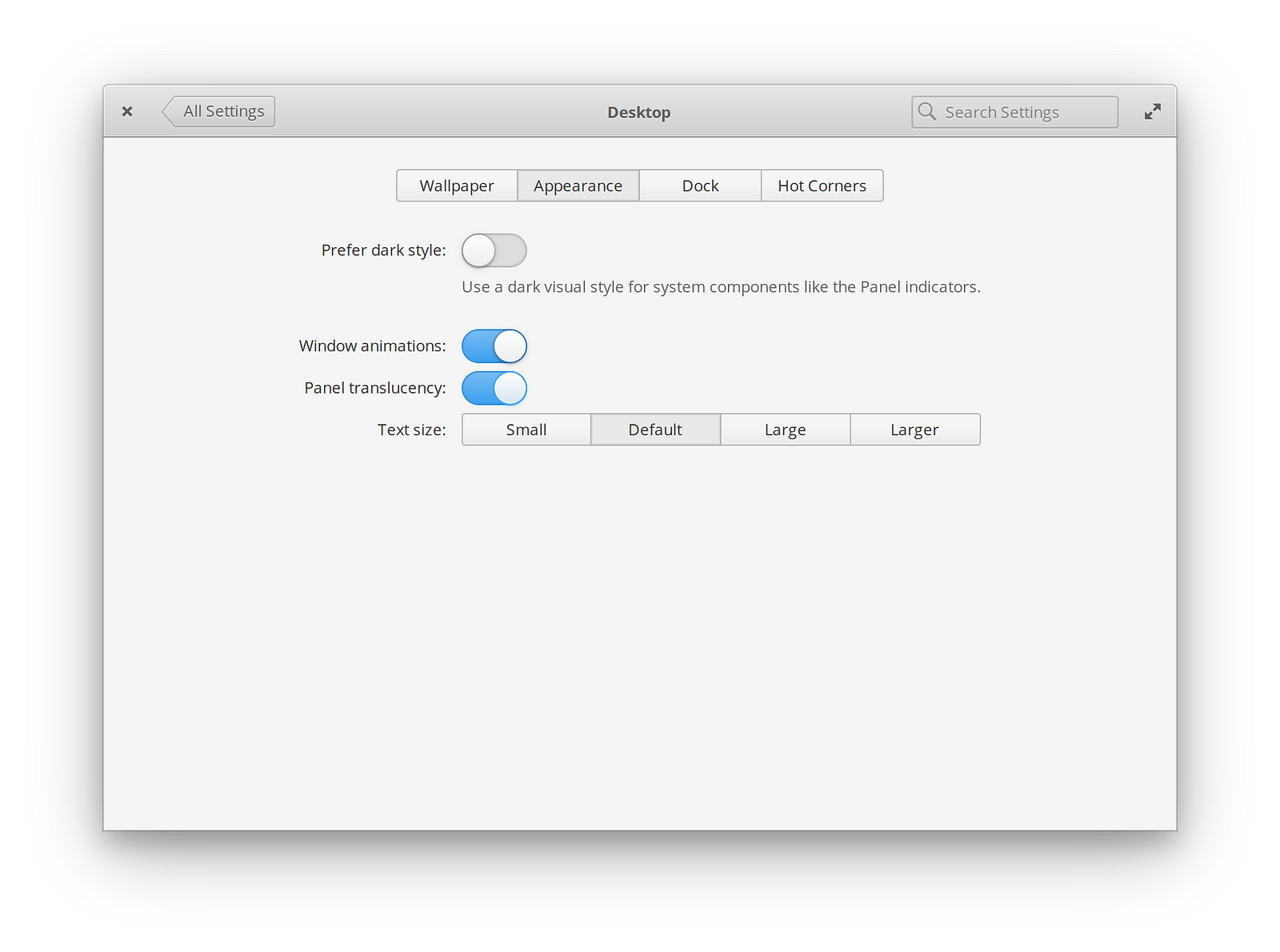
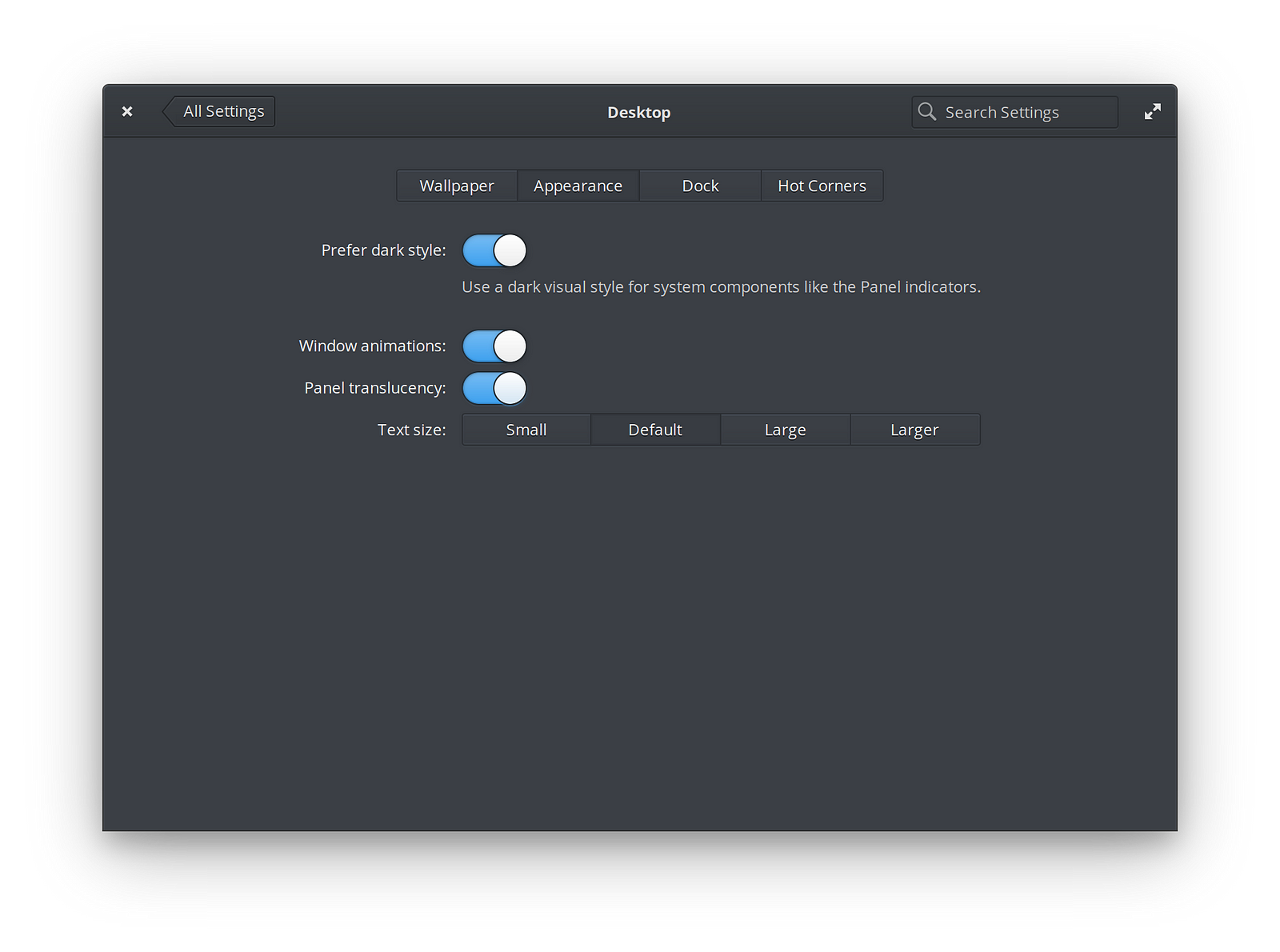
Prototype “Prefer dark style” toggle in System Settings → Desktop → Appearance
Note that this is different from forcing the GTK stylesheet variant, or changing the entire stylesheet out from under the desktop! It simply toggles a GSetting that other implementations can also hook off of.
Shell components
Components of the elementary OS desktop shell like the panel, screenshot dialog, shortcut overlay, and agent/permission dialogs have been updated to listen to this preference and request the dark GTK variant in response.
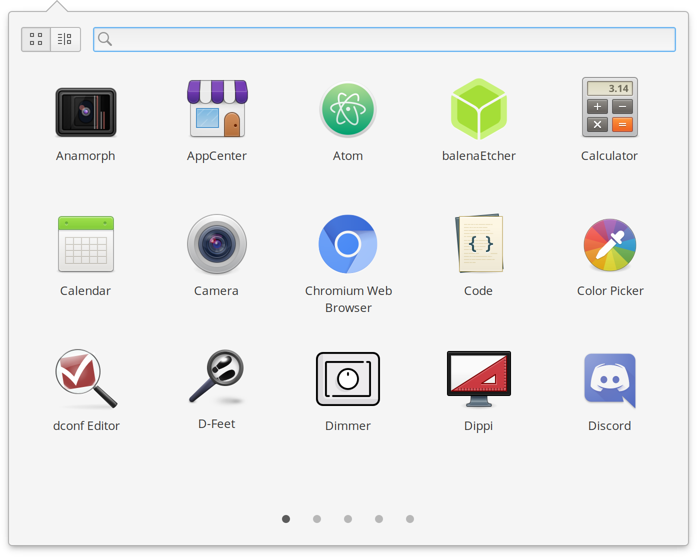
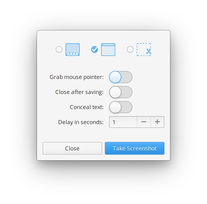
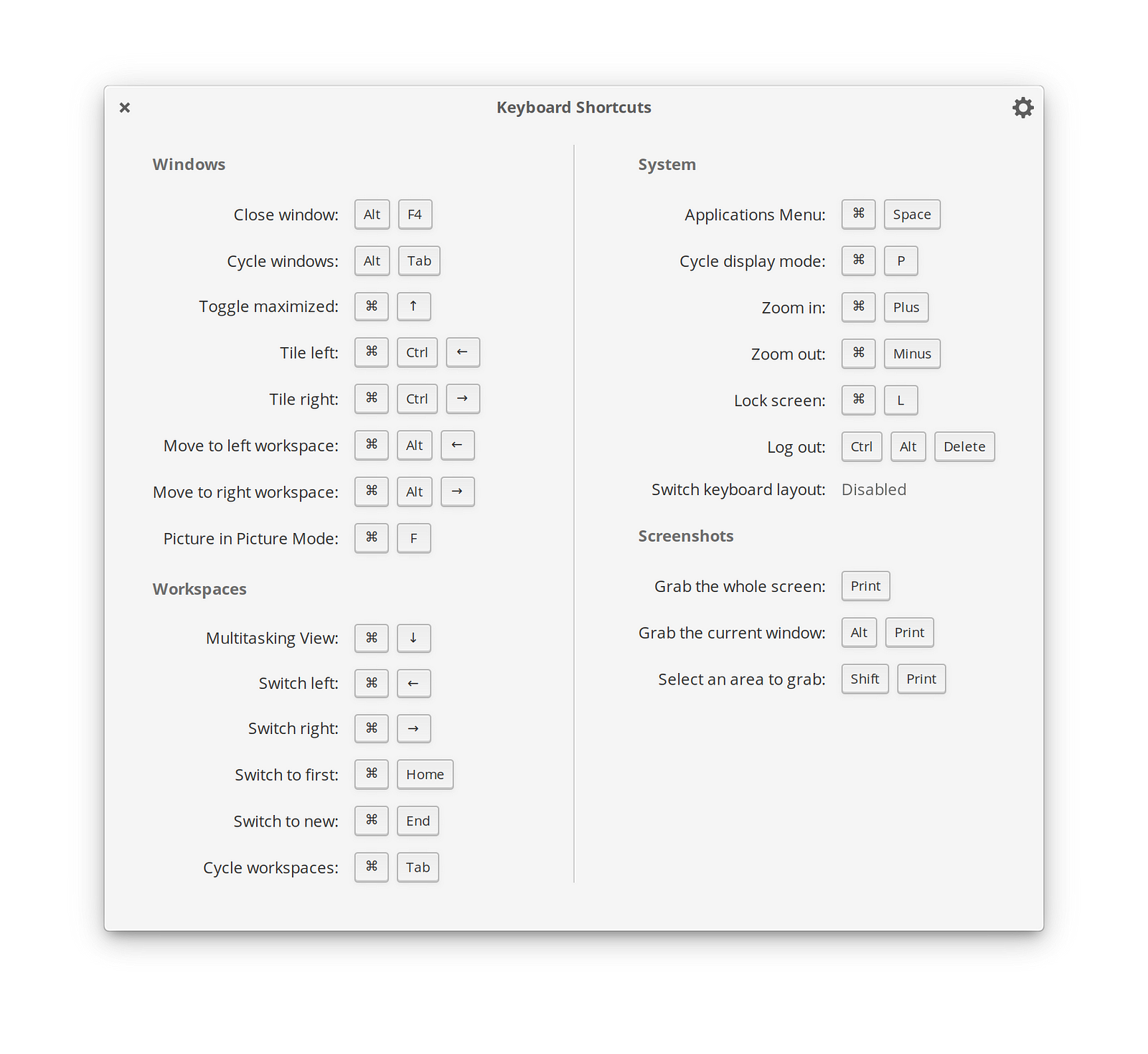
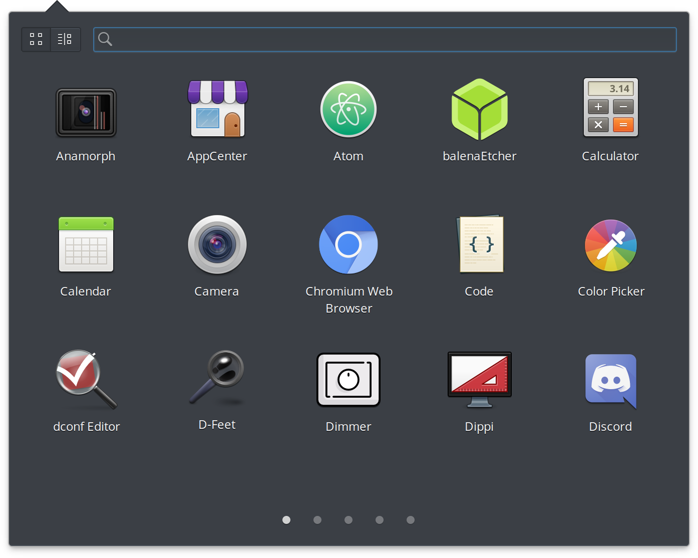
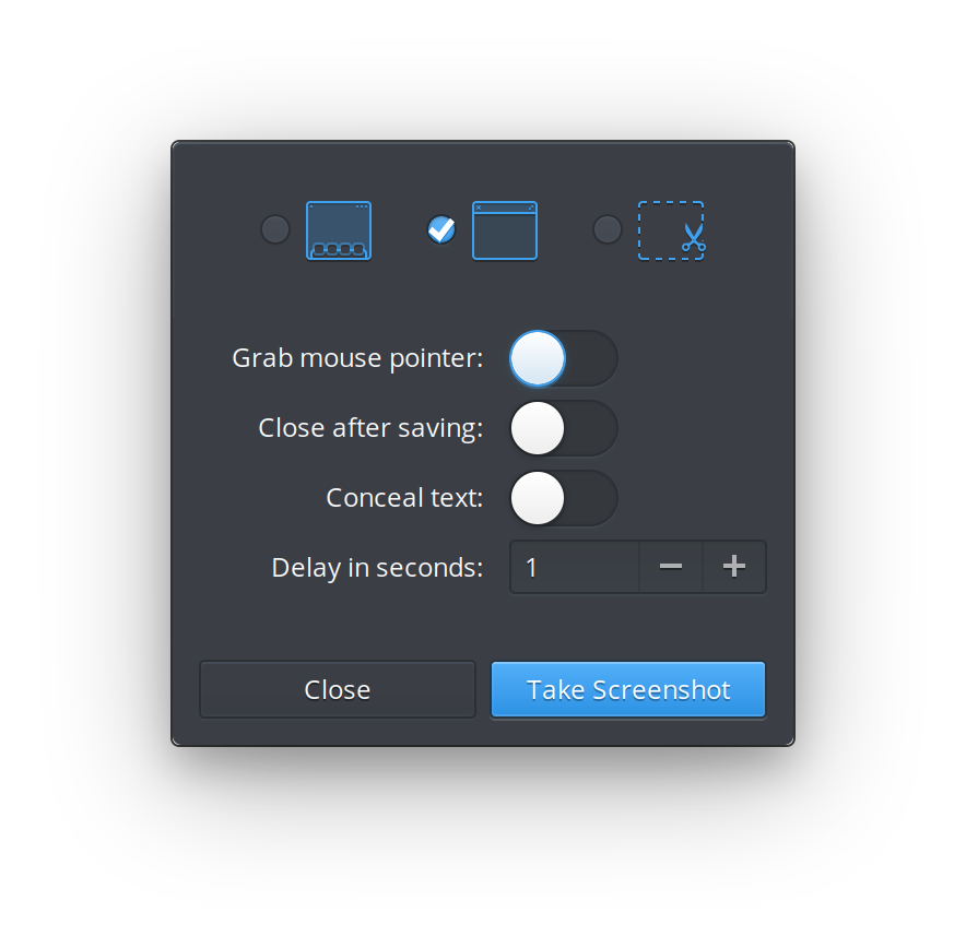
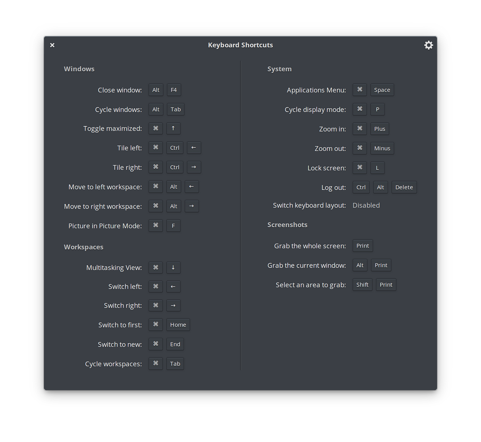
You’ll recall this is typically the first step in a two-phase implementation as seen in macOS and Android.
Default apps
Several default apps on elementary OS have been updated to listen to this preference and respond by requesting the dark variant from GTK, sometimes with minor stylesheet update to support the new dark styles.
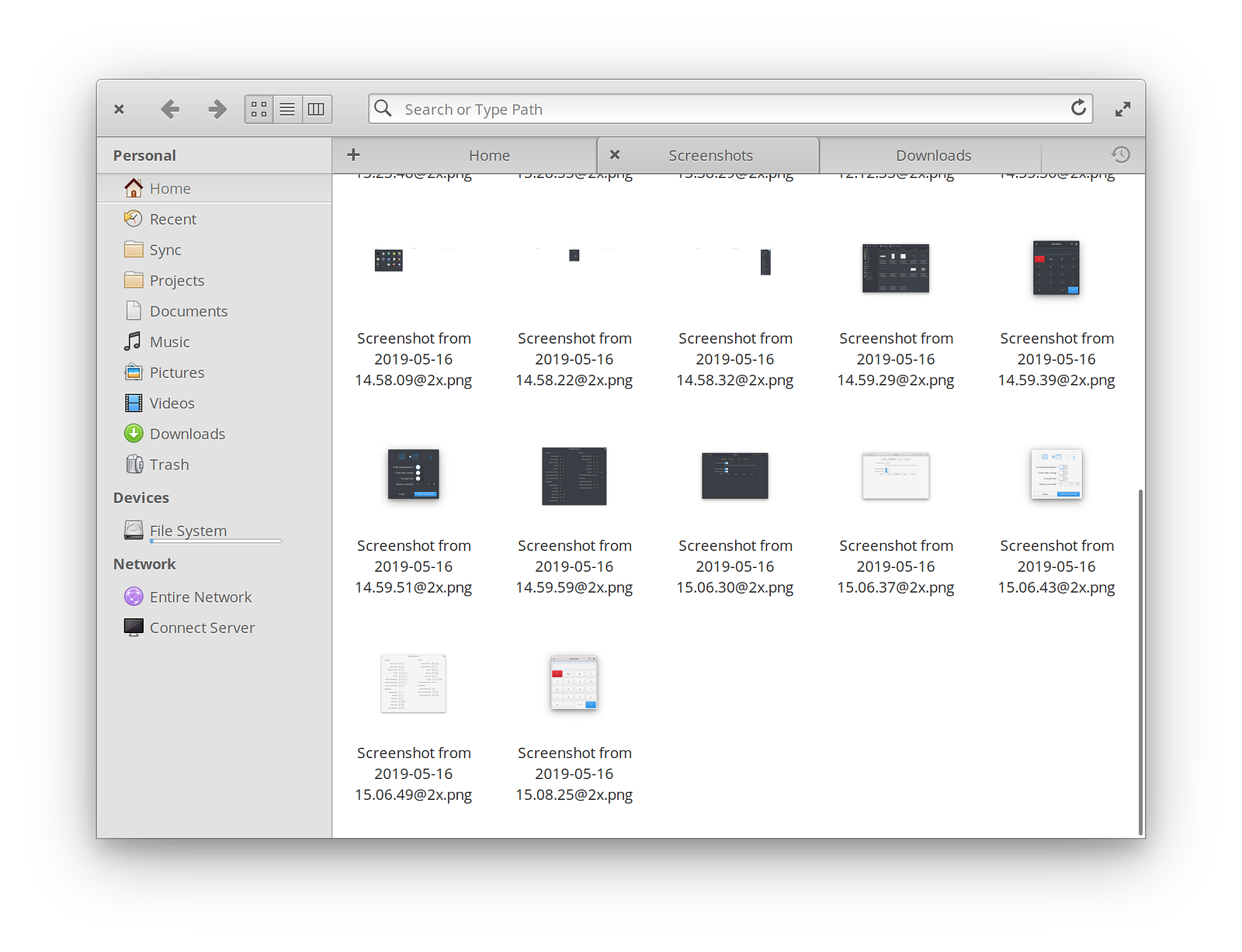
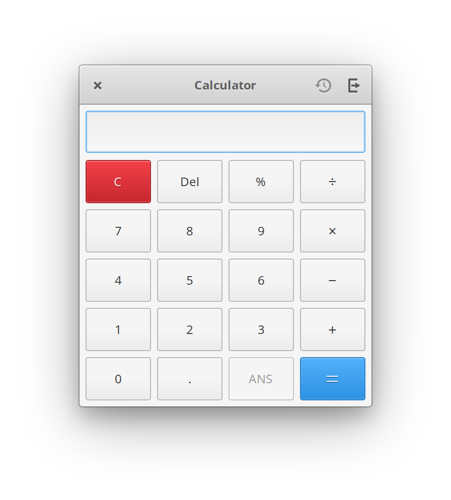

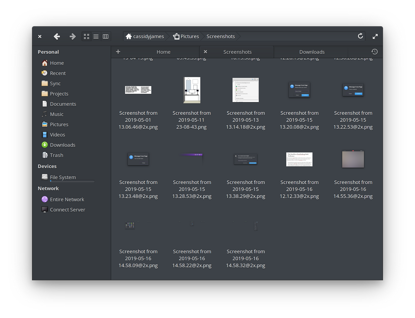
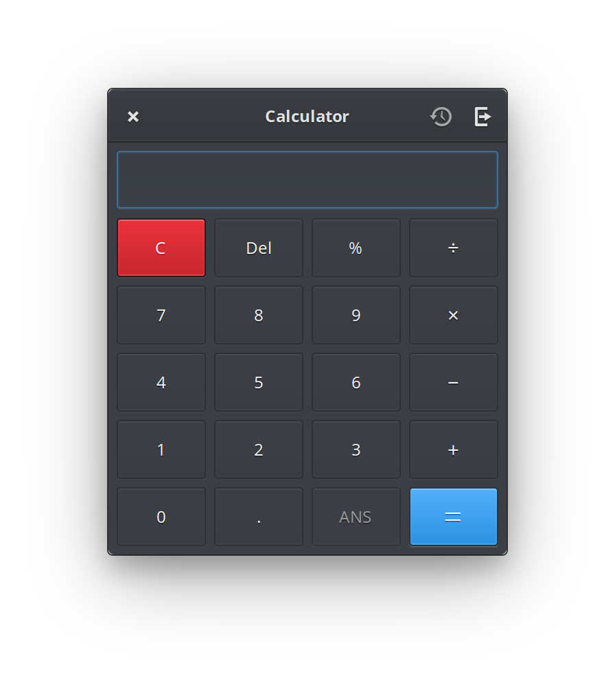
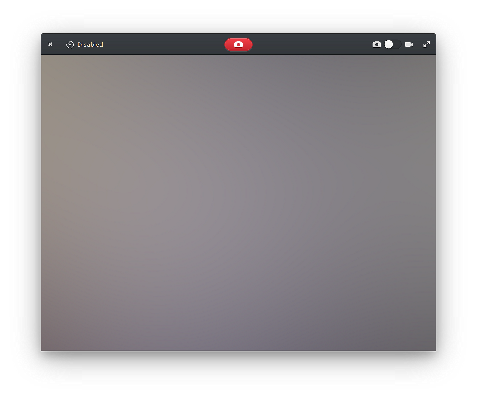
These include simpler apps like Calculator and Camera, as well as prototypes for much more complex apps like Files, Music, and Mail.
Third party apps
I’ve updated several of my own apps to listen to this preference and request the dark GTK variant in response.

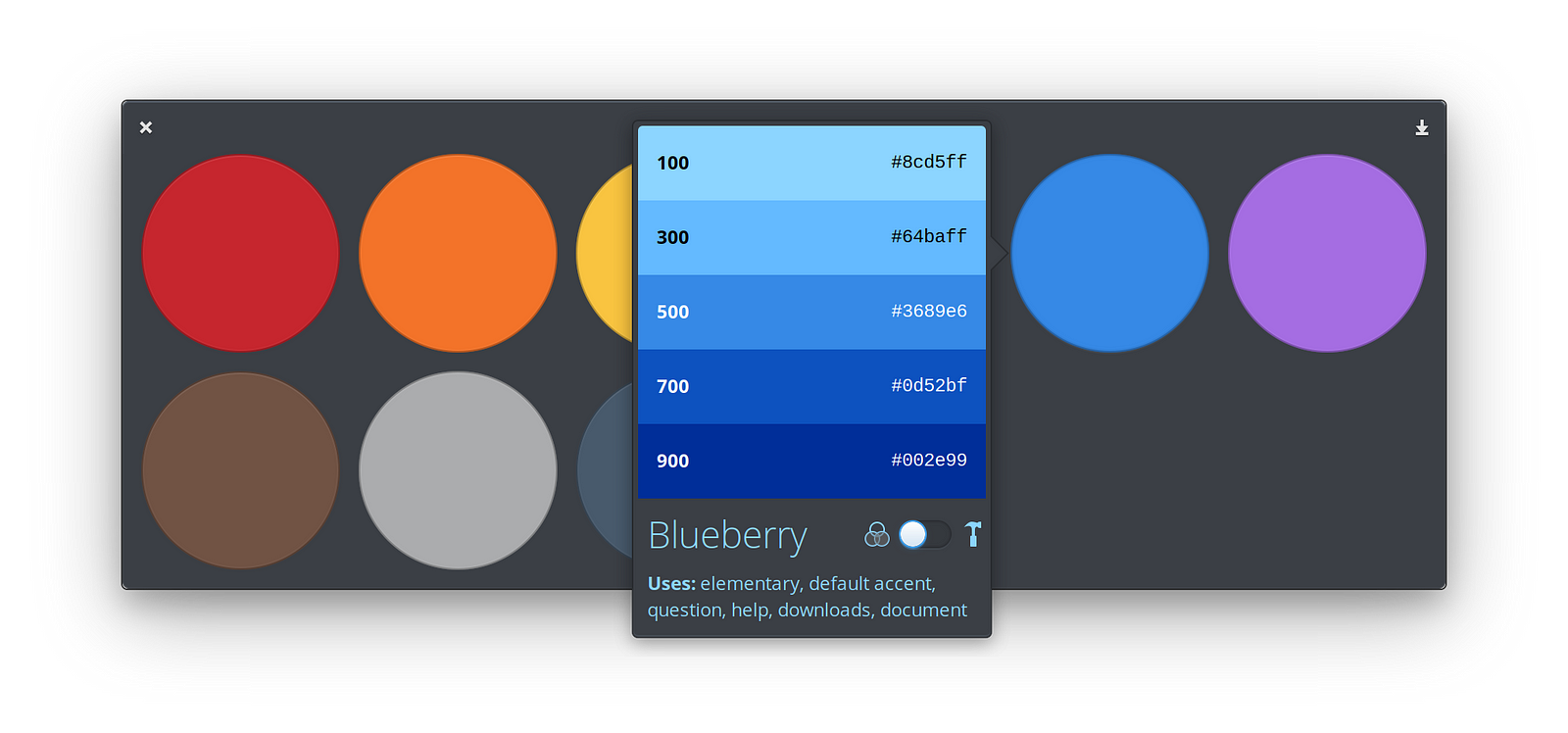
Palette actually uses a lot of subtle but custom styles, so it required some care when supporting a dark style. But done correctly, I think it looks nice.
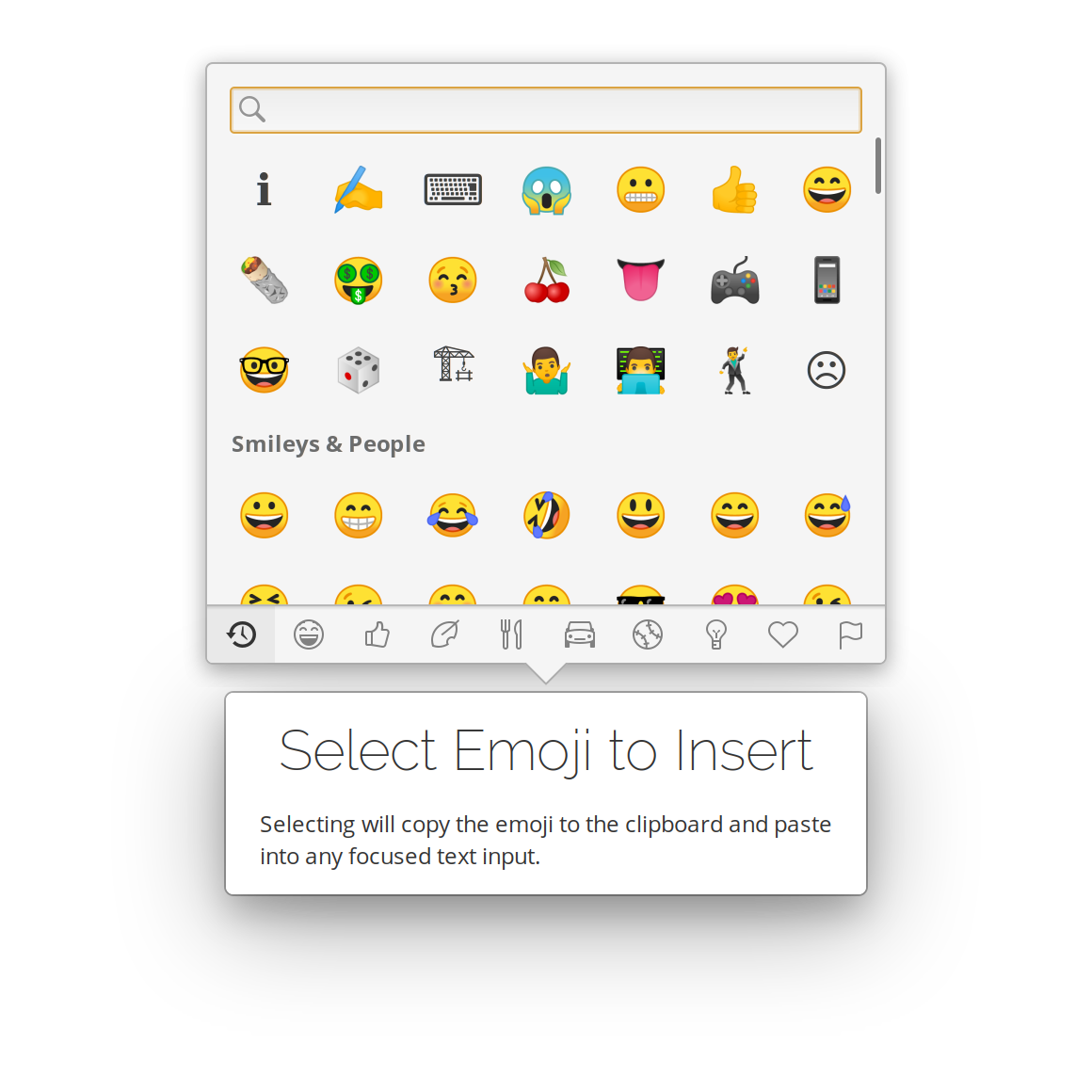
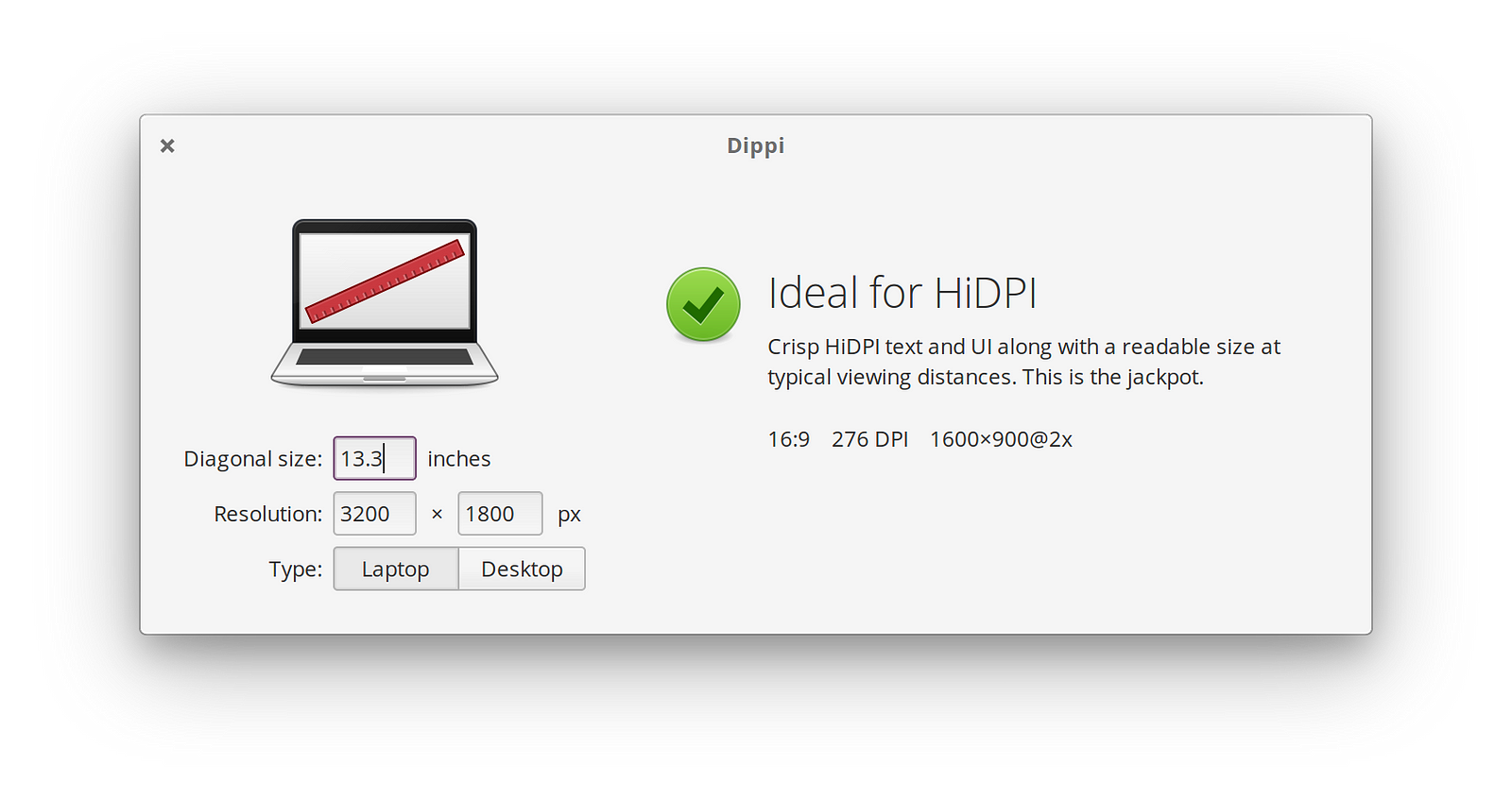
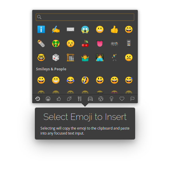
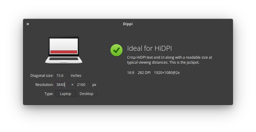
Dippi and Ideogram are very simple and didn’t require any custom styling; simply changing out the GTK style variant worked right away.
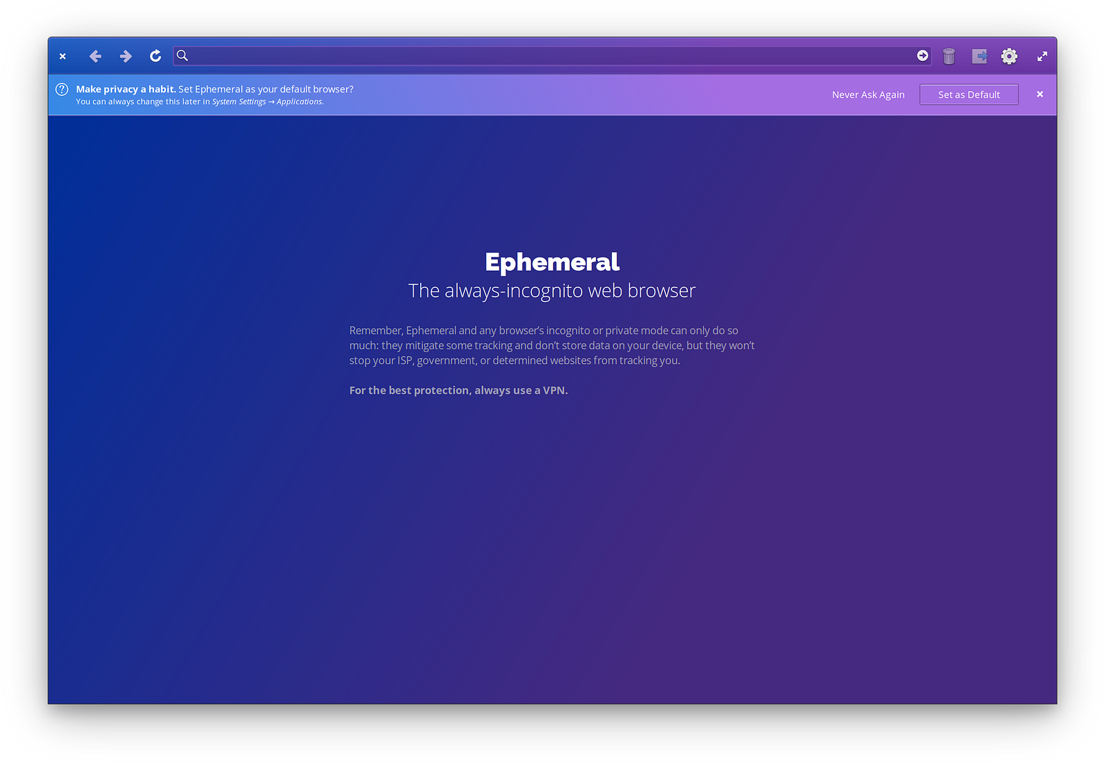
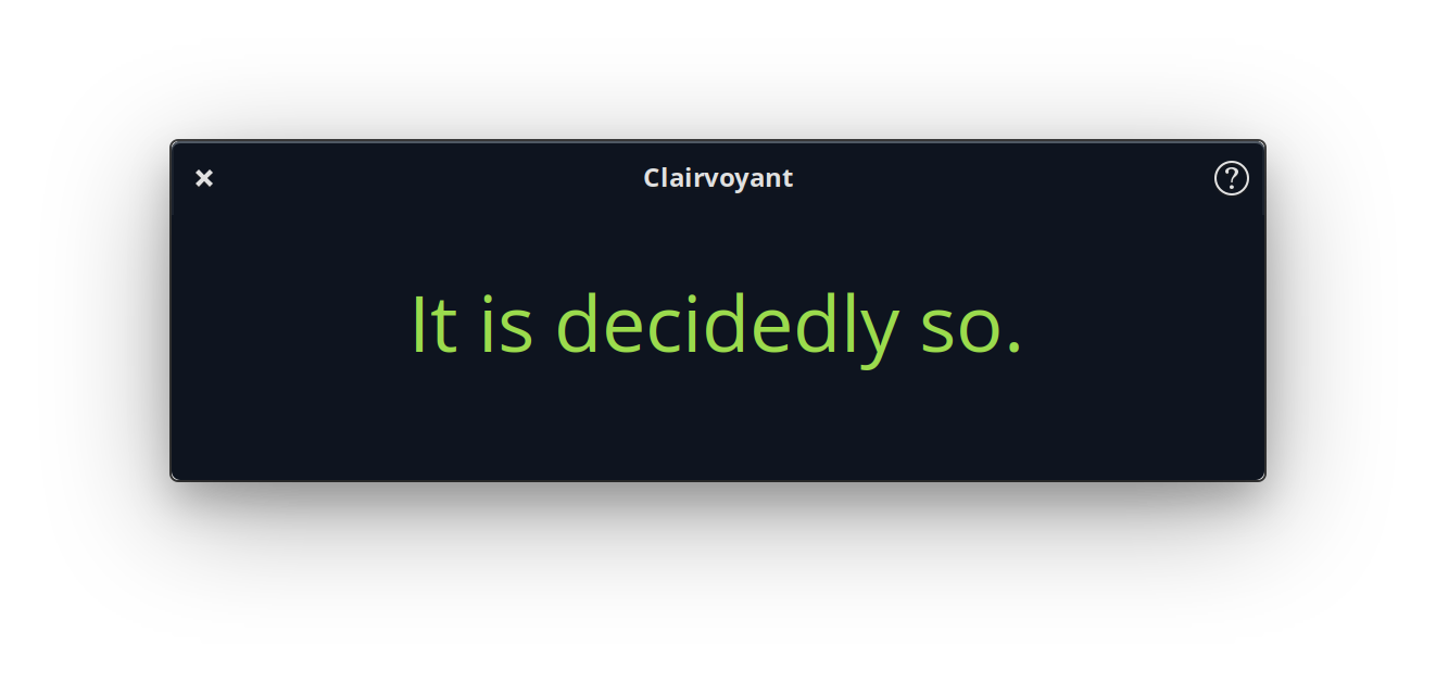
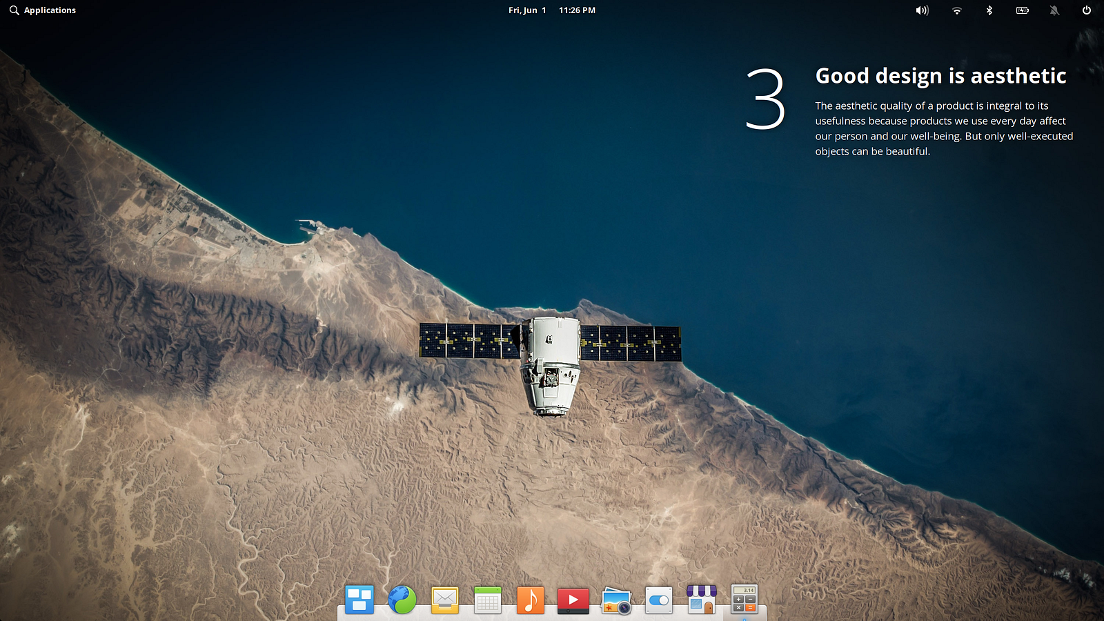
On the other hand, some apps don’t need to do anything at all. Clairvoyant is supposed to be reminiscent of a magic 8-ball, so it’s always dark. My browser Ephemeral has very custom styles that are intentionally always a dark blueish-purple; in this case, there’s nothing for me to do until I can toggle a WebKit property for web content itself. Lastly, Principles is a unique applet that has a transparent background and extensive custom styles (like a desktop widget), so supporting a system-wide dark style isn’t directly relevant.
Still needs work
I’ve been secretly using this setup for a few months now, and it feels pretty close in my view. However, there are few areas that aren’t quite ready for users:
- Dock is always light. Waiting for a patch to Plank to enable a dark variant when the dark style preference is set.
- Notifications are still light. Gala (our window manager) needs to be made aware of the spec, and draw them using a dark style.
- Transition could be smoother. Right now the transition between light and dark styles is a little rough: you can briefly see widgets transitioning at different times. However, Gala can effectively paper over this with a smooth fade much like macOS does.
- Remaining contrast issues in the dark stylesheet. The dark elementary stylesheet was not originally intended to be used system-wide, but was designed for use in specific types of apps. We’ve improved the contrast in many places, but there is still room to improve.
- Custom styles in default apps. There are still some instances of custom styling within default apps on elementary OS that will need to be revisited for a dark style.
- Standardized way to read the preference. Right now apps are manually checking the GSettings key — while it’s only a handful of lines of code, it adds up and should probably be handled by Granite or GTK instead.
- Developer guidance. Apple and Google have both provided excellent dark style guidance for macOS and Material Design, and we should similarly document it for developers in the elementary OS ecosystem. This also includes standardizing on a behavior for apps like Terminal and Code where they already support multiple color schemes.
- WebKit integration. Safari and Mail on macOS work with the proposed web standards to enable dark styles in websites and HTML emails, and we’ll need WebKitGTK to do so as well.
- Cross-platform app integration. Submitting patches to Firefox, Chrome, and Electron are far outside my area of expertise. For this to truly work well across desktops, we’ll need these apps to do on Linux what they already do on macOS and Windows.
That might seem like a lot, but formalizing the spec and getting others on board will only speed it up!

What’s Next: GUADEC & Formalizing the Spec
The working prototype was implemented on elementary OS, but adheres to what I expect could become a FreeDesktop.org specification, and be implemented in other projects like GNOME, KDE, XFCE, Firefox, Chrome, Electron, etc. An example specification is available here, and is open to collaboration. Understandably GSettings is not likely the most cross-desktop and future-proof solution, but a similar idea should be followed in the final spec.
I also plan to attend GUADEC where I am organizing the FreeDesktop Dark Style Preference BoF (what a mouthful!). I would be happy to discuss and refine these efforts at that session, and see if we can formalize the spec and implement it GNOME, elementary OS, and any other interested desktops.
Changes
The following edits were made for clarity or to reflect new information.
July 30, 2019:
- Added an iOS section (and modified relevant copy elsewhere) since iOS 13 has implemented a dark style preference
- Updated the macOS section to reflect that developers get some automatic support when building against the latest version of macOS
- Added my other third-party apps and why they do or don’t change for the dark style preference
August 19, 2019:
- Added Chrome OS to list of platforms testing a dark style
- Mentioned accessibility features in opening paragraph
- Added screenshots and macOS version names to macOS section
- Added screenshots to Windows section
- Added screenshots to Android section
- Added screenshots and expanded with more details in the iOS section
- Added screenshots and mentioned the blog’s styles in Web section
- Tweaked formatting of this “Changes” section
Thank You
Thanks to all of our supporters, backers, and customers! Your contributions make elementary possible. If you’d like to help build and improve elementary OS, don’t hesitate to Get Involved.
We’re accepting limited sponsors for the elementary Blog. View our public analytics and learn more if you are interested.


