What’s Up With HiDPI Icons?
Thoughts from the GNOME WestCoast Summit

We’ve recently returned from GNOME WestCoast Summit with a wealth of information and one of the breakthroughs we made was with regard to HiDPI icons. While the update should soon land for elementary OS Freya users, I wanted to take the time to document the changes we made. Hopefully this information will be useful to other open desktops and I do want to bring to light an open question about how third party app developers should be distributing HiDPI compatible icons.
What is a HiDPI Icon?
Just to be clear, this post is relatively technical and is mainly meant for other icon theme designers. As a user, you should never have to see or worry about what we’re doing behind the scenes ;)
If you’re not quite sure what HiDPI is, for the purposes of designing icons we can just think of it as pixel doubling. If you’re drawing a 32px icon, you need an equivalent 64px icon for HiDPI users. That sounds pretty easy on it’s face, but I’d like to try to illustrate why it’s a little more complex.
The first thing to make clear is that in elementary OS, we ship 16, 24, 32, 48, 64, and 128px icons. These are exactly the sizes that we use throughout the interface. No extra sizes. No missing sizes. We expect to design each size specifically for where it will be displayed. To contrast, GNOME supplies 8, 16, 22, 24, 32, 48, and 256px icons. So in GNOME what you see after 48px is the 256px icon scaled down. But just what does this have to do with HiDPI? Remember that according to the system we’re just doubling pixels. GNOME’s approach is exactly that. Take for example a 64px Terminal icon. On HiDPI this a 128px icon right? (just an ironic note: if you’re already on HiDPI the following images will probably make little sense to you)
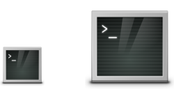
GNOME doesn’t supply either of those sizes. They just down scale the 256px icon. Notice how in both cases the borders and highlights aren’t sharp or necessarily even visible. Things aren’t inherently grid aligned. This basically means that you won’t be able to notice or reproduce an issue with GNOME icons. They always look like that in GNOME. But what do those icons look like in elementary OS?

In elementary OS, we supply icons at these exact sizes. Everything is always grid aligned. It’s always sharp. And here’s where the HiDPI part comes in. Since a 64px icon in HiDPI is really just a 128px icon, that should look great right? It’s already clean and sharp on my LoDPI display. But it turns out, that’s not what you see. The icon looks downscaled. So the solution is to provide @2x icons. These are icons that aren’t just double the canvas size, they’re double everything. Here’s what those 128px icons look like on a LoDPI display as a comparison (128x128 on the left, 64x64@2 on the right):

Notice how the second one (64x64@2) doesn’t look that nice on LoDPI. The border and highlight looks too big. It fills the canvas differently. But here’s an approximation of what HiDPI displays will see (128x128 on the left, 64x64@2 on the right):

See how the downscaled 128px icon is super blurry compared to the 64px @2x icon? This is counter-intuitive. We definitely want that second one on HiDPI, even though it looks wrong on LoDPI. It maintains the same sharpness that we expect from elementary icons.
If you were confused by this part, that’s okay! It can be hard to wrap your head around until you see icons in action on a HiDPI display. It make take a couple of read-throughs for it to click.
The Work Around
If you’ve ever used SVG (or font) icons on the web as a solution for HiDPI, you should be saying that since we ship SVG icons it should be magic and just work. However, at the moment Gtk seems to be built around shipping raster icons. Its default behavior is to work around this by grabbing a larger canvas size. But as illustrated above, this isn’t the behavior we want. It makes our icons look ugly. So what can we do?
Luckily, the icon.theme spec has the ability for us to specify folders that contain @2 icons. However, it won’t accept us naming the same folder as being two different scales. So we have to play some tricks to get it to do the right thing:
- Create symlinks to all your top level icon folders with “@2” following the name. For elementary, this means “categories@2” is a symlink to “categories” etc
- Now you’ll need to add all of the “new” directories to your directories list in your .theme file. For elementary this means having “categories/32” and “categories@2/32”. If you have your directories with sizes first, you’ll have “32/categories” and “32@2/categories”.
- Add definitions for all of these new folders below and make sure to add the “scale” property. Also make sure the definitions for all of your folders contain proper Min and Max sizes. Min size can be anything (good for making sure icons still scale to fill any gaps you might have), but MaxSize shouldn’t be larger than the next available size you supply. This is important for making this work properly
[categories@2/32] Size=32 Scale=2 Context=Categories MinSize=8 MaxSize=47 Type=Scalable
That should do the trick! Your icon theme should now support HiDPI properly, assuming you’re using SVG icons. If you’re using a non-scalable format like PNG, you’ll actually have to go through and create real @2x assets. This is a good time to reconsider that choice since it’s a huge amount of work. Imagine when @3x displays come out, you’ll have to do it all at that size too.
The Question
My big open ended question for the open desktop community is: What about 3rd party developers? I’m unsure what to tell them to distribute with their apps. How do we make sure their icons work as well? This is something I think we’ll need to come together and make sane decisions for. Decisions that will work across all our desktops and the many different icon sizes and styles that we all provide.
Wait. Wat. Halp
If you’re totally lost right now and need help making your icons work on HiDPI, please feel free to reach out to us on social media we’ll do our best to sort you out :)
Thank You
Thanks to all of our supporters, backers, and customers! Your contributions make elementary possible. If you’d like to help build and improve elementary OS, don’t hesitate to Get Involved.
We’re accepting limited sponsors for the elementary Blog. View our public analytics and learn more if you are interested.


