Updates for July, 2019
Lots of small updates, and a new blog!
It’s that time again! Time to look back at the past month and see all of the updates that have been pushed out to elementary OS, and what else we’ve been up to. This month was somewhat quiet as we work on some bigger things to come, but there’s still a lot of good stuff. Let’s take a look.
New Blog!
It’s not an OS update, but it’s still exciting:
If you’re reading this, it’s because of our new blog (or RSS feed)! We spent a few days investigating various options, and we landed on a new completely static blog that gives us more control over our content, better respects your privacy, and is way faster. We’ll have a more comprehensive post about the new blog, our reason for self-publishing, and its architecture later—but for now: welcome!
Files
We released a whole bunch of updates to Files in July, thanks largely to the hard work of Jeremy Wootten, Corentin Noël, and Paulo Galardi.
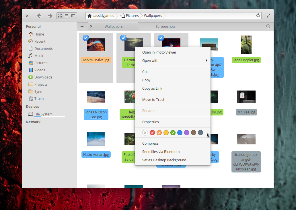
Color tagging has been greatly improved! The menu item for selecting color tags has been rewritten, using GTK instead of custom Cairo drawing. The click targets are bigger and more clear, plus contrast has been improved. The menu also now shows all tags for selected files, which is a nice touch.
Files now shows more search results in the search drop down, making it more effective with lots of similar results. Opening Files from the Terminal now opens a new tab instead of a new window. We’ve improved keyboard navigation and made the progress window closable when copying network files to removable storage.
We also fixed some instances where tab names would be incorrect and folders would have the wrong sort order. MTP support (for external devices like Android devices and MP3 players) has been improved, we’ve fixed a few rare crashes in certain situations, and we’ve reduced memory usage of the file chooser dialog. We also fixed copying and pasting when dealing with symbolic links, fixed dragging-and-dropping in certain situations, and improved keyboard navigation throughout.
Under-the-hood, we ported more code from C to Vala to make it easier to read and work with within the rest of the codebase.
Terminal
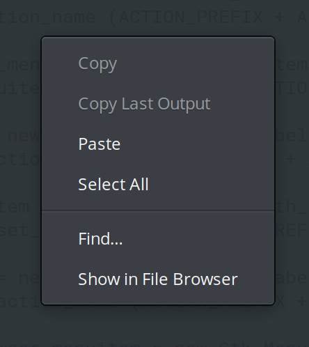
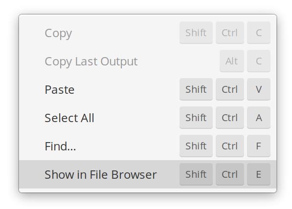
Terminal received a few small improvements: the Menu key found on some keyboards now opens the context menu, we added a separator to the context menu to better delineate text actions from app actions, and we save more window state between sessions.
Onboarding
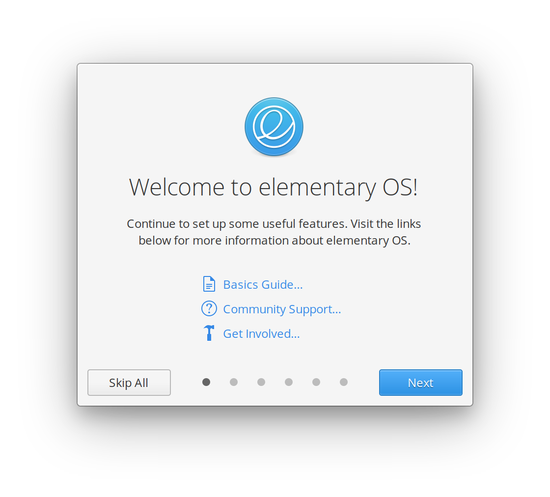
The new Onboarding app was released in July! It has not been included by default in the desktop session, so you probably haven’t seen it if you’re an existing user. Hold tight, it will be included by default in an upcoming update.
Panel & Indicators
We’ve updated the Session indicator, which shows the device’s user accounts and session actions like Shut Down. We improved the styling of the Shut Down dialog when being launched from the Greeter, made sure the indicator can be closed with a single click in certain situations, and updated it so using the Esc key always closes the Shut Down and Log Out dialogs.
Look and Feel
This past month we improved the look and feel of elementary OS via the system stylesheet and icons.
Stylesheet
The big new change here is the color-neutral dark style. Dark-styled apps in elementary OS now sport a dark color-neutral shade of gray instead of the previous cool-tinted gray. We’re trying this out in order to make certain situations like photo and video editing apps easier for color-correction, but we’re also still looking for feedback and might tweak or revert it in the future.
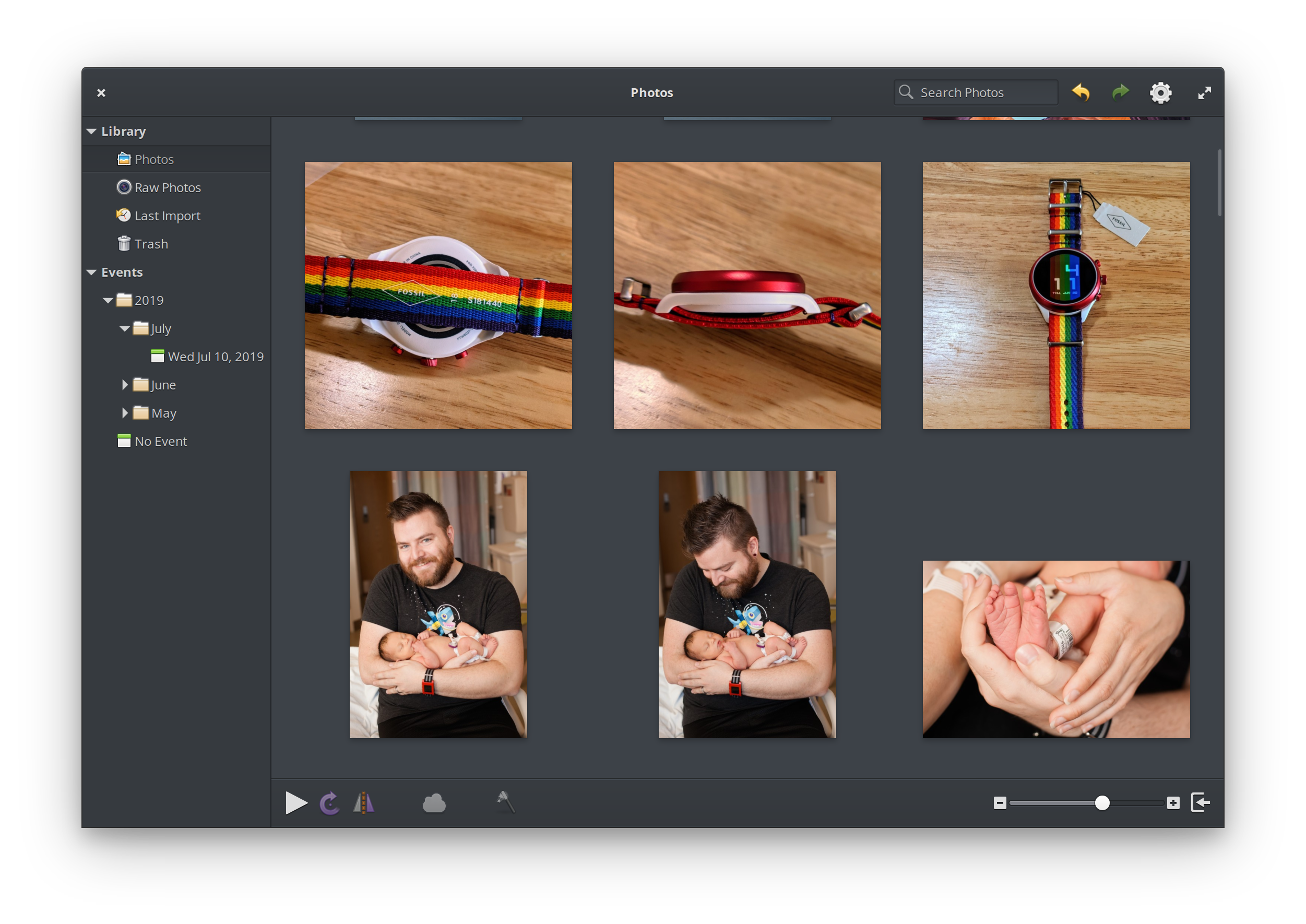
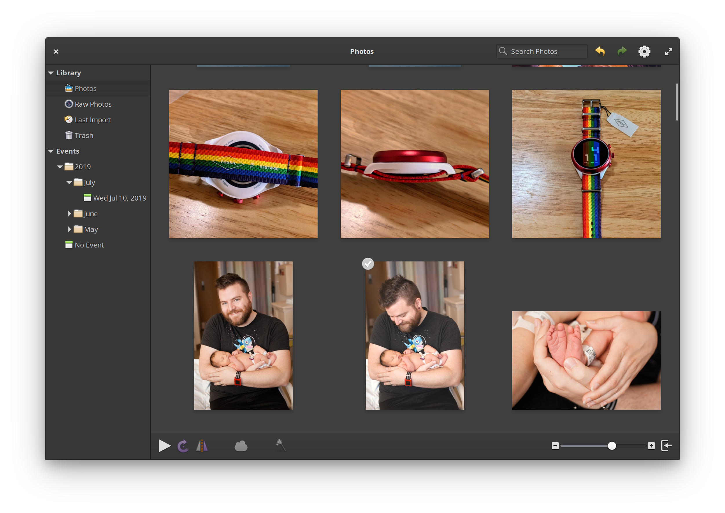
Left: Previous cool-tinted dark style | Right: New color-neutral dark style
We’ve made other small improvements to the dark style: we improved StorageBar styling, fixed background colors from insensitive buttons, and fixed border colors of insensitive suggested action buttons.
We also added a subtle fade-out effect to the start and end of lists in popovers, like the list of Wi-Fi networks in the Networking indicator, or users in the Session indicator.
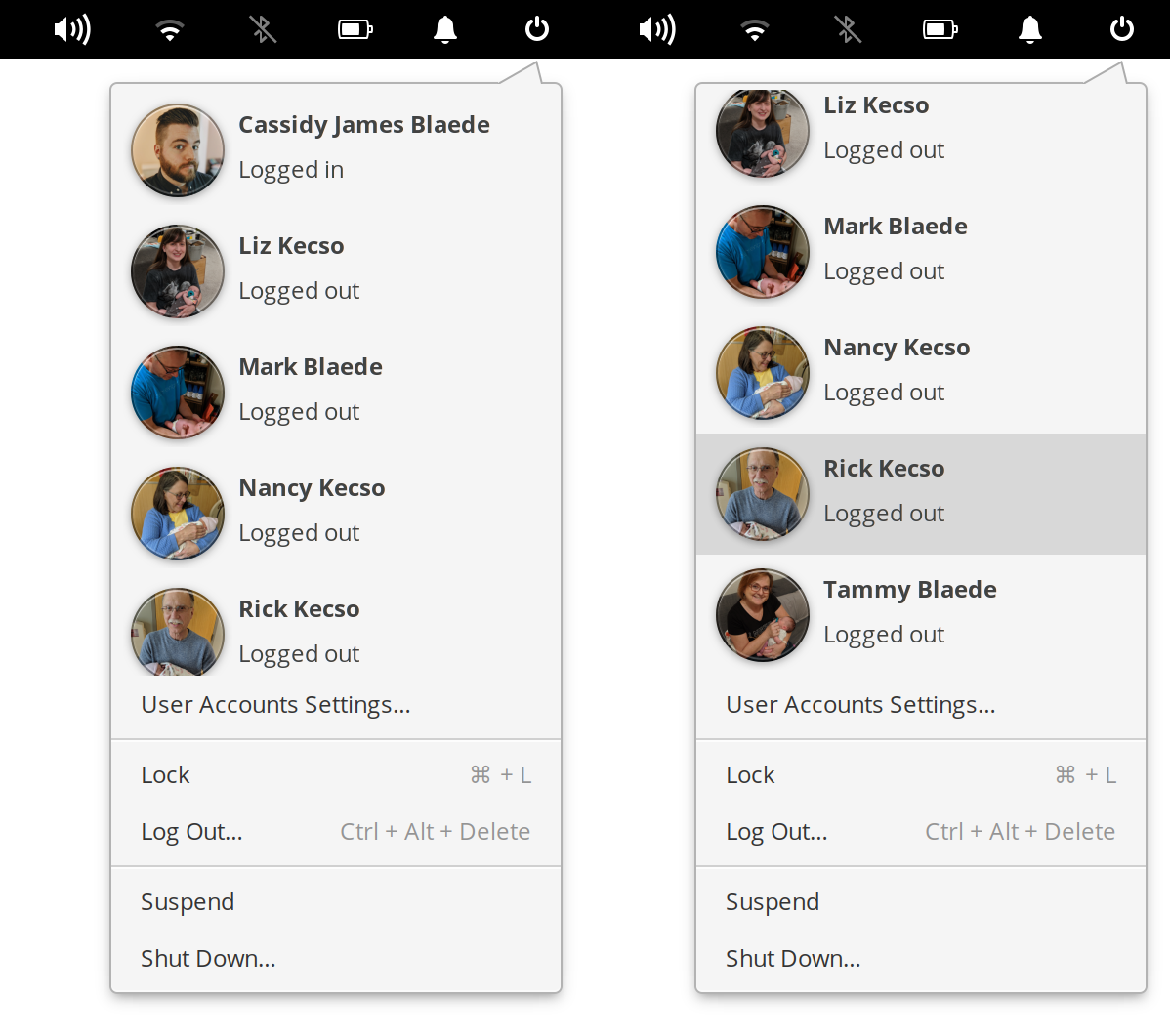
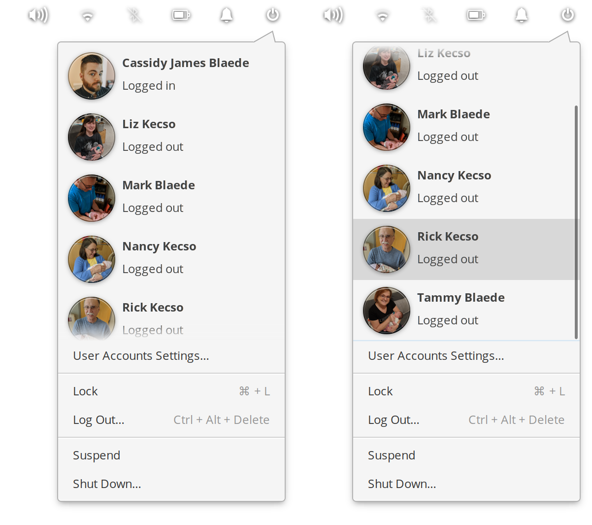
Left: Old hard cut-off in popover lists | Right: Soft fade in popover lists
We’re styling Keycaps in menus now with a flatter style, which will come into play as we add keycaps in menus in future updates.
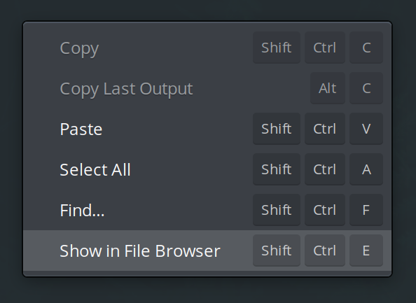
Progress and loading states on entries (like the address bar of browsers when a page is loading) have been made more subtle. Lastly, the system stylesheet now supports the floating-bar widget used in newer versions of Epiphany.
Icons
The most obvious icon change is the newly redesigned wired networking icons, visible if your device has Ethernet or another wired network. In the panel, the new icon is simpler and clearer—instead of the complex and hard-to-align ISO IEC-60417-5988 “Computer network” symbol, we use a simpler metaphor that has been adopted by other platforms like Android, macOS, and Chrome OS.
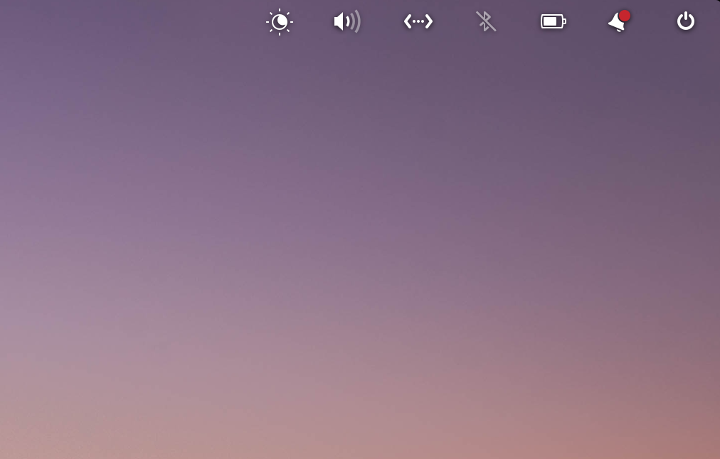
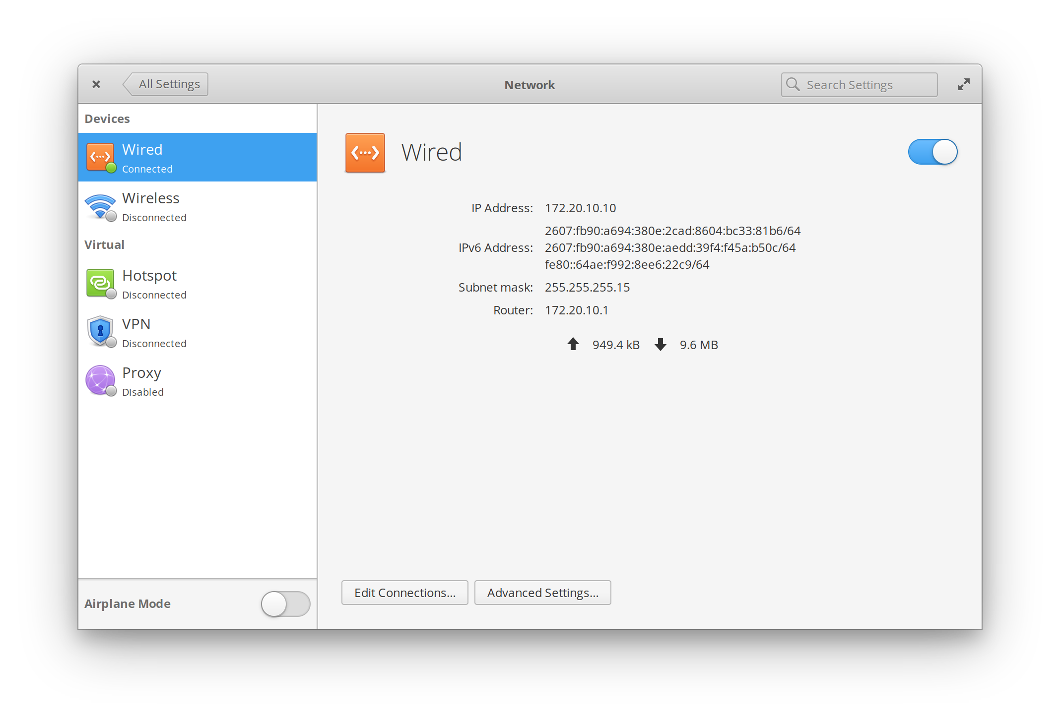
Left: New wired icon in the Panel | Right: New wired icon in Networking settings
While the ISO symbol technically represents any wired network, it has become overwhelmingly associated with Ethernet connections; since we also use this symbol for USB network connections, we feel the new symbol works better. It’s also easier to add states to it like “connecting” or “disconnected.” We also took the opportunity to align the full-color and symbolic versions of the icons: instead of an Ethernet jack for the full-color version, we use the new symbol on an orange tile.
Several other icons were improved or added in July: the image-missing icon was simplified, new sizes were added for find-location, process-completed, night-light, image-crop, and mail-send. The software-update icon is now a fun badge shape instead of a square. New housekeeping icons were made in all sizes, and several symbolic versions were added: computer-laptop, media-memory, mail-forwarded, application-x-firmware, location-active, location-inactive, and location-disabled.
Under the Hood & Developer Tools
We improved several utilities in Granite, our library of common widgets and utilities. We added more keys to accel-to-string, making keyboard shortcuts read more naturally. We added the ability to set an icon badge to MessageDialog, making it more versatile and preventing developers from having to drop to a custom Gtk.Dialog for that commonly-used pattern. We also moved the DateTime settings schema to use the GNOME interface schema, keeping datetime settings better in sync. Lastly, we deprecated IconFactory and utilities that are now provided by GLib.
Our new Feedback app was released. There’s nothing user-facing that’s new yet; we simply moved the System Settings → About → Report a Problem dialog from the System Settings plug codebase into its own standalone app. We have some bigger plans for it in the future, but for now, it just means it’s easier to update on its own.
Cerbere—the system process that relaunches critical desktop components—was updated to better handle shutdown states and cleanly exit.
And More!
As with each monthly update, you can expect other bugfixes, performance improvements, and translation updates. Be sure to open AppCenter and hit Update All to get the latest and greatest.
Thank You
Thanks to all of our supporters, backers, and customers! Your contributions make elementary possible. If you’d like to help build and improve elementary OS, don’t hesitate to Get Involved.
We’re accepting limited sponsors for the elementary Blog. View our public analytics and learn more if you are interested.


