elementary OS 6 Updates for November, 2021
New features and improved design to get ready for the holidays

This past week was Thanksgiving in the US, which for my family means decorating for the holidays is in full swing. In a similar vein, we’ve spent some extra time over the past month focusing on both visual and functional polish to make sure elementary OS 6 looks as good and works as well as it can—read on for the details!
The Desktop
We spent a lot of time working on improvements and new features across the desktop, from quick window switching and animations to new search functionality and improved indicator designs.
Quick Window Switching
Let’s start with possibly the most obvious update to elementary OS this month: the redesigned AltTab quick window switcher.
Previously, quick window switching re-used the dock to show which app windows you’d switch between, and dimmed out the rest of the desktop to highlight just the newly-focused window. However, over time and based on a lot of real world feedback, we found that looking down at the dock—or even across physical space to the primary display in the case of multi-display users—was less intuitive and overloaded the dock’s purpose. Dimming the desktop and visually focusing windows also meant a lot of flashing if you switched quickly which was inelegant at best, and could be an accessibility issue for people with certain types of photo-sensitivity. Thanks to Aral Balkan, we kicked off a project to rework quick window switching—and the initial work has been released this month!
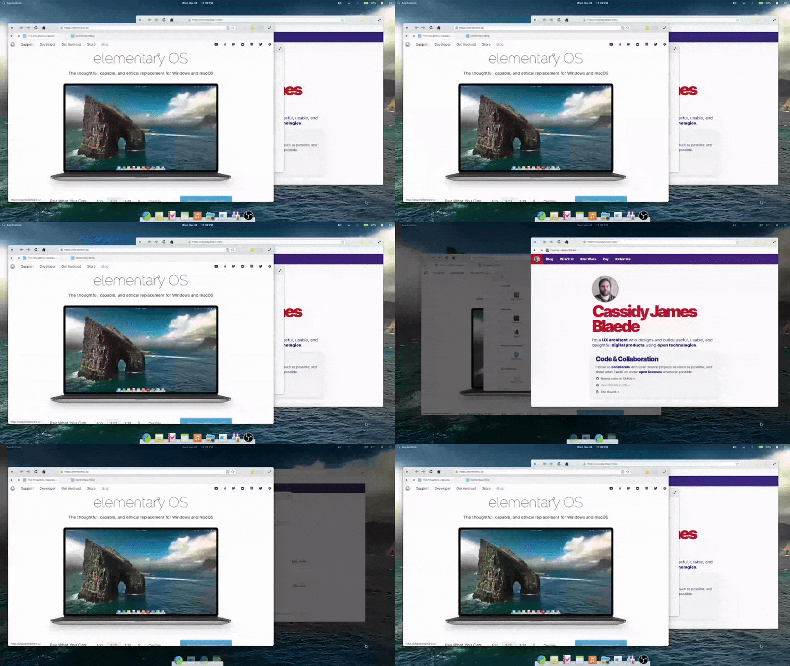
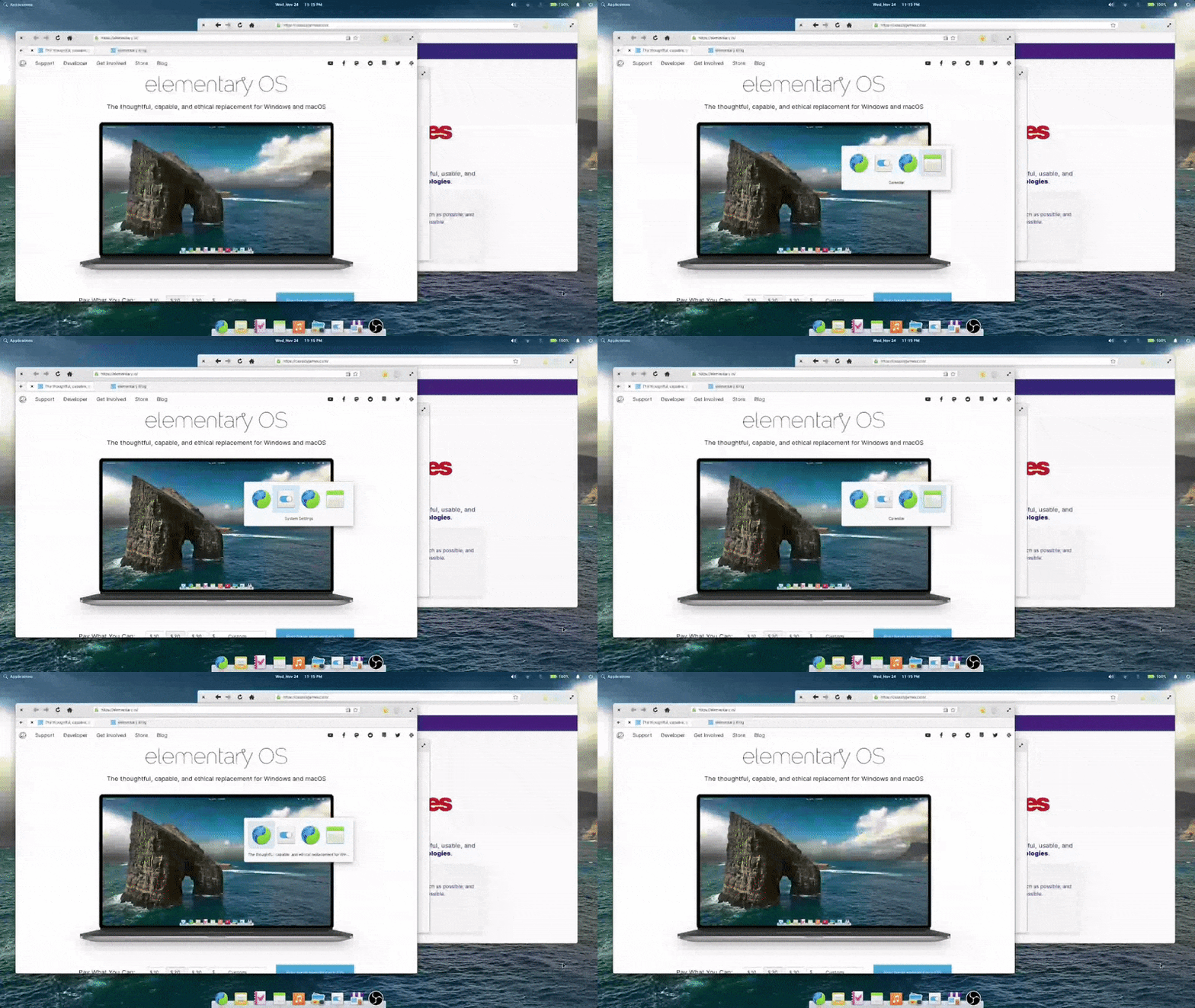
Left: Old window switcher | Right: New window switcher
The new window switcher always shows centered on current display, making it much more likely to be near your gaze. It also features bigger icons, helping you more quickly identify apps. It includes window titles, helping to differentiate between multiple windows from the same app. We also ensured the new design helps you keep your context—and no longer flashes the screen. As a bonus, it follows both the dark style preference and your selected accent color, making your elementary OS installation feel even more personal.
Dialogs
Not content to stop with the AltTab quick window switcher, we also refreshed the interaction design of dialogs in elementary OS. First, you’ll notice dialogs animate in from above on top of their parent window instead of shooting out from within their parent window. This helps reinforce that dialogs are a more transient interaction. We also dim the parent windows behind blocking modal dialogs to make it more clear which window it belongs to, and that the dialog needs to be addressed before proceeding.
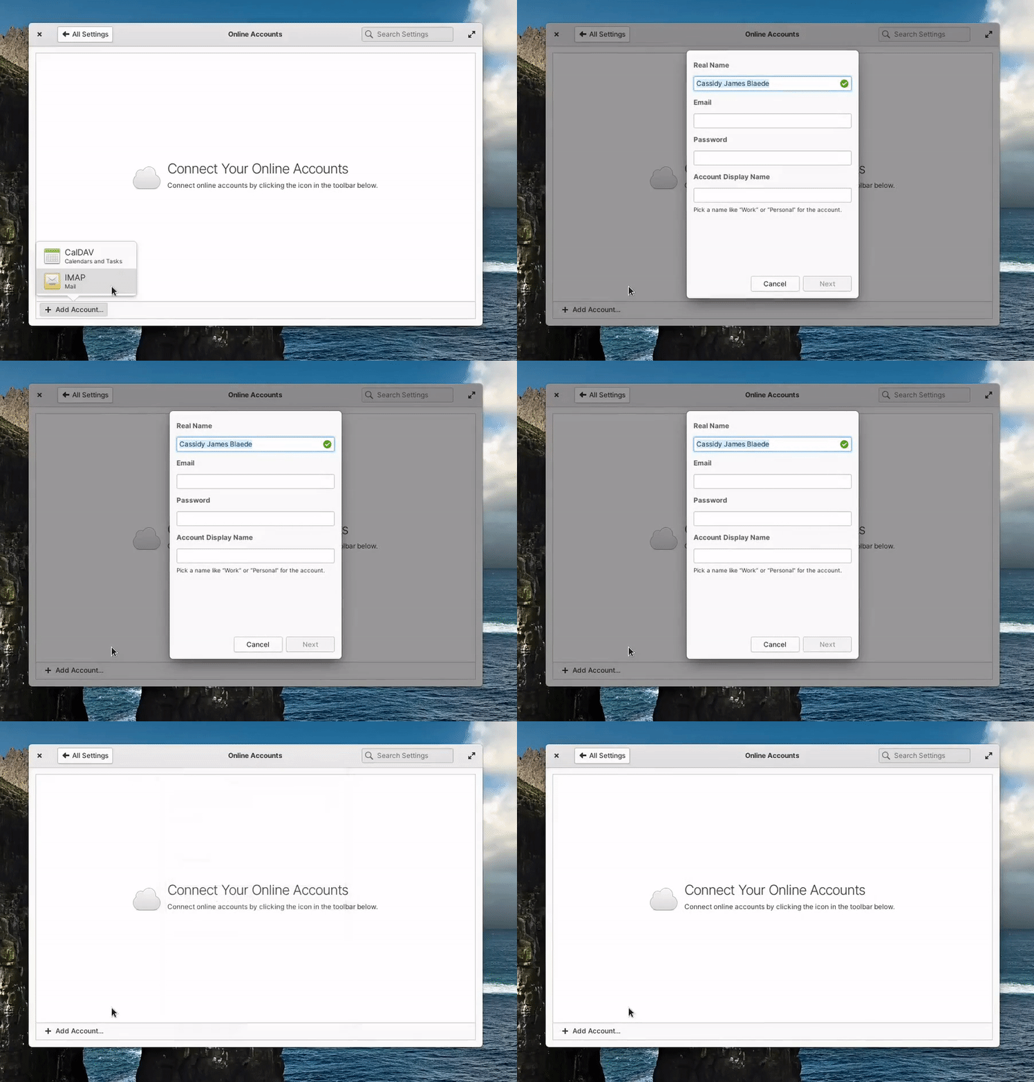
These two changes make for a subtle but ever-present interaction change that is more clear and feels more modern.
We also fixed a handful of small visual issues across the desktop: legacy/server-side decorated windows should no longer have clipped shadows, we isolated the workspace “nudge” animation (when trying to navigate past the last workspace) to only show on the primary display, and we improved that nudge animation to work with the mouse wheel in addition to touchpads, touchscreens, and the keyboard.
Applications Menu
We landed a major new feature to the Applications Menu to speed up your workflow: file bookmark search! Now you can search right from the Applications Menu for bookmarked folders and locations like Downloads, Pictures, or even network shares.
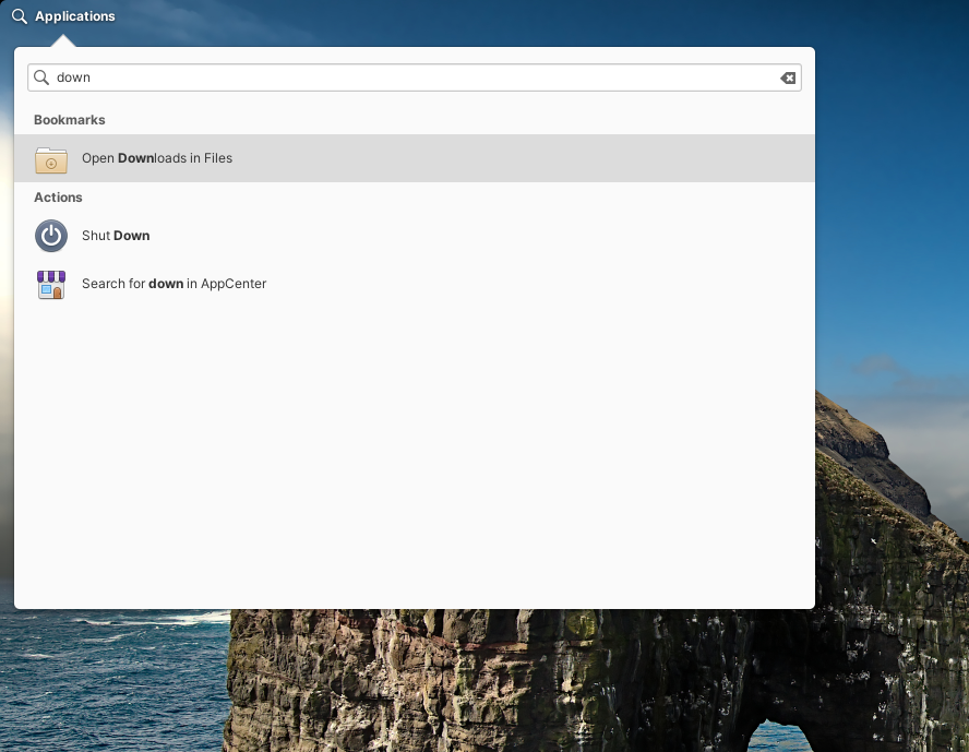
And following cross-desktop standards, this feature will work with whatever your default file manager is—whether or not it’s the default elementary Files app.
Housekeeping
elementary OS has a Housekeeping feature where old temporary and trashed files can be automatically cleaned up to save space and help protect your privacy.
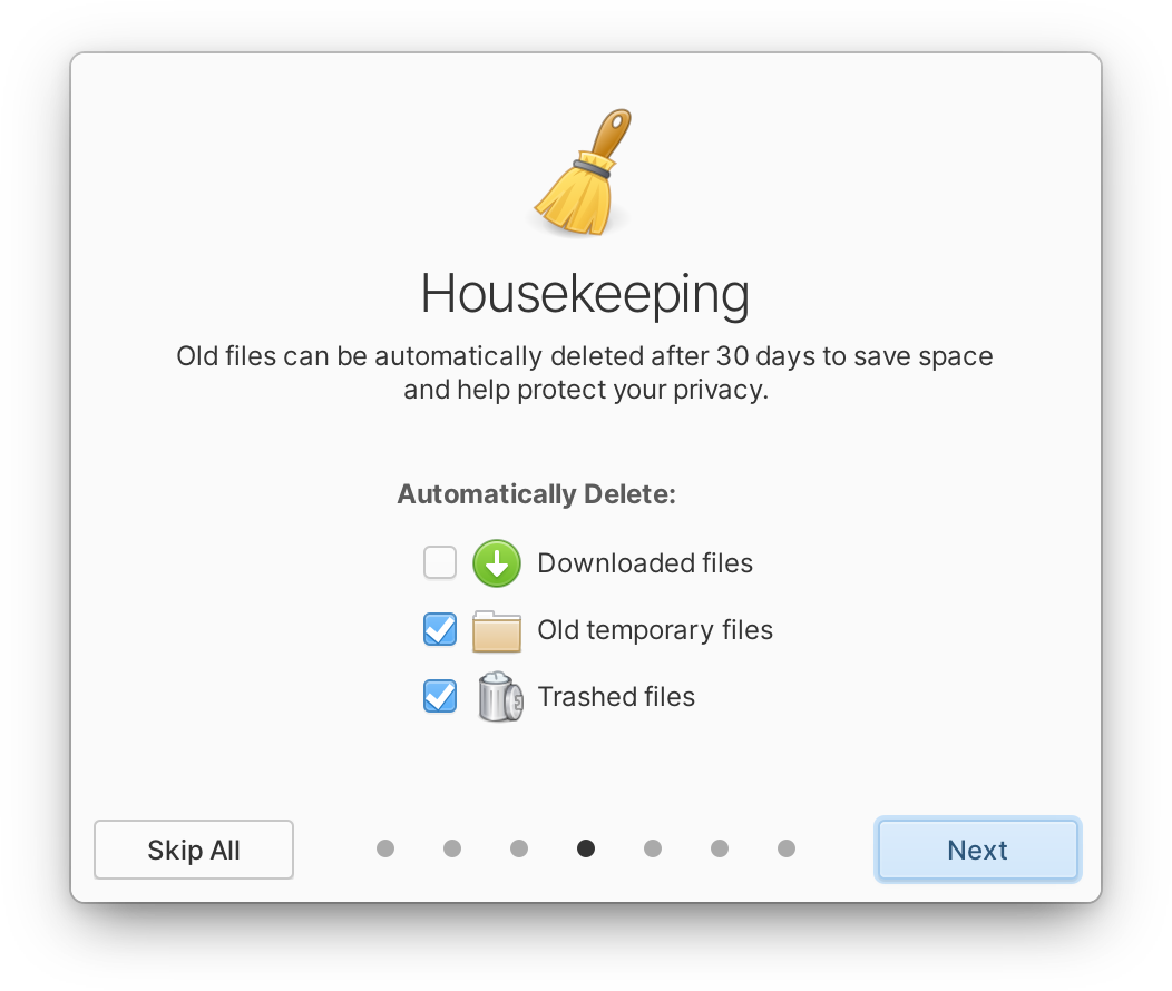
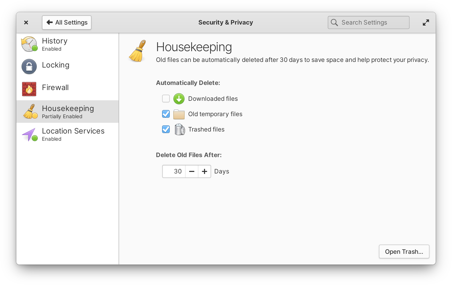
Left: Housekeeping in the Welcome app | Right: Housekeeping in System Settings
This month we improved Housekeeping with the addition of Downloads to the options, and a more clear and consistent design between both the Welcome app and System Settings.
Sound
Lastly, we focused on improving the sound indicator and settings. In the indicator, you’ll notice new device icons to make it easier to find the right output. We also improved the scroll interaction on the volume slider to work with horizontal scrolling, and cleaned up invalid “analog” output devices that could appear in certain situations.

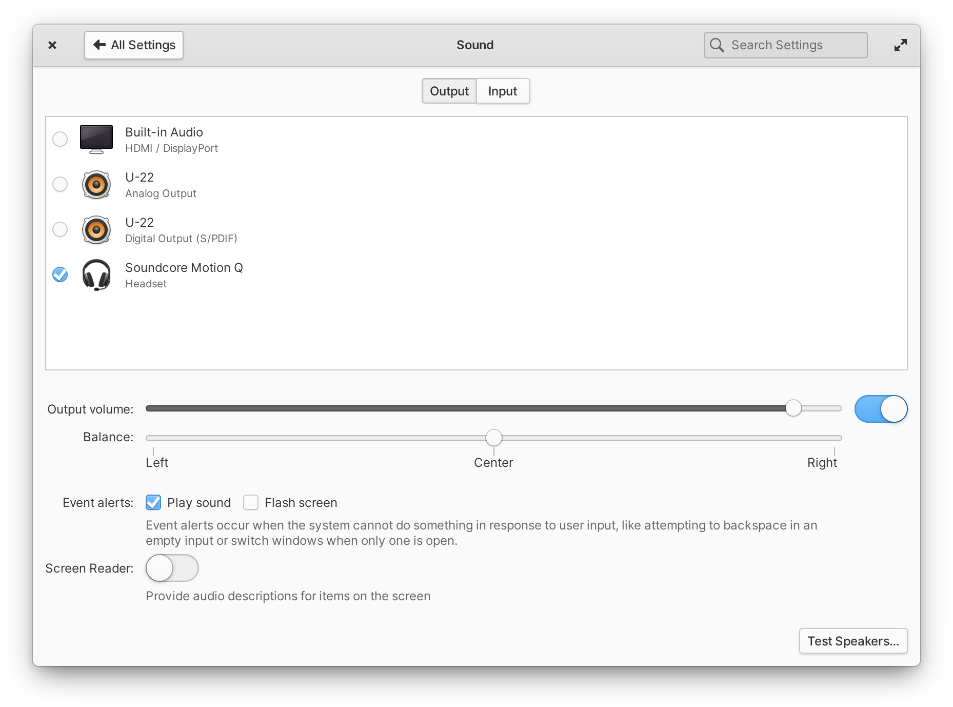
Left: Sound indicator with device icons | Right: Sound settings with similar icons
In Sound settings, you’ll see similar but larger, full-color device icons to distinguish devices, as well as an easier-to-scan multi-line layout.
System Settings
In addition to the aforementioned Housekeeping and Sound improvements, we released updates to a handful of System Settings panes this month. To better support a wide variety of display sizes and resolutions, we added more granular text scaling in the Desktop settings—and moved the text settings to their own page for clarity. As a reminder, text scaling in elementary OS affects both text and much of the UI while keeping pixel-perfect icons and strokes, so this update is a great alternative to fractional scaling for anyone with a display whose resolution sits in between the ideal loDPI and HiDPI ranges. In Keyboard settings, we improved the custom shortcuts view with a more straightforward design and menu for changing or deleting shortcuts, and added an on-screen keyboard switch to the Layouts tab.
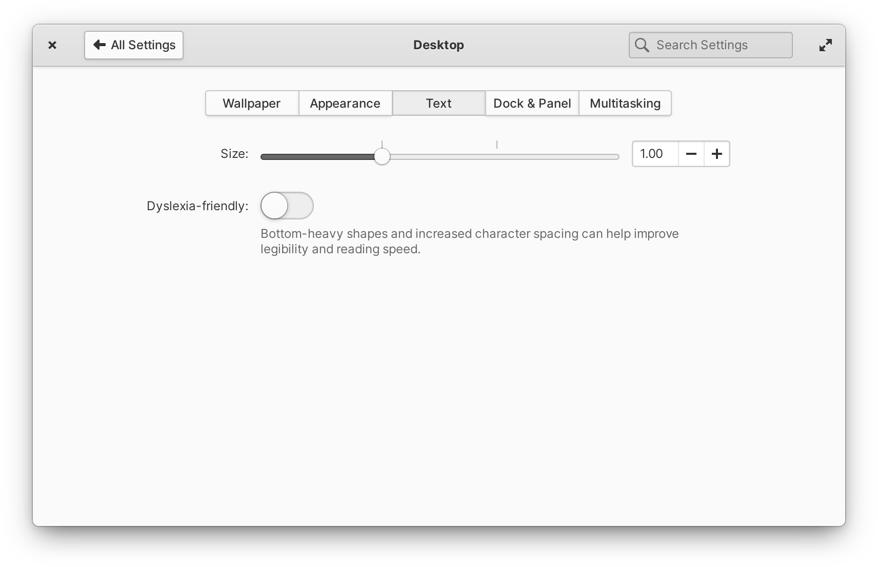
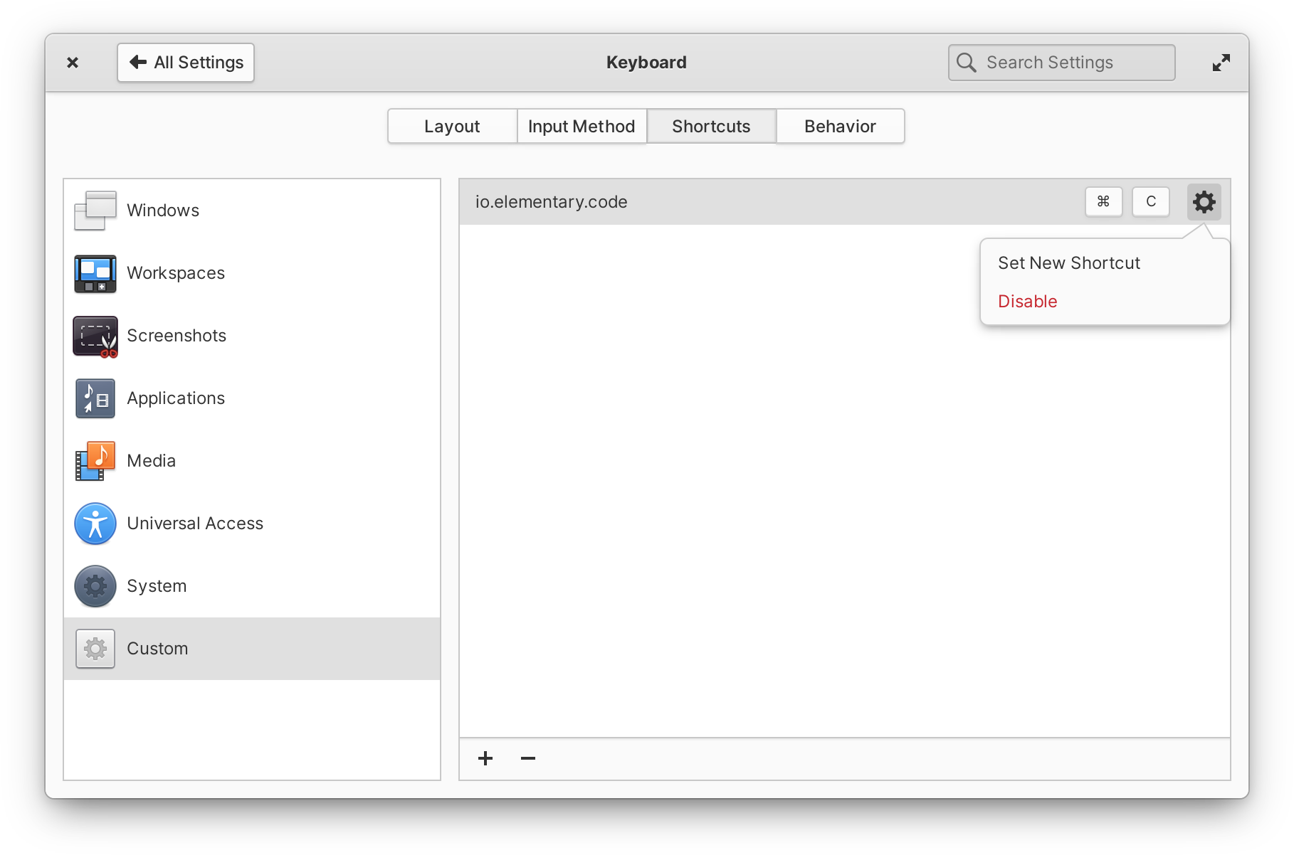
Left: Improved text scaling options | Right: Improved custom keyboard shortcuts design
In User Accounts settings, we fixed an issue with updating permissions when enabling and disabling accounts. And over in Online Accounts, we updated the IMAP account window to dim the System Settings app behind it while being used.
Apps
We also released a handful of updates to the default apps this month.
AppCenter
We’ve continued our work on the design of AppCenter with a few small but impactful changes. First, Category views (like Audio or System) are now shown with a more space-efficient grid view. We also separate paid, free, and non-curated apps (if you’ve added a third-party remote like Flathub) into their own sections within categories.
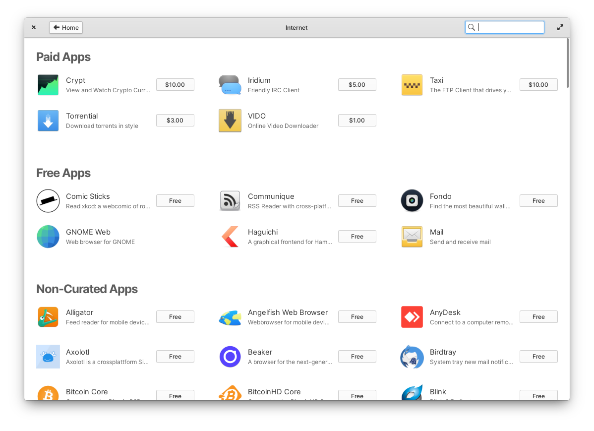
In an effort to better surface the interesting apps being submitted, we’ve added a new Privacy & Security category, and apps categorized as “Amusements” will now appear in the Games category. This month we also continued working directly with our third-party app developers to improve the categories listed in their app’s metadata to make sure they’re accurate and more discoverable for users. And lastly, we’ve improved the responsiveness of the UI throughout to allow the window to be resized to much narrower sizes.
Files
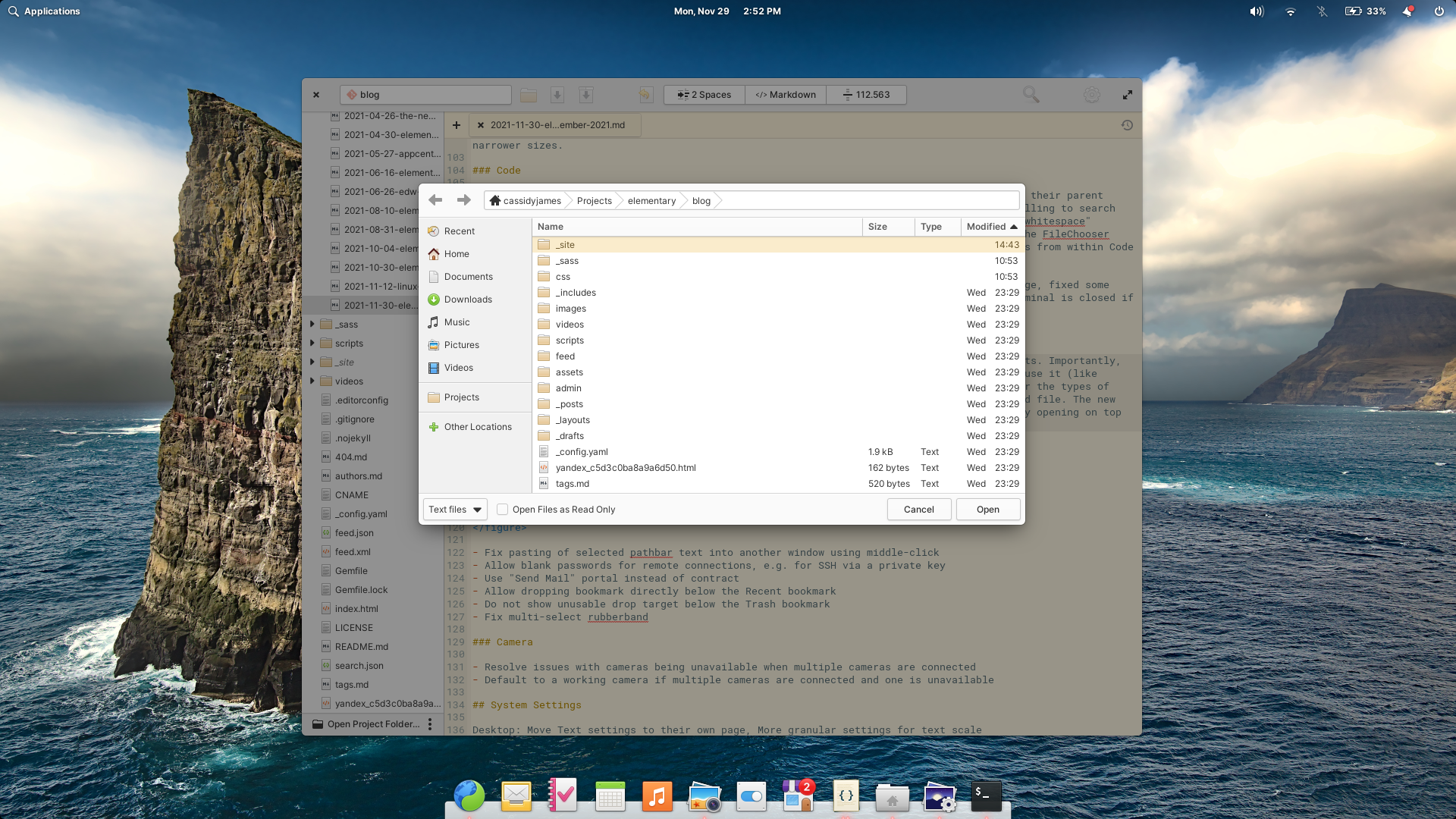
We released a significant update to Files this month with a handful of fixes and improvements. Importantly, we greatly improved the File Chooser portal that is used when apps request to open a file. This update brings new functionality like a New Folder action, a drop-down to filter the types of files shown, and an option to restrict the requesting app’s access to a read-only version of the opened file. The update also improves how the dialog is displayed in apps, fixing issues with focus and more reliably opening on top of the requesting app window.
We’ve also released a handful of improvements to Files itself. Files now uses the Send Mail portal for emailing files, which should open compatibility up to more third-party email clients and work better across other desktops. The “Connect to Server” dialog now allows blank passwords for remote connections, e.g. for connecting to an SSH server via a private key instead of a password. We restored the multi-select capability of rubber-band style file selection, meaning you can drag-to-select a group of files, hold Ctrl, and drag to select an additional group of files. And lastly, we improved the drag-and-drop to the sidebar for bookmarks, ensuring drop targets show up in the correct places.
Code
In Code, we now distinguish between projects with the same name in the sidebar by including their parent folder. The project/folder search dialog now shows centered over the window, and when scrolling to search results, we overshoot the result slightly for better visibility. We also made the “visible whitespace” setting simpler and more clear with a switch instead of a drop-down. We’re also now using the File Chooser portal provided by Files instead of the default dialog from GTK; as a result, opening files and folders from within Code will benefit from the recent improvements in the portal, and will be more consistent with Flatpak apps.
If you use the Terminal extension, we fixed the visibility of Terminal button on Welcome page, fixed some keyboard shortcuts affecting unfocused document instead of focused Terminal, ensure the Terminal is closed if shell exited, and create a new Terminal if it’s re-opened with no shell.
Camera
We pushed out a smaller update to Camera this month focused on multiple camera support. We resolved issues with some cameras being unavailable when multiple cameras are connected, and we now default to a working camera if multiple cameras are connected but one is unavailable.
Other Fixes & Updates
We fixed a couple of issues discovered in the system stylesheet; namely, the accent color in IBus candidate window and the font style for labels in header bars for Japanese characters. We updated the Network indicator to prevent blank lines in the list of VPNs. And as always, there are translation updates, code cleanups, and other under-the-hood improvements included with these updates across the OS and apps.
For developers, we added a min_length property for Granite.ValidatedEntry and released a new Granite.HyperTextView for navigable URLs in text views. On the icons front, we released new preferences-desktop-font* icons, additional sizes for playlist-queue and emblem-downloads, redesigned the PDF file type, and removed arrows from Copy and Paste actions. Lastly, we released version 6.0.4 of the Flatpak platform with the latest Granite, icons, and stylesheet updates.
If you’re experiencing an issue that wasn’t fixed in this month’s updates—or if you have an idea for a new feature—we’d love to hear from you. We prioritize our work based directly off of the feedback we receive. Be sure to check out our issue reporting guide for tips and more info.
Get These Updates
As always, if you’re already running elementary OS 6 you can get updates directly from AppCenter by opening up the “Installed” tab and selecting “Update All.” Previous OS 6 purchase links from email receipts will be upgraded to the newest OS 6 release as usual.
If you’re not yet running elementary OS 6, we’ll be publishing a new 6.0.4 download for a pay-what-you-can price that includes all of these updates on our homepage soon.
Thank You
Thanks to all of our supporters, backers, and customers! Your contributions make elementary possible. If you’d like to help build and improve elementary OS, don’t hesitate to Get Involved.
We’re accepting limited sponsors for the elementary Blog. View our public analytics and learn more if you are interested.


