elementary OS 6.1 Available Now
We come bearing gifts and Yule tidings!
Just over four months ago we announced elementary OS 6 Odin with new ways to be in control and express yourself, a slew of innovative new features, and a focus on gettability and inclusivity. So far, OS 6 has been downloaded from our website over 250,000 times—and as always, that’s not including downloads from third parties or direct downloads via torrent that bypass our download page!
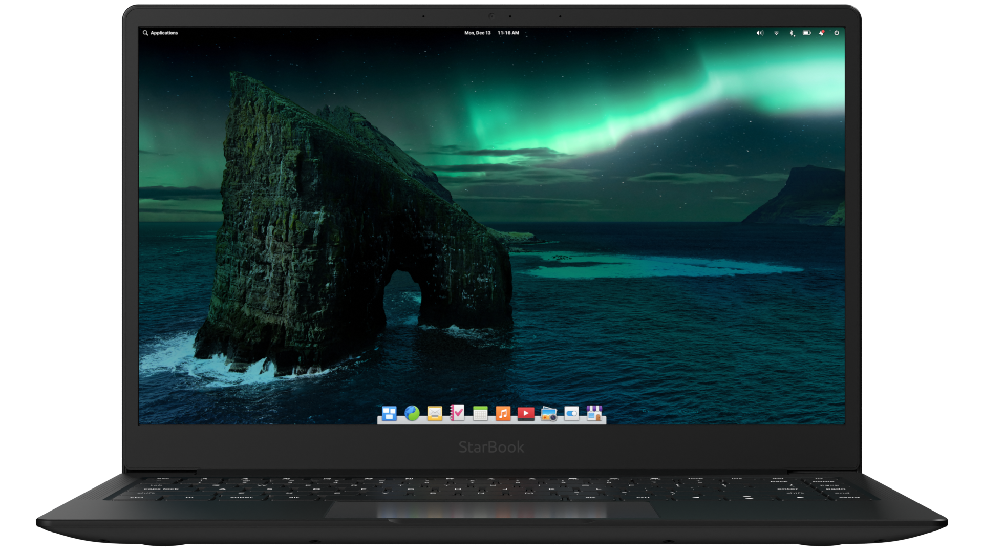
Today we’re proud to announce that OS 6.1 Jólnir is available to download now for new users, as an easy upgrade for existing users, and shipping on several high-quality computers. With OS 6.1, we’ve focused in on:
- Addressing your feedback with new features and fixes
- Making elementary OS more useful with office productivity features
- Expanding compatibility with a wide range of hardware
To get elementary OS 6.1 now, head to elementary.io for the download—or read on for an overview of what’s new.
What’s in a Name and Number?
elementary OS 6.1 Jólnir takes the same foundation as OS 6 Odin and elevates it to a new level of polish. Thanks to some great new tooling and release management processes at elementary, we’ve been able to make larger strides in less time than ever before. This release represents the sum of our work over the last several months as a single major update to the OS 6 series—and we believe there’s enough great new stuff here that this release deserves its own name and identity.

We always name our releases after mythological beings and deities, and Jólnir is no different. Jólnir is the name for Odin as he relates to the Yuletide and is one of the original inspirations for Father Christmas—or Santa Claus.
Updates from the OS 6 Release
Since elementary OS 6.1 Jólnir builds on OS 6 Odin, it includes all of the monthly OS updates we’ve detailed since the OS 6 release. You can check those monthly stories for the nitty-gritty—and if you’ve diligently followed along, much of this will be a review—but here’s a higher-level overview of what gifts OS 6.1 Jólnir brings this season:
AppCenter
AppCenter continues to fill out with apps from developers—and since the move to Flatpak, all apps that have been released for OS 6 will continue to be available on OS 6.1 and beyond! You can currently find over 90 curated apps in AppCenter, and developers have continued to push out rapid and frequent updates to their apps with new features and bug fixes, as they’re in control of their own update schedule. Our shift from Debian packages to Flatpak for both curated and non-curated apps also means we’re able to lean more on Flatpak features, and we’ve been using this as an opportunity to make AppCenter much more engaging and informative right from the start—directly addressing feedback about the discoverability of the wide variety of apps in AppCenter.
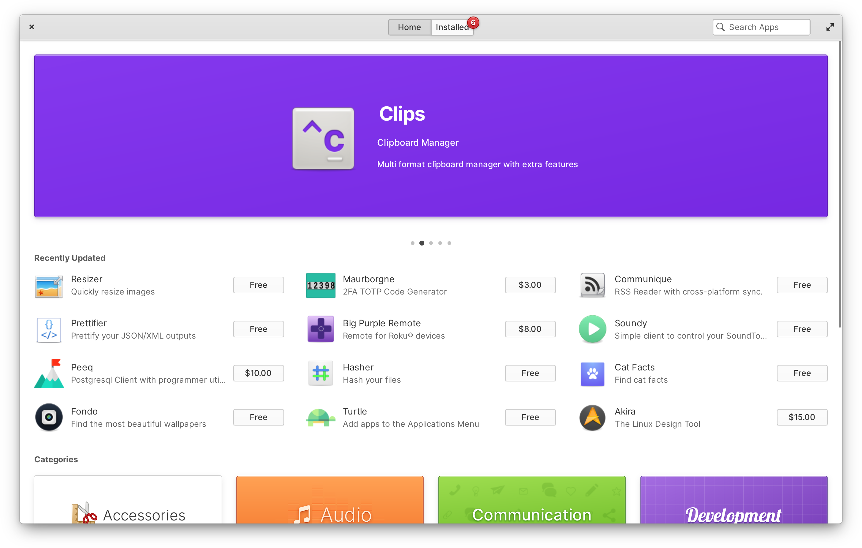
For example, we’ve largely reworked the home page with banners featuring the most recently released and updated curated apps in a multi-touch swipable carousel. We’ve also added up to twelve more of the most recently-updated apps directly below. Rather than just showing the app’s icon and name, we now also show each app’s summary and an install button—including the developer’s recommended price if it’s a monetized app. Since we enforce accurate update information for curated apps, this data is populated locally from the apps’ AppStream data rather than from a remote API as before. The result of this work is a faster home page with over three times the apps displayed, as well as the ability to purchase or install several apps with far fewer clicks.
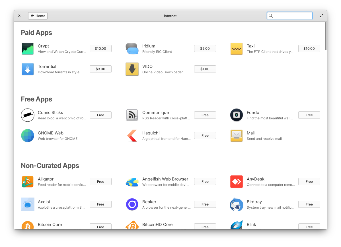
Category views (like Audio or System) are now shown with a more space-efficient grid view. We also separate paid, free, and non-curated apps (if you’ve added a third-party remote like Flathub) into their own sections within categories. In an effort to better surface the interesting apps being submitted, we’ve added a new Privacy & Security category, and apps categorized as “Amusements” will now appear in the Games category. We’ve also been working closely with third-party developers to ensure that their apps list a more complete set of categories in their metadata so that they appear in the correct category pages.
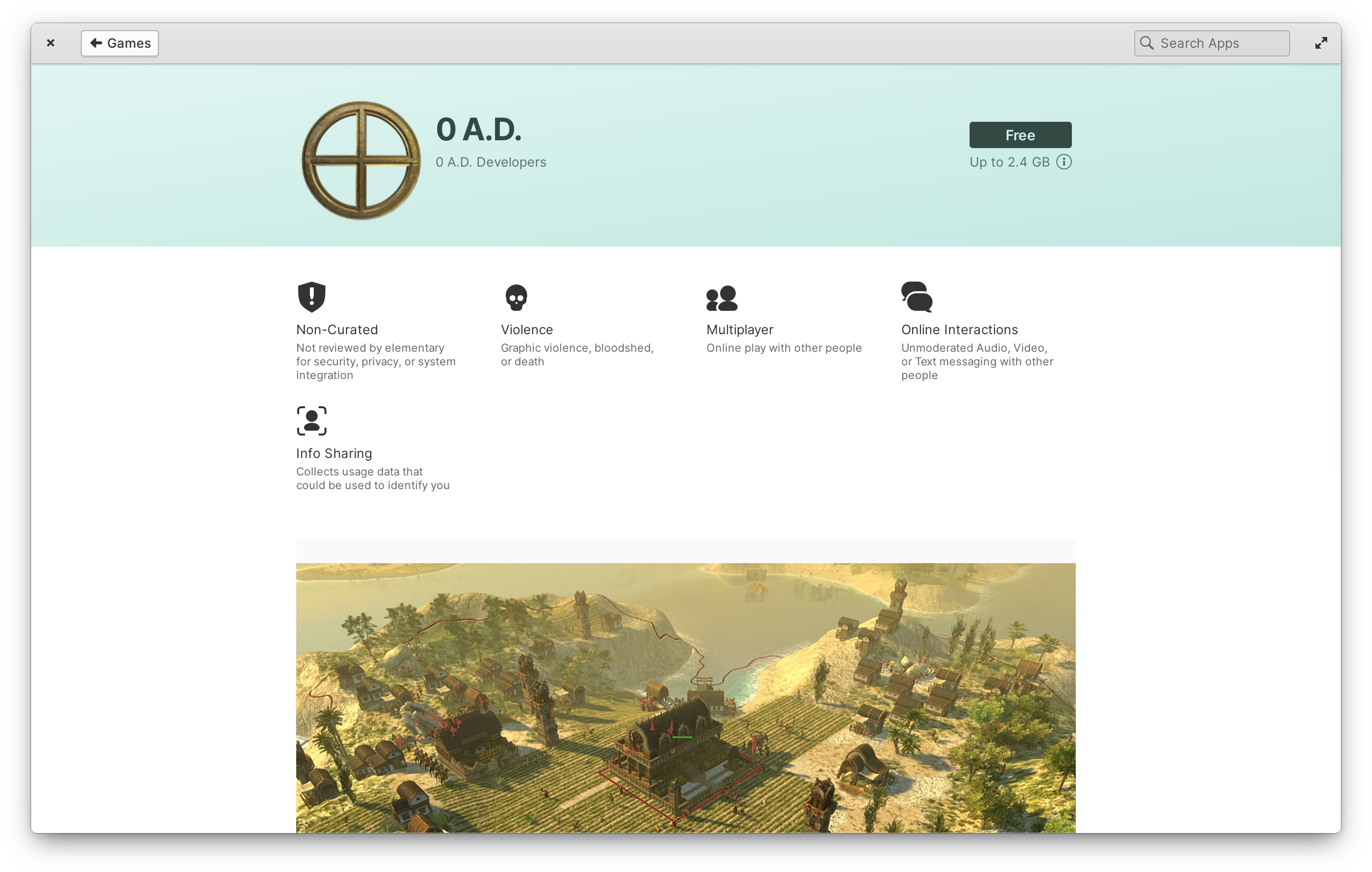
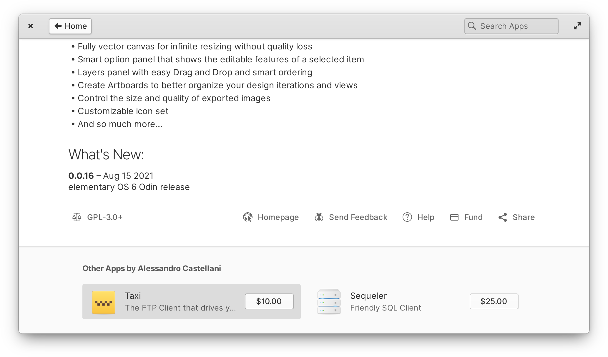
Left: A non-curated app info page and its “report card” | Right: Other Flatpak apps from the same developer as the selected app
We’ve also spent significant time improving individual apps’ info pages based on your feedback. Rather than displaying a generic “explicit” warning dialog when installing an app with certain content warnings, we show this information ahead of time at the top of the page. We differentiate between and inform about several content warnings including things like violence, language, and nudity as well as privacy-related topics like online interactions and data collection. And since we validate this information for curated apps but can’t make any guarantees about non-curated apps, we also more clearly inform ahead of time when an app is not curated with an additional badge. This new section works like a content and privacy “report card” you can use to learn more about apps and make informed choices while also reducing the road blocks to installing the apps you want.
We’ve also improved the banner colors for apps that don’t provide their own brand colors—including non-curated apps—to use a more subtle look based on your selected system-wide accent color. And now we show apps from the same developer at the bottom of app info pages regardless of packaging technology used, meaning it works equally well for first-party, curated, and non-curated apps.
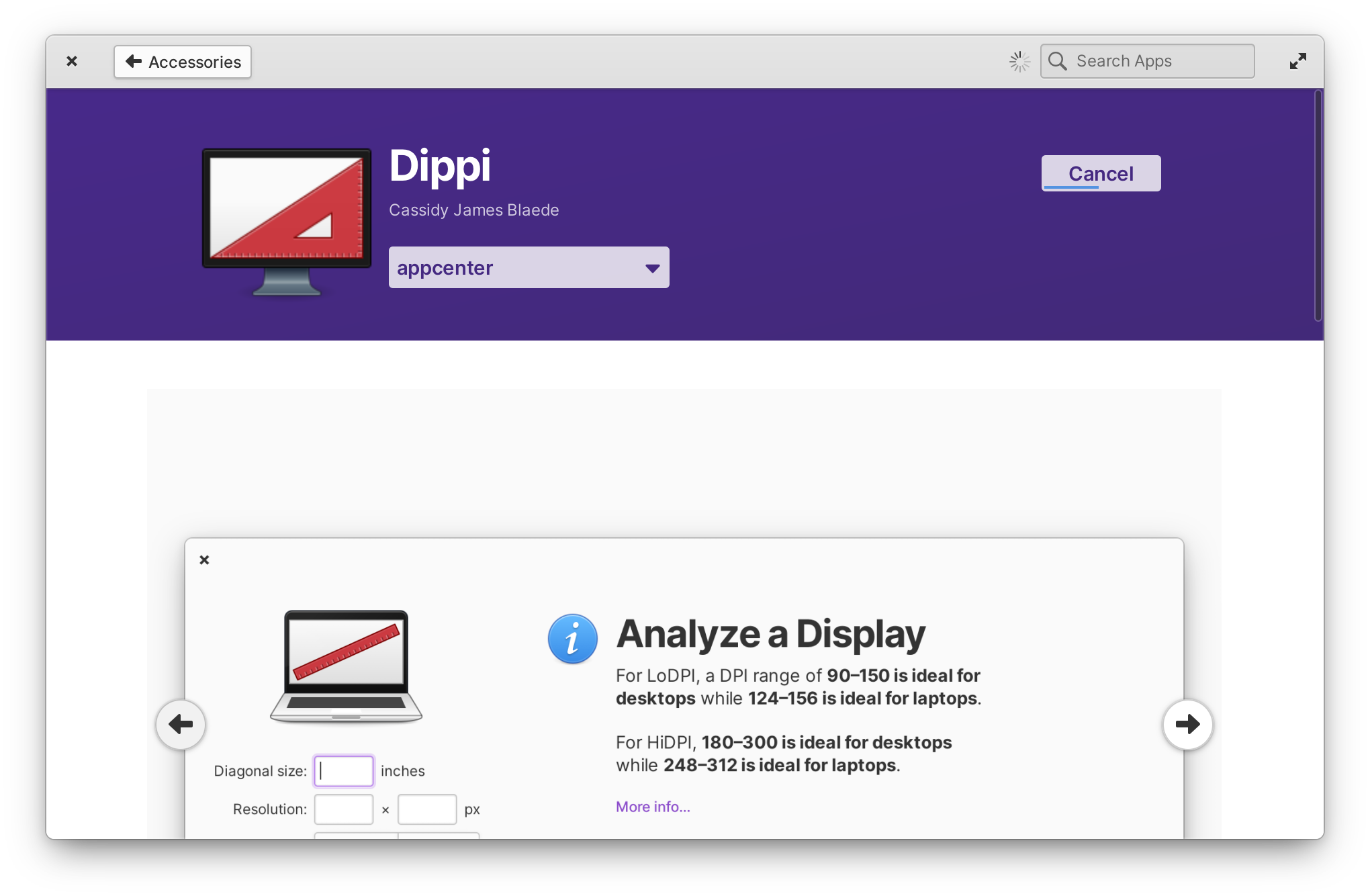
As part of our effort to make AppCenter a better experience on small displays and when tiled to half of the display, there is the new progress indicator when installing, removing, or updating apps. Instead of a separate progress bar, progress is now indicated in a compact way over the cancel button. This greatly improves AppCenter with smaller window sizes and fixes layout issues in views that show a lot of apps like the home page and when showing other apps by an author on the app info page.
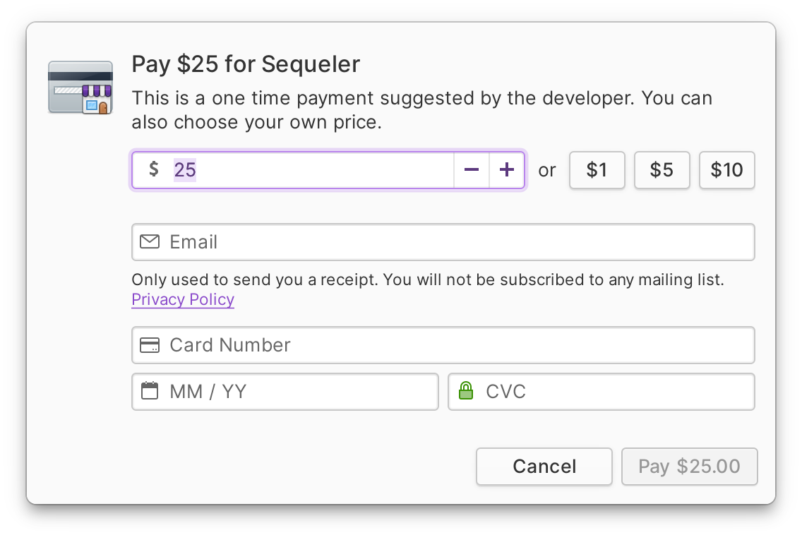
As we continue to work on our “AppCenter for Everyone” campaign, we’ve reworked the Install button to ease into the future flow that will use a Flatpak authenticator to handle purchases; rather than having a drop-down arrow with a popover to change the price, we’re now more clear about how “Pay What You Can” works and include changing the amount to pay in the payment dialog itself—and validated entries now show a green check and invalid ones show a red error so it’s much clearer when card info has been entered incorrectly. And since we use this same widget on the home page, on app info pages, and in lists of apps, it’s consistent everywhere.
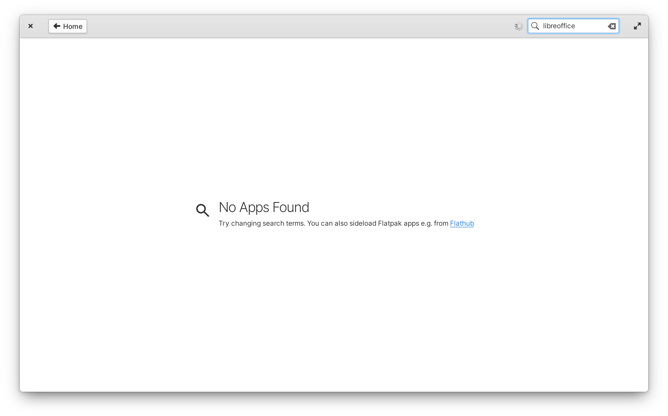
Finally, we’ve been putting a lot of work into the first run experience, especially with regards to apps from third-party stores like Flathub since we know many of you are sideloading. For example, apps from freshly-added remotes now show in AppCenter without needing to restart your device. We’ve also added a reminder about Sideload when searching returns no results with the same language that is used in the Welcome app and a link that will open Flathub.org with your search terms—helping address the feedback around discoverability of non-curated apps while keeping clearer expectations. We also now ensure that apps default to install per-user instead of system-wide when selected from the home page, and both AppCenter and Sideload can now use system-wide installed app runtimes for per-user app installs; as a result, the first time you install a new app should now be an even faster, smaller download. And if you’ve had trouble with device drivers that rely on DKMS, AppCenter will now automatically pull in the required Linux kernel headers when installing them.
If you’re not running elementary OS but still want to get AppCenter apps, we’ve made it much easier with a recent update to our AppCenter website: Free apps now include a “Download as Flatpak” button that will give you a Flatpak reference file which you can sideload on your operating system of choice. We also build all AppCenter apps for 64-bit ARM platforms, so you can use them on platforms like Pinebook Pro and Raspberry Pi 4. Enjoy!
The Desktop
For OS 6.1, we focused on improving and polishing the experience across the entire desktop, from quick window switching and picture-in-picture to animations and the dark style.
Quick Window Switching
Possibly the most obvious update to our window manager is the redesigned AltTab quick window switcher—a direct result of lots of user feedback and testing.
Previously, quick window switching re-used the dock to show which app windows you’d switch between, and dimmed out the rest of the desktop to highlight just the newly-focused window. However, we heard from several users that looking down at the dock (sometimes physically far away on large displays or multi-display setups) was less intuitive and overloaded the dock’s purpose—and we agreed. Dimming the desktop and visually focusing windows also meant a lot of flashing if you switched quickly which was inelegant at best, and could be an accessibility issue for people with certain types of photo-sensitivity. So in OS 6.1, we’re shipping a new, simpler window switcher that’s less intrusive to your workflow.
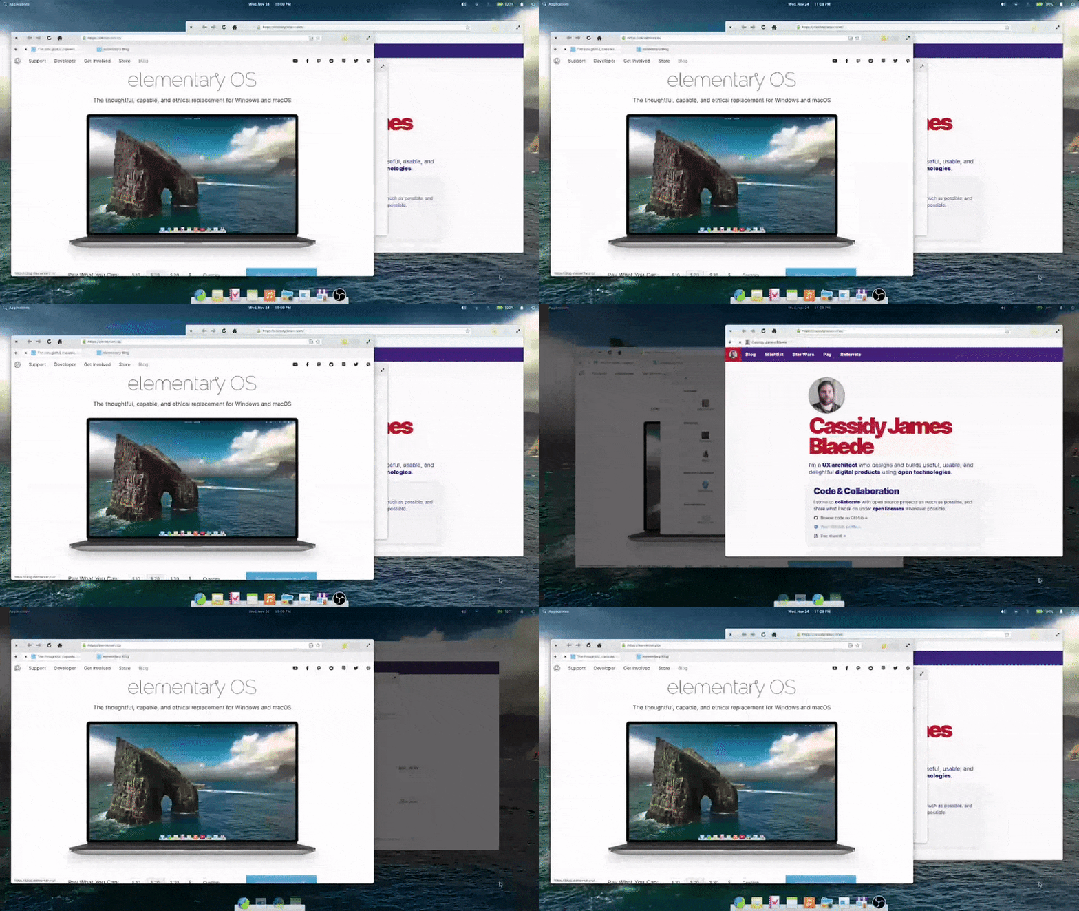
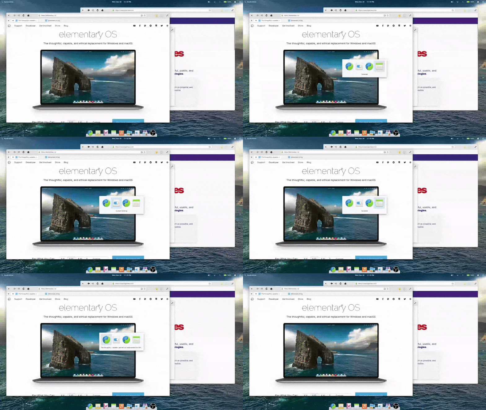
Left: Old window switcher | Right: New window switcher
The new window switcher always shows centered on current display, making it much more likely to be near your gaze. It also features bigger icons, helping you more quickly identify apps. It introduces window titles, helping to quickly differentiate between multiple windows from the same app without the visual overload and screen flashing. As a bonus, it follows both the dark style preference and your selected accent color, making your elementary OS installation feel even more personal.
Dialogs
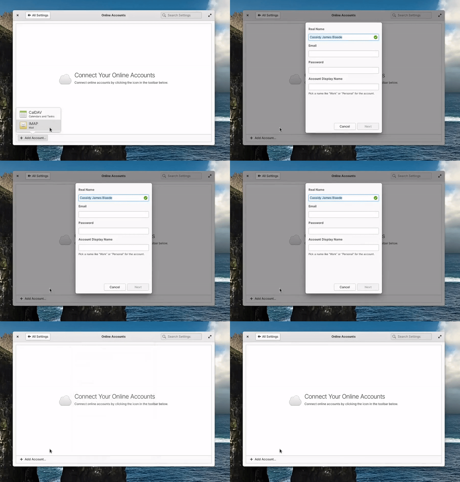
We also refreshed the interaction design of dialogs in elementary OS. First, you’ll notice dialogs animate in from above on top of their parent window instead of shooting out from within their parent window. This helps reinforce that dialogs are a more transient interaction. We also dim the parent windows behind blocking modal dialogs to make it more clear which window it belongs to, and that the dialog needs to be addressed before proceeding.
Portals
We greatly improved the File Chooser portal that is used when apps request to open a file. We introduced new functionality like a New Folder action, a drop-down to filter the types of files shown, and an option to restrict the requesting app’s access to a read-only version of the opened file. We also improved how the dialog is displayed in apps, fixing issues with focus and more reliably opening on top of the requesting app window.
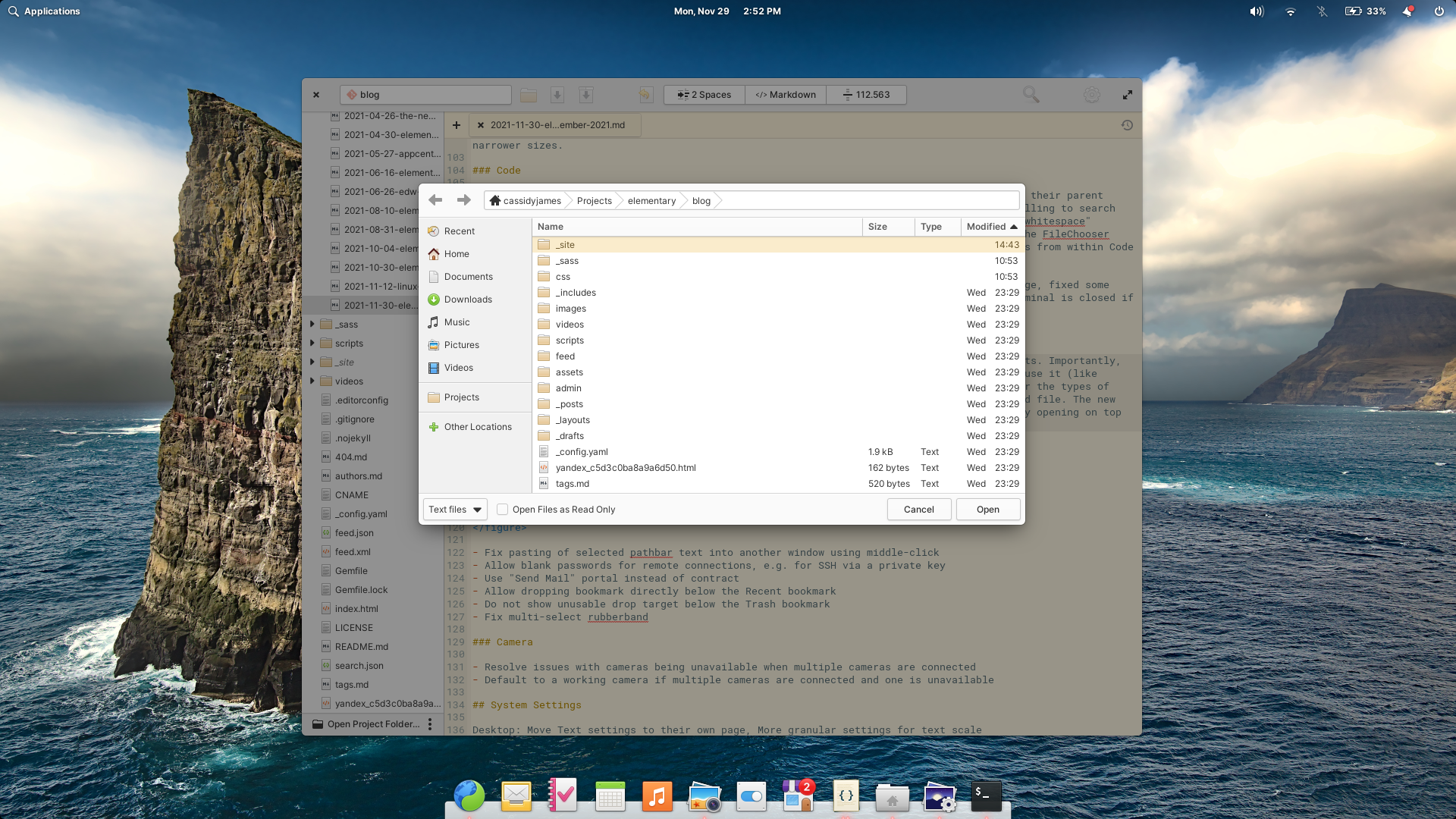
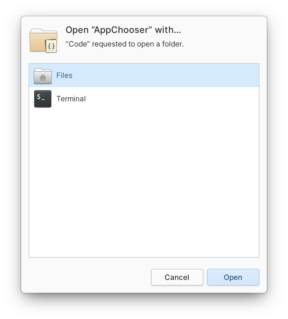
In other exciting portal news, we also shipped a new AppChooser. You’ll notice Flatpak apps which launch files in another app using the new design.
The Dark Style
You may recall that Cassidy started the discussion around the need for a FreeDesktop standard for the dark style a little over two years ago. We shipped the first iteration of an opt-in dark style preference in OS 6, and in 6.1 the dark style preference is now more widely respected across desktops.
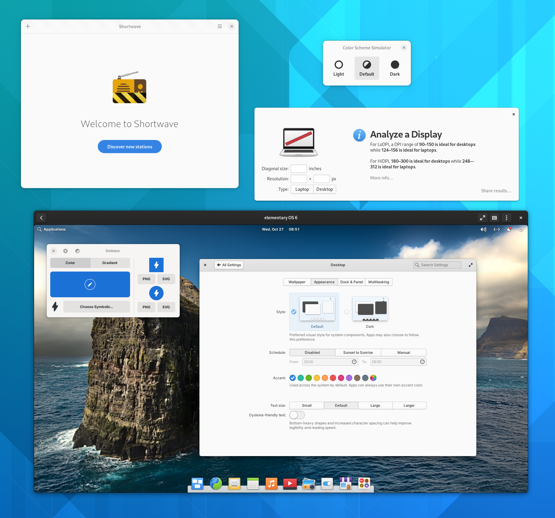
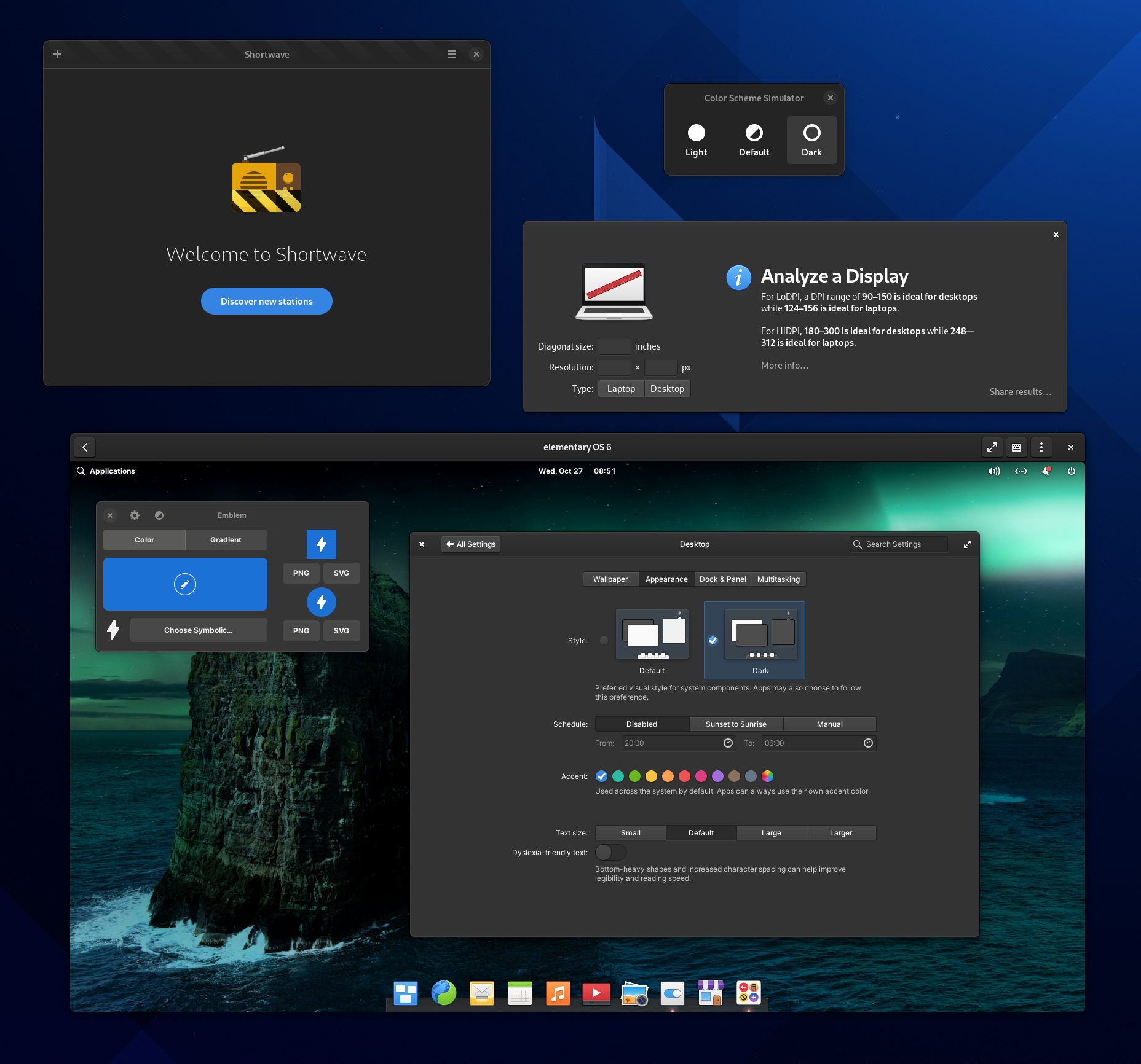
The dark style preference is now respected across desktops for GNOME and elementary OS apps
As before, this dark style preference is still opt-in for developers, which means it won’t break apps that weren’t tested against it. However, we’re now using an agreed upon desktop-agnostic namespace in the Settings portal which works across application toolkits and desktop environments. What that means for you is that GNOME apps will begin respecting the dark style preference and we hope to see this compatibility spread to KDE apps and more in the future. It also means that those running AppCenter apps on GNOME 42 will have their dark style preference automatically respected on day one.
Applications Menu
We’ve heard that you want to search more than just your apps, so now you can search for bookmarked folders and locations like Downloads, Pictures, or even network shares right from the Applications Menu. And following cross-desktop standards, this feature will work with whatever your default file manager is—whether or not it’s the default elementary Files app. We’ve also improved search results for Settings so that terms like “mouse speed” return “Mouse & Touchpad → Mouse → Pointer Speed”, making it easier to find settings without knowing their exact names.
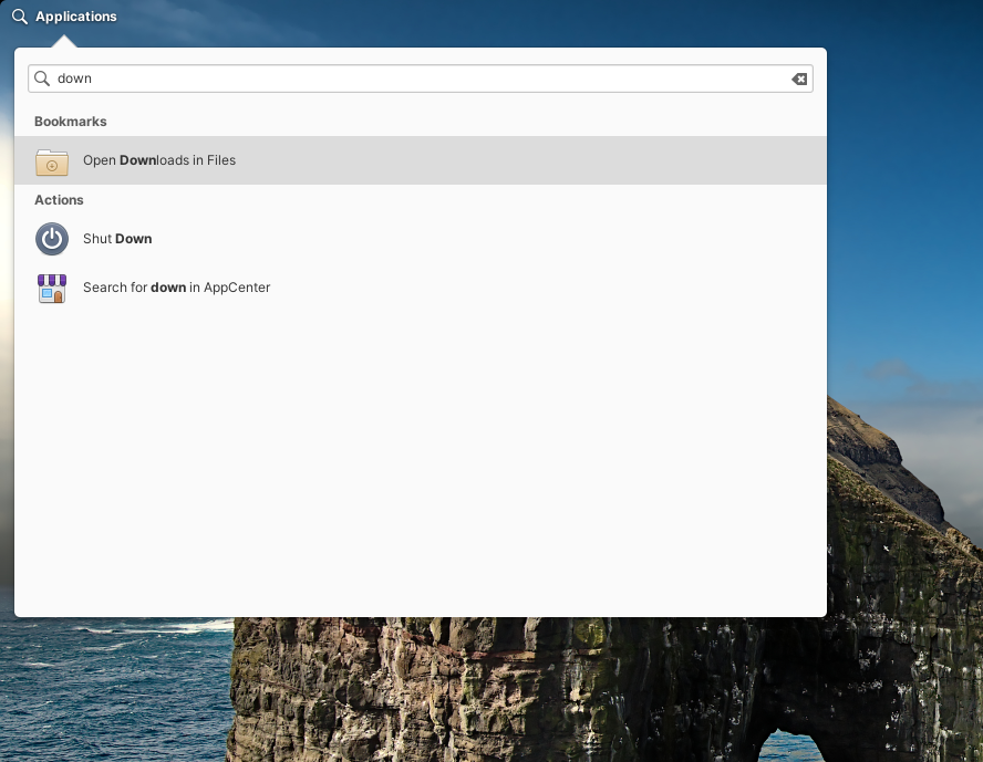
The Applications Menu now shows a secondary-click menu on search result items, and we’ve expanded hardware integration with support for launching apps on dedicated graphics on hybrid graphics systems (e.g. NVIDIA Optimus). Lastly, we’ve reworked the way the Applications Menu watches for changes in installed apps, so it should be more responsive about showing freshly installed-apps without a restart.
Installer & Initial Setup
A couple of nice fixes landed in the Installer and Initial Setup that make it easier to set the name of your device—helpful both for end users and OEMs. We now double check at install time that the default generated hostname is valid and you can change it to something you like more during initial setup. A formatted name like “Cassidy’s StarBook” will be shown when possible—like in System Settings—and will automatically fall back to something more machine friendly like “Cassidys-StarBook” in places like Terminal.
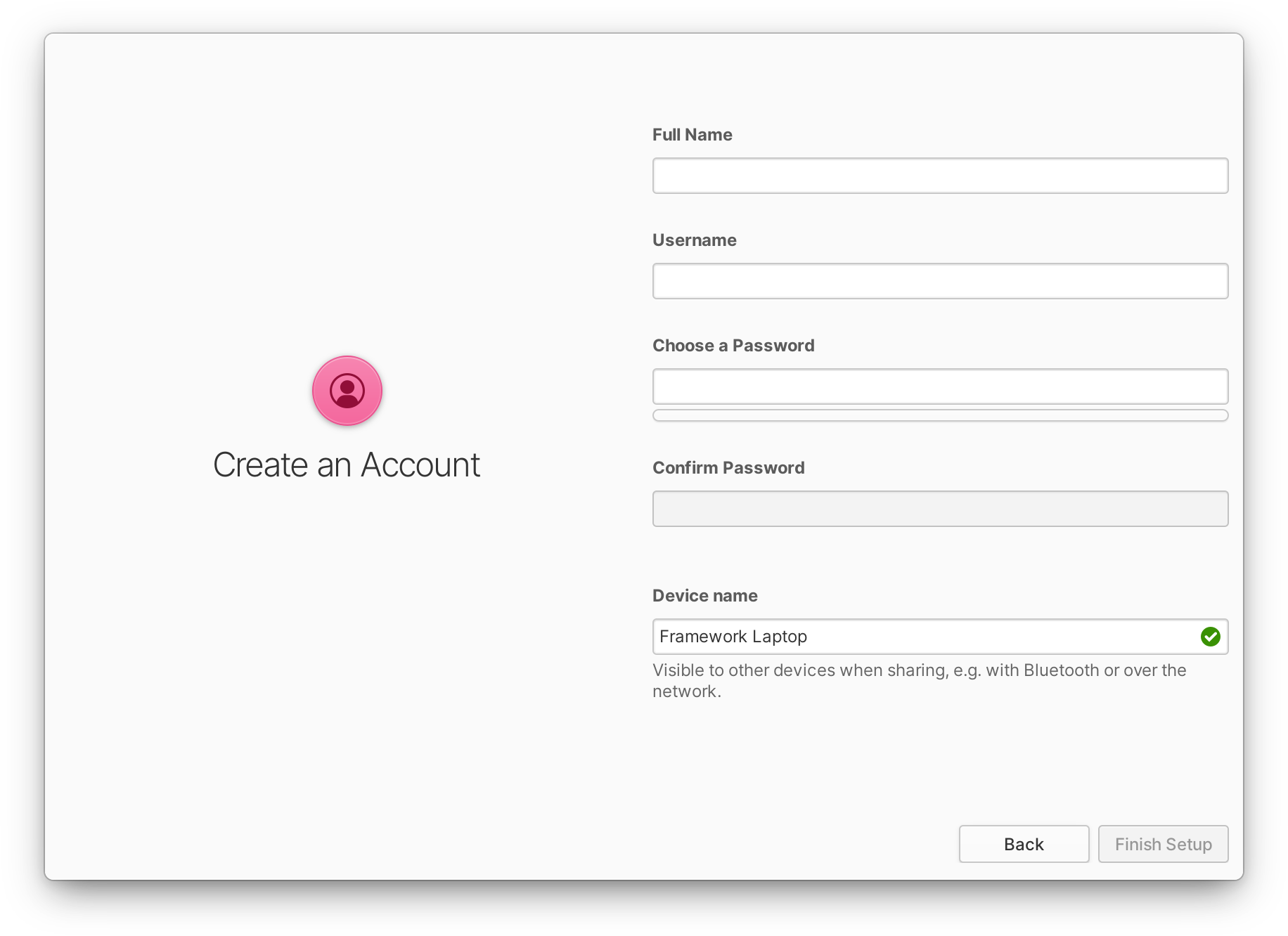
We’ve also fixed a styling issue with “Unused” disk partitions in the custom install mode, and during the pre-installation checklist we now warn about what to expect when installing in a virtual machine. We added two-finger swipe to go back during Initial Setup, and changed the source of locale names to avoid some politically-charged naming of certain locales. Plus, we now hide the clock during Initial Setup since it often was covered.
Housekeeping
elementary OS has a Housekeeping feature where old temporary and trashed files can be automatically cleaned up to save space and help protect your privacy.
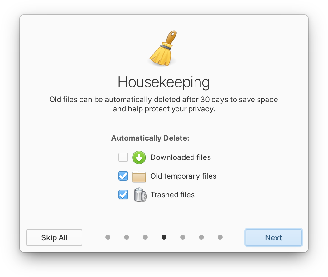
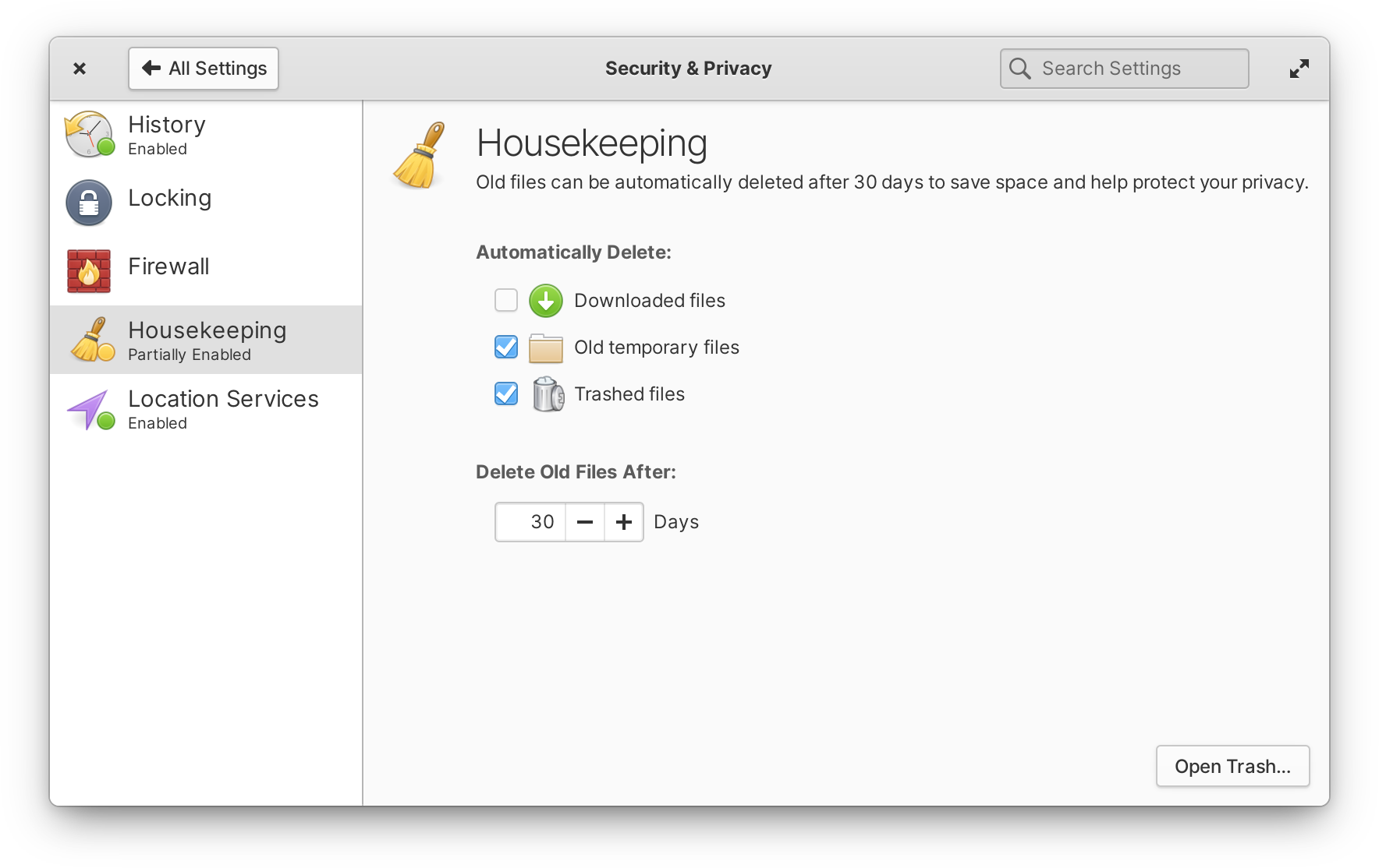
Left: Housekeeping in the Welcome app | Right: Housekeeping in System Settings
We improved Housekeeping with the addition of Downloads to the options, and a more clear and consistent design between both the Welcome app and System Settings.
More Updates and Fixes
Along with all of the features above, there are several more minor updates across the desktop in OS 6.1, fueled in large part by the feedback of OS 6 users. You can now stash the picture-in-picture window by pushing it off an edge of the screen, making it easier to get at whatever was under the window. We isolated the workspace “nudge” animation (when trying to navigate past the last workspace) to only show on the primary display, and we improved that nudge animation to work with the mouse wheel in addition to touchpads, touchscreens, and the keyboard. We redesigned the app icon for the Document Viewer, and PDF file type icons to match. On the Login & Lock screen, we now use the user’s selected accent color for the logged-in check mark for an additional splash of accent color. The Power indicator includes a number of improvements such as showing the screen brightness level when scrolled, better matching the scroll behavior of other indicators, automatically showing the battery percentage when it’s low, and showing “Fully Charged” when at 100% and plugged in. The Captive Network Assistant also gained a new icon and is now shipped as a Flatpak for greater security. Plus, we fixed a number of other smaller issues that were reported.

We also switched the default wallpaper over to the dark variant of the OS 6 wallpaper designed in partnership with the creative agency Freehive and photographer Brendon Porter, released under the Creative Commons BY-SA 4.0 license. If you’re coming from OS 6 and have not changed the default wallpaper, you’ll automatically be switched over—but both light and dark versions remain available in System Settings → Desktop → Wallpaper.
System Settings
One of the most obvious places your feedback has shaped new OS features is in System Settings, where we’ve added a number of new settings and redesigned some old ones.
Displays & Scaling
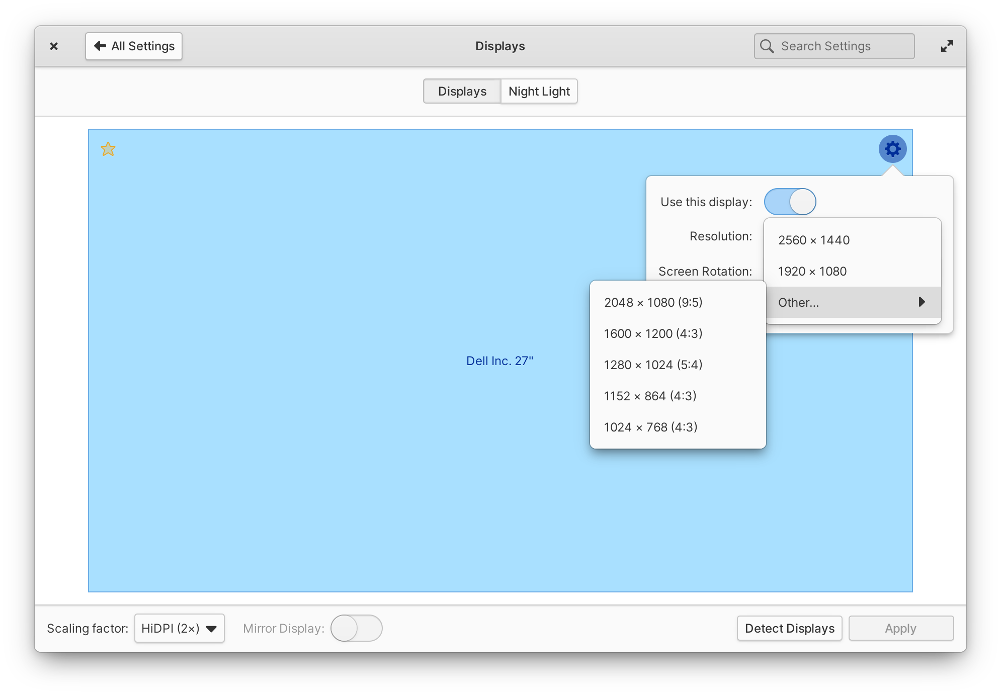
In Display settings, we’ve fixed an issue that caused the “Use this display” switch to fail in certain multi-display setups. Changing display resolution should be quite a bit more convenient now since we now show resolutions with a different aspect ratio in a separate sub-menu. We’ve also tweaked the style of Displays settings to be slightly lower contrast in the dark style, and we fixed an issue that prevented display name tags from appearing on all workspaces.
To better support a wide variety of display sizes and resolutions, we also added more granular text scaling in the Desktop settings—and moved the text settings to their own page for clarity. As a reminder, text scaling in elementary OS affects both text and much of the UI while keeping pixel-perfect icons and strokes, so this update is a great alternative to fractional scaling for anyone with a display whose resolution sits in between the ideal loDPI and HiDPI ranges.
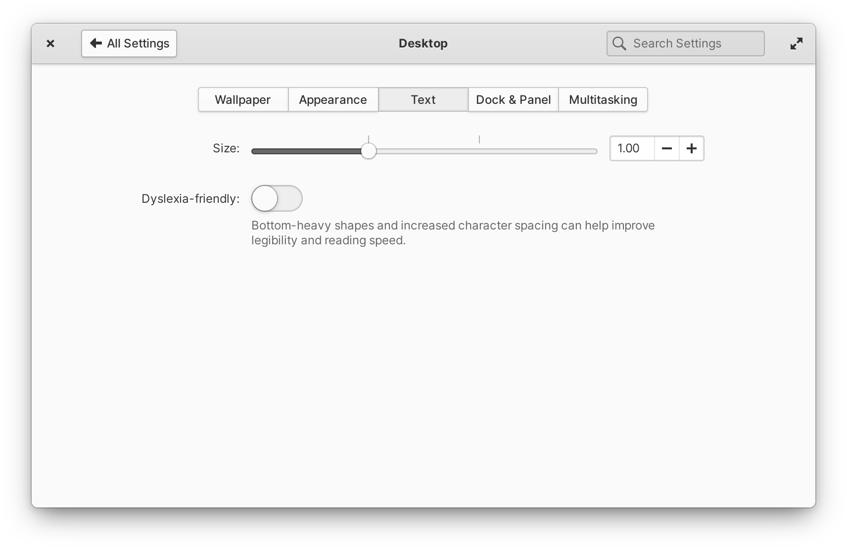
Improved text scaling options
Sound
In the indicator, you’ll notice new device icons to make it easier to find the right output. We also improved the scroll interaction on the volume slider to work with horizontal scrolling, and cleaned up invalid “analog” output devices that could appear in certain situations.

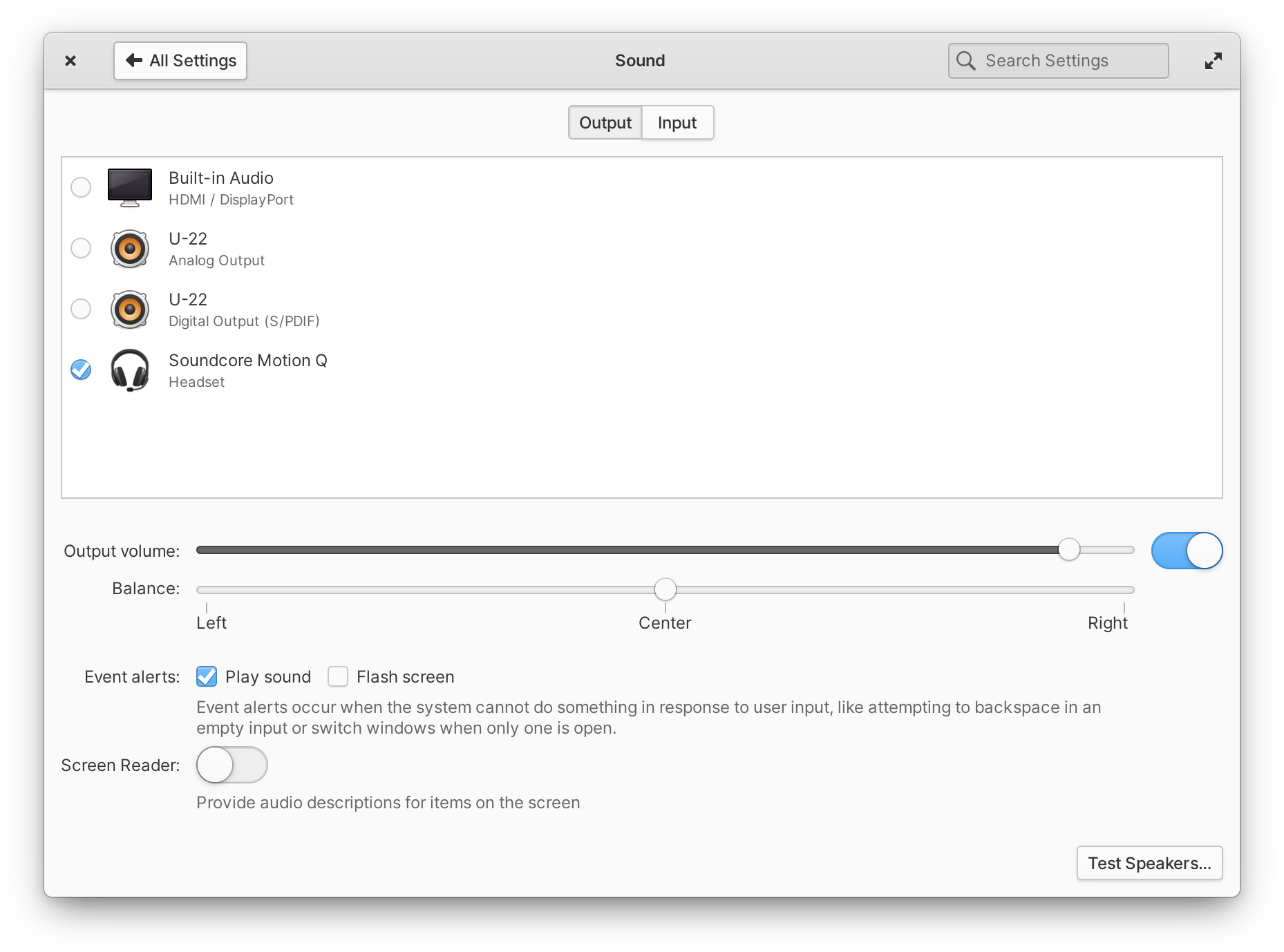
Left: Sound indicator with device icons | Right: Sound settings with similar icons
In Sound settings, you’ll see similar but larger, full-color device icons to distinguish devices, as well as an easier-to-scan multi-line layout.
Keyboard
In Keyboard settings, we improved the custom shortcuts view with a more straightforward design and menu for changing or deleting shortcuts, and added an on-screen keyboard switch to the Layouts tab.
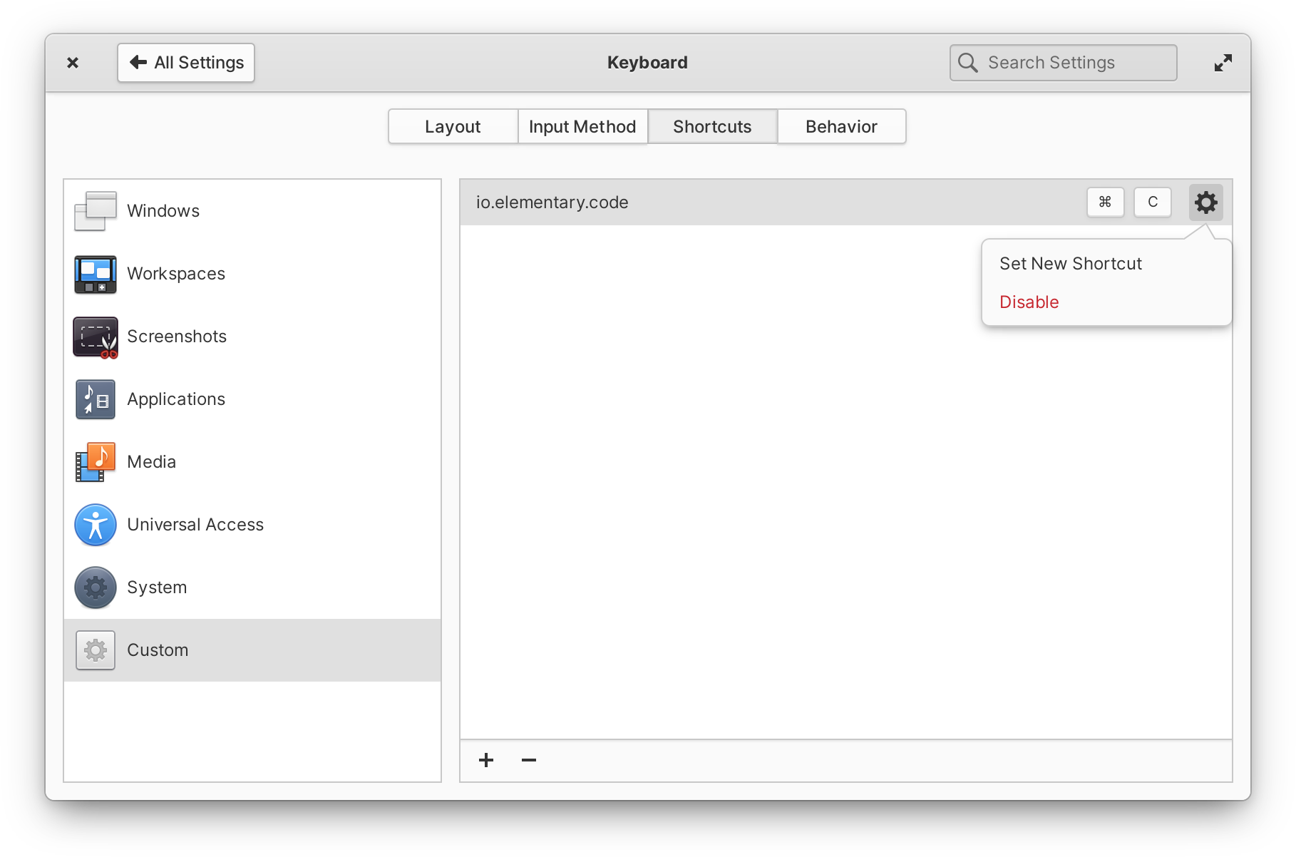
Improved custom keyboard shortcuts design
For those of you using advanced keyboard input methods, we now ensure IBus automatically starts on login and we fixed issues with illegible text selection in IBus candidate window.
And More
In addition to the major improvements above, we fixed a number of reported issues and crashers, an issue in Power settings that could sometimes cause problems with resuming from sleep. Plus we added a switch to show or hide the battery percentage in the Panel, and a new toggle for “Double-tap and move to drag” in Mouse & Touchpad settings. In the System page, we now display more information for certain graphics chipsets, including Intel® Xe Graphics. And we also improved the way we remember Bluetooth state on restart and when resuming from suspend. We also spent some time resolving cross-platform issues, which should make our desktop environment more easily portable to distros like Fedora and Nix OS.
Office Productivity
OS 6.1 also brings a number of refinements and new features for staying productive at work and keeping things synced between all your devices.
Online Accounts
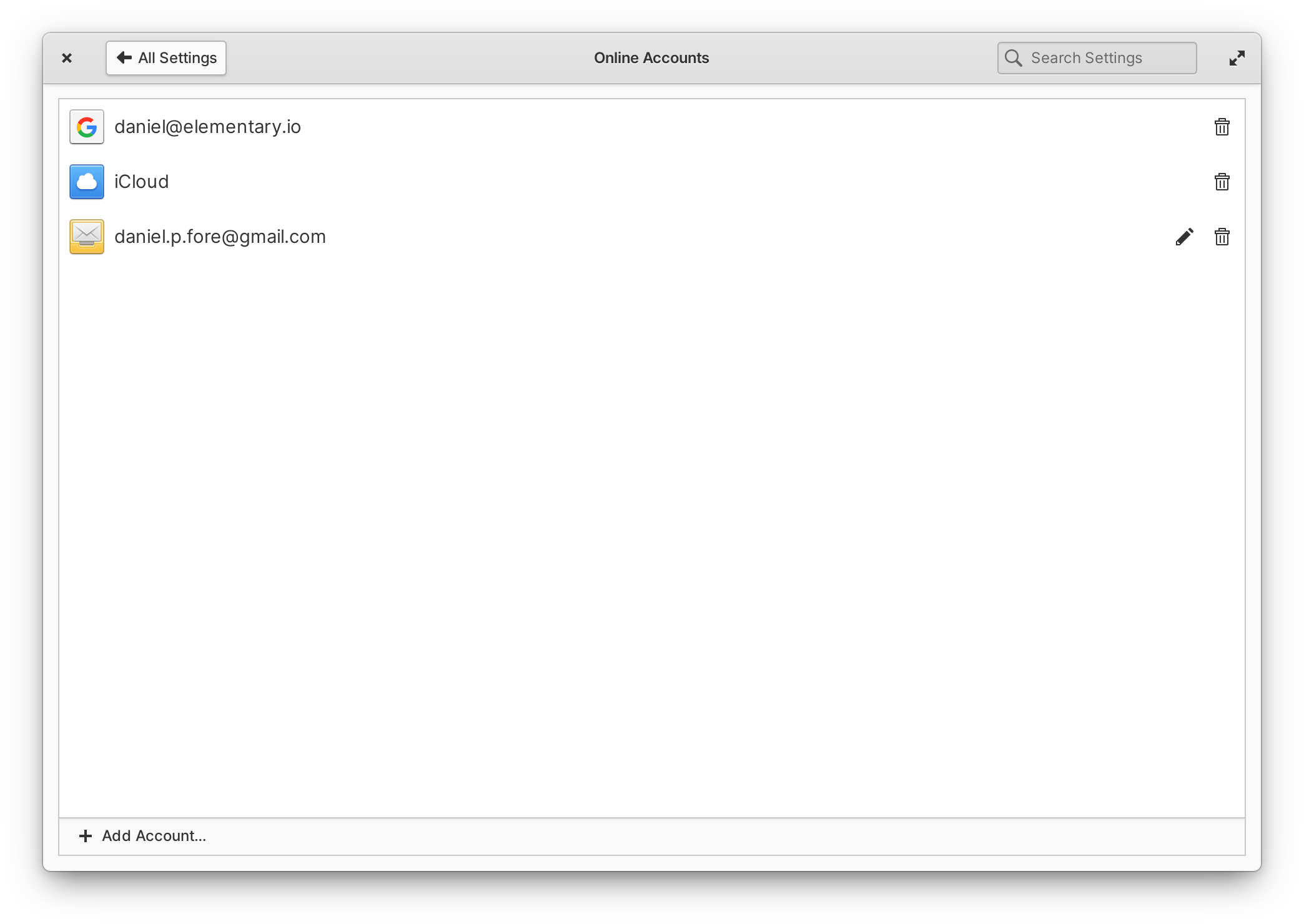
In OS 6 we debuted a new Online Accounts system built around Evolution Data Server (EDS) and over the past several months we’ve rolled out quite a few improvements. Firstly, we’ve make sure you can always navigate next when adding an account by pressing Enter and that you can close dialogs as expected with Esc.
Thanks to some helpful feedback from our community, we’ve made the process of detecting IMAP authentication methods much more robust. We also ensure the refresh interval for an IMAP account is set (which will let apps like Mail change this in the future). And you can now edit existing CalDAV and IMAP accounts by selecting the pencil icon in its row.
elementary OS 6 featured a brand new version of Mail built around EDS instead of the Geary mail engine. Since its release we’ve continued to implement the remaining important features from the old version, and we’ve made quite a lot of progress!
Mail will once again automatically notify you when new messages arrive, even when the window is closed. There’s also clever grouping of notifications so that if several messages come in at once, we’ll only send one notification per account.
Conversations in the list view have a handy secondary-click menu again, and the next conversation in the list is automatically selected after archiving or deleting the current conversation. We’ve also moved the in-app notification for “Undo” to be less intrusive. Conversations with unread messages now use your accent color for their titles to stand out a bit more. We’ve added a new inline toolbar with a “refresh” button to manually fetch new messages and togglable filters for unread or starred conversations. And we make sure that conversations get resorted by time and date when new messages are received.
We’ve fixed a number of reported crashes and rendering errors, improved search performance and startup times, and improved issues around saving drafts and deleting messages with various mail servers including Outlook.com. We’ve improved handling of mailto: links, better ensure the correct “From” address on replies when multiple accounts are set up, sent messages will no longer be marked as “unread”, and messages will use your local time in their headers. Mail also now provides the email portal for apps that support it (replacing the previous Contractor contract on elementary OS), making it easier for sandboxed apps to prompt you to start composing a message.
Tasks
We shipped a number of improvements to Tasks: to prevent accidental task deletion, we’ve replaced the Delete shortcut key with CtrlBackspace and added a confirmation dialog when deleting a task list; we’ve improved performance in lists with lots of completed tasks; we prevent account name headers from being displayed multiple times in the sidebar; we now truncate long descriptions at the end instead of the beginning; we ensure tasks are saved when the description is removed; and, we improved cursor placement in descriptions when editing. Task items with due dates now also appear alongside daily events in the Date & Time indicator and selecting task items there will launch Tasks. And, you can now drag and drop task items between lists in the sidebar. Plus we’ve resolved some issues regarding saving task items with the proper time zones, so if you have outstanding tasks with due dates, it’s worth double checking those after the update.
As a note, if you were having issues adding, editing, or removing lists, try removing and re-adding your CalDAV account in System Settings → Online Accounts to take advantage of the improvements made there.
Calendar
We’ve greatly improved Calendar’s reliability with regards to sending notifications, including fixes for the Notifications indicator, opening Calendar when clicking notifications, and sending notifications for upcoming events while Calendar is closed. Time zones have been a major focus as well with improvements around getting and saving time zone information, including Windows-style time zones in synced events, and plugging memory leaks related to fetching time zone data. We’ve improved handling of all-day events and we do a better job of getting calendar colors from online accounts. Plus, you can now quickly open Calendar by middle clicking on the Date & Time indicator.
Web
We made the leap from Web 3.38 to 41 which brings quite a number of improvements including a redesigned tab bar, several performance and stability fixes, and of course rounded window corners!
The preferences dialog itself has been redesigned and now includes search. Managing search engines and passwords have been completely redesigned. A setting to disallow local storage is now included, and there’s a new optional Google search suggestions feature that is off by default. Appearance settings now include the ability to add custom JavaScript. Fans of Firefox sync should note that this feature has moved from the preferences dialog to a top-level item in the main menu.
The new tab bar includes slick animations when opening, closing, and reordering tabs. Drag and Drop is much improved. When there are many open tabs, they can now be scrolled through quickly instead of individually paged with arrows. Closing tabs waits to resize like elementary apps. And the new tab bar fully supports touch screens. For a deep dive into the new tab bar, check out Alex’s blog post.
Files
Files received quite a lot of attention around bookmarks, selecting files and folders, networking, and more.
We improved drag-and-drop to the sidebar for bookmarks, ensuring drop targets show up in the correct places, and fixed dropping paths onto storage devices and network locations. Files also includes fixes for issues regarding renaming bookmarks as well as bookmarking with the shortcut CtrlD. You can now open bookmarks in a new tab with Ctrl Click, the names of bookmarked folders will now properly update if your language was changed, and we also made sure the overlay bar in the bottom right doesn’t briefly appear when switching between bookmarks. Plus, we resolved several issues with how drives, volumes, and network shares are displayed in the sidebar.
You can now drag-to-select a group of files, hold Ctrl, and drag to select an additional group of files. We ensure Files doesn’t deselect a file or folder when secondary clicking the blank space around it, and we now show the folder context menu when secondary clicking outside of a selection. We also added items to the secondary-click menu for “Select All”, “Deselect All”, and “Invert Selection” where appropriate and with their respective keyboard shortcuts.
Audio files now correctly fall back to a placeholder icon when album art can’t be loaded, and color tags no longer disappear when thumbnails are hidden. Files will more reliably restore tabs after a system restart. The “Connect to Server” dialog now allows blank passwords for remote connections, e.g. for connecting to an SSH server via a private key instead of a password. We better handle displaying permissions for files and folders on network shares. Files and folders managed with Git have improved emblems. And, Files now uses the Send Mail portal for emailing files, which should open compatibility up to more third-party email clients and work better across other desktops.
And Other Apps
Previously, Camera’s resolution had been reduced for performance reasons; in the latest version Camera will continue to use a more performant resolution in the preview, but will save full-resolution pictures. We resolved issues with some cameras being unavailable when multiple cameras are connected, and we now default to a working camera if multiple cameras are connected but one is unavailable.
Now when you open an image in the Photos previewer, we focus the image itself instead of the save button; this enables navigating with the left and right arrow keys right away. The actions for “Toggle Sidebar” and “Toggle Photo Info” have been moved from the secondary-click menu of certain views to the main menu button, hopefully making these customization options more discoverable.
When Calculator starts up, we now focus the main text entry so that entering numbers with the keyboard works right away. We’ve also improved the experience with multiple windows: there’s now a “New Window” action when secondary-clicking Calculator in the Applications Menu or Dock, and we fixed an issue with showing advanced controls so that it only affects the currently focused window.
Videos now supports the two-finger-swipe to go back gesture and navigation code has been cleaned up a ton. Also, we’re now shipping Videos as a Flatpak which should resolve some reported issues with certain video codecs.
In Code, we now distinguish between projects with the same name in the sidebar by including their parent folder. We now hide the project chooser button when hiding the sidebar, allowing a smaller minimum window width. We also better ensure files created from the sidebar are automatically opened. And when scrolling to search results, we overshoot the result slightly for better visibility. If you use the Terminal extension, we fixed the visibility of Terminal button on Welcome page, fixed some keyboard shortcuts affecting unfocused document instead of focused Terminal, ensure the Terminal is closed if shell exited, and create a new Terminal if it’s re-opened with no shell.
Developer Platform
In tandem with our work on portals, we’ve released several updates to our Flatpak platform and development libraries.
Granite was updated to use the Settings portal for retrieving the FreeDesktop dark style preference, and now contains several fallback methods to try to determine if a dark style is being requested when apps are running on a platform where the Settings portal isn’t available. Since there was no API break, there’s no additional work needed from developers to support the new standard. However, now that the portal is available, we’re advising developers to drop the sandbox hole for AccountsService in their Flatpak manifest for improved security. The new version of Granite also automatically uses the Settings portal for a couple other things like date and time settings. This fixes an issue with time picker widgets not respecting AM/PM vs 24-hour time format preferences, for example. We also added a new Granite widget HyperTextView to support navigable URLs in text views, and Granite.ValidatedEntry now has a min_length property.
Our system stylesheet was updated with support for the tab bar widget in LibHandy, which we previously mentioned is now used in Web but is available for other developers to use as well. We also made sure that header bars with the flat style class inherit the background color of their containers, which makes it easier to implement split header bar designs in apps like Tasks. and Our system icon set now includes more sizes for icons like emblem-downloads and playlist-queue.
The latest release of the 6 series Flatpak platform contains all of these fixes, plus newer versions of other libraries like WebKit to keep apps secure, stable, and performant. We now include the FreeDesktop sound theme and the elementary sound theme in the platform for apps that want to use audio feedback for actions. And as alluded to before, we publish 64-bit ARM versions of our platform to support those builds for AppCenter.
We also published the first version of the 6.1 series Flatpak platform, built on top of the GNOME 41 platform. This platform contains even new libraries than are available from the Ubuntu repos as well as a fix that makes sure apps built with the 6.1 runtime will use the Blueberry stylesheet from OS 6 when running on OS 5. Developers will have to manually opt-in to this update since it is API-breaking in some cases.
Get elementary OS 6.1
elementary OS 6.1 Jólnir is available as a pay-what-you-can purchase at elementary.io today. Localized direct downloads and a torrent magnet link are provided.
If you’re already on elementary OS 6 Odin, you’ll get the update to OS 6.1 Jólnir alongside regular operating system updates. If you haven’t already, open AppCenter and select Update All to be upgraded.
Devices
Our hardware retailers Laptop with Linux, Slimbook, and Star Labs are all offering elementary OS 6.1 Jólnir out of the box starting today. Visit retailers’ individual sites for more information.
Thanks to upstream developers working on Ubuntu, we’re now shipping a fix for an issue that prevented some computers from being able to boot, including Dell devices with UEFI and some other models. If you weren’t able to boot the initial release of OS 6, give it another shot! If you were able to get OS 6 installed, you’re not affected by this issue and you don’t need to re-install. This latest build inherits all the other great hardware compatibility improvements included in Ubuntu 20.04.3 release as well. Thanks, Ubuntu!
Thank You
Thanks to all of our supporters, backers, and customers! Your contributions make elementary possible. If you’d like to help build and improve elementary OS, don’t hesitate to Get Involved.

We'd like to specially thank Laptop with Linux for sponsoring this blog post and supporting our work. Laptop with Linux offers laptops and desktops that are perfectly tuned and optimized for use with various Linux® based operating systems, and aims to make it accessible for every computer user to switch to Linux by increasing freedom of choice.


