Updates for August, 2022
Plus, our plan for responsive apps
This month, updates for 6.1 are a bit small as we’ve been doing quite a bit more work on OS 7! Read ahead for a summary of your 6.1 updates plus information about our work porting to Gtk 4 and with responsive design in OS 7.
Desktop Settings
In August we released two small updates and a few fixes for Desktop Settings, mostly regarding Wallpapers. We now sort your imported wallpapers to the top of the list, and there is now an “undo” option when removing a wallpaper from your collection. Plus, the selection check now matches your chosen accent color. We’ve also resolved an issue that occurs when importing wallpapers with the same file name, and fixed a couple of issues related to keyboard navigation.
Get These Updates
As always, pop open AppCenter on elementary OS 6.1 and hit “Update All” to get all these updates plus your regular security, bug fix, and translation updates.
AppCenter
Last month, I made a brief mention of some of the work we had starting doing towards responsive interfaces in our apps. This work continues this month, and I wanted to go a bit more in depth into why we’re doing it and what we’ve accomplished.
Firstly, if you’re not familiar with the term “responsive design” it refers to designing interfaces in a way such that they respond to changes in the size of the window or display. Typically when folks talk about responsive design, they’re thinking in terms of shrinking things down to fit on mobile displays, but it can also mean making them work better for large desktop displays including ultrawide formats, and for us it means designing for resizable windows—including tiling. We’ve heard, both from people who use elementary OS and from our downstreams like System76, that there’s a desire for tiling both simple and complex apps and even on smaller laptop displays. We’ve also heard for many years a desire to run elementary OS on tablets and phones, which would require us to make apps that can work on even smaller displays and in vertical layouts as well. So I’m excited to say that we’ve started to make progress towards this goal and future designs will keep responsiveness in mind.
One of the places that we’ve made the most progress here is in AppCenter. AppCenter is a core experience on elementary OS since it’s the recommended place to discover and install new apps as well as get updates. The most immediately noticeable change is in the headerbar which now focuses on search and de-emphasizes navigation with the installed apps view.
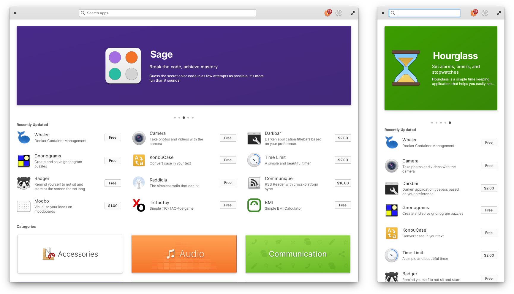
Left: AppCenter’s new navigation area | Right: The home page scaled down to mobile widths
On the Installed apps view we now show release notes in a dialog instead of fitting them in between rows. This should make them a lot easier to reveal and read on both large and small form factors and could enable new features in the future like listing release notes for every version in between an upgrade.
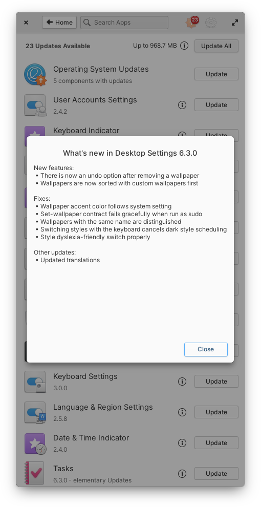
Release notes are now shown in a dialog
There’s still some work to do with resizing images and de-cluttering the header, but App info pages now do a better job of wrapping elements and preventing text from being ellipsized at small sizes. You’ll also notice that there’s now an accent colored background behind screenshots and captions are shown when available.
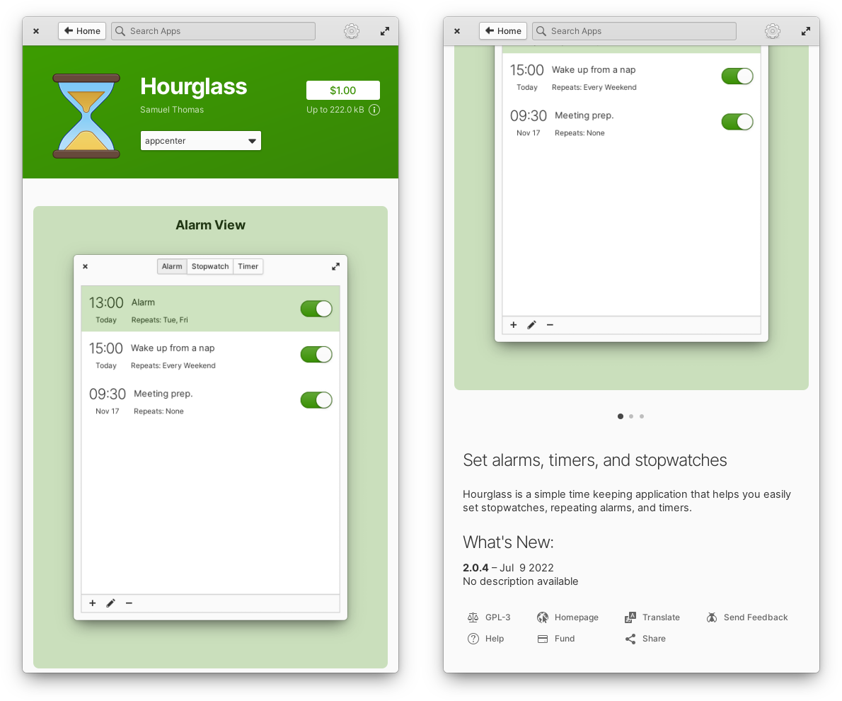
Elements shrink or wrap to fit in small sizes
And at larger window sizes you’ll notice that more screenshots can be viewed at once, so again we’re looking at responsiveness in both directions.
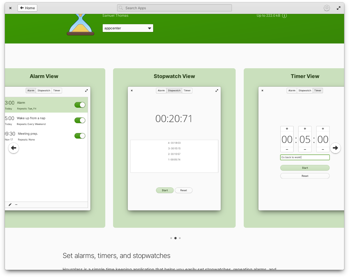
More screenshots are shown at once at large sizes
There’s also been a lot of progress made on porting AppCenter to Gtk 4 and I’m happy to say that there is a pull request currently in review to complete this port. The process of getting AppCenter ready for Gtk 4 has lead to a ton of improvements that should make the code base more maintainable and lead to real world improvements in performance and reliability. I’m also very excited about the foundations that have been laid here to enable new features and more compelling design.
System Settings
System settings is another place where there has been a lot of effort made towards Gtk 4 porting and the beginnings of more responsive layouts. Since this is a pretty large app, it’s unclear if this work will be completed in time for the launch of OS 7, but it could be made available in a future point release.
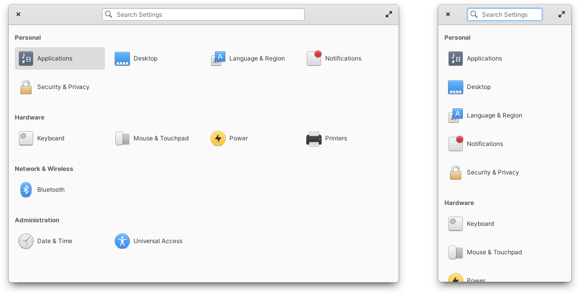
Left: System Settings in Gtk 4 | Right: Scaling down the new System Settings
There’s been a lot of progress porting each of the panes to Gtk 4 and some of these panes are usable at pretty small sizes, but there’s a lot of work to do to make them truly responsive
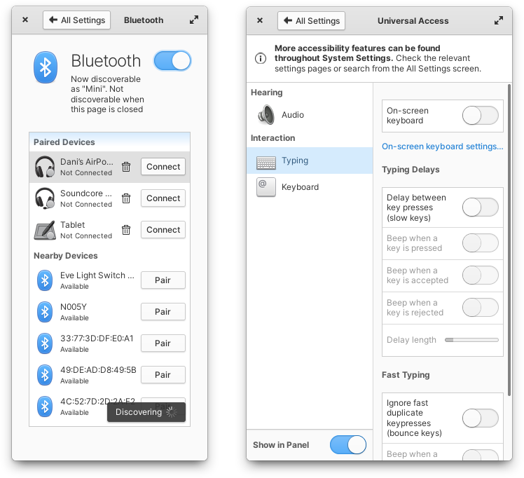
Left: Bluetooth settings uses too much padding | Right: Universal Access settings’ sidebar occupies too much space
Stay Tuned
You can follow along on GitHub for more detailed information about Gtk 4 porting and Responsive apps as well as look forward to seeing more on the blog here! Everything shown here is still evolving and changing, but you can be among the first to try it and give your feedback by joining Early Access for a $10/mo sponsorship. Can’t wait to see you in the next one!
Thank You
Thanks to all of our supporters, backers, and customers! Your contributions make elementary possible. If you’d like to help build and improve elementary OS, don’t hesitate to Get Involved.
We’re accepting limited sponsors for the elementary Blog. View our public analytics and learn more if you are interested.


