Switching from macOS: The Basics
Part 1 of a 5-part series
We’ve been getting a ton of traffic at elementary.io and hearing a lot of chatter from Apple users after the underwhelming MacBook Pro event— mainly that Apple has abandoned the “Pro” market for which so many of their products are named. With this five part series, I’d love to show you how elementary OS is great for both casual computer users and professional developers. Particularly those coming from or more familiar with macOS.
This piece kicks off with: The Basics.

While it’s not intended to be a 1:1 copy, elementary OS will be familiar to macOS converts in a few key ways:
The Dock

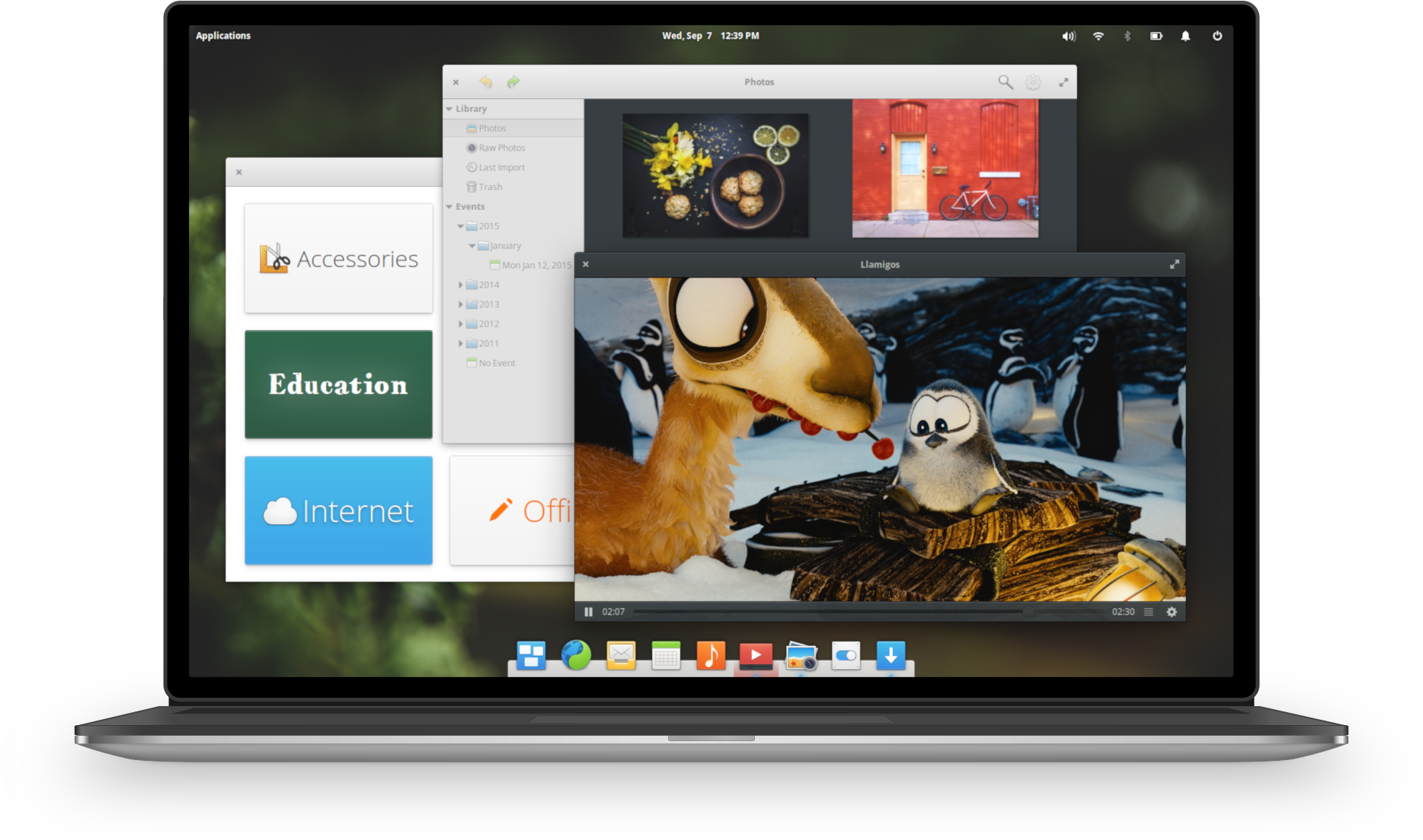
It has a dock at the bottom of the screen with your favorite and currently running apps. These can be arranged with drag and drop and have extra app-specific actions behind a secondary (two-finger or right) click, similar to macOS.
The hiding behavior in elementary OS, however, is so much better than the dock in macOS! In macOS, the dock can either autohide at all times, or not hide at all which are both inconvenient; it’s either totally in your way or totally invisible. By default in elementary OS, the dock is there when there’s room, but hides when it’s in the way. You can also choose between a few more smart modes, always visible, or always autohiding if any of those are more your thing.
The Panel & Indicators

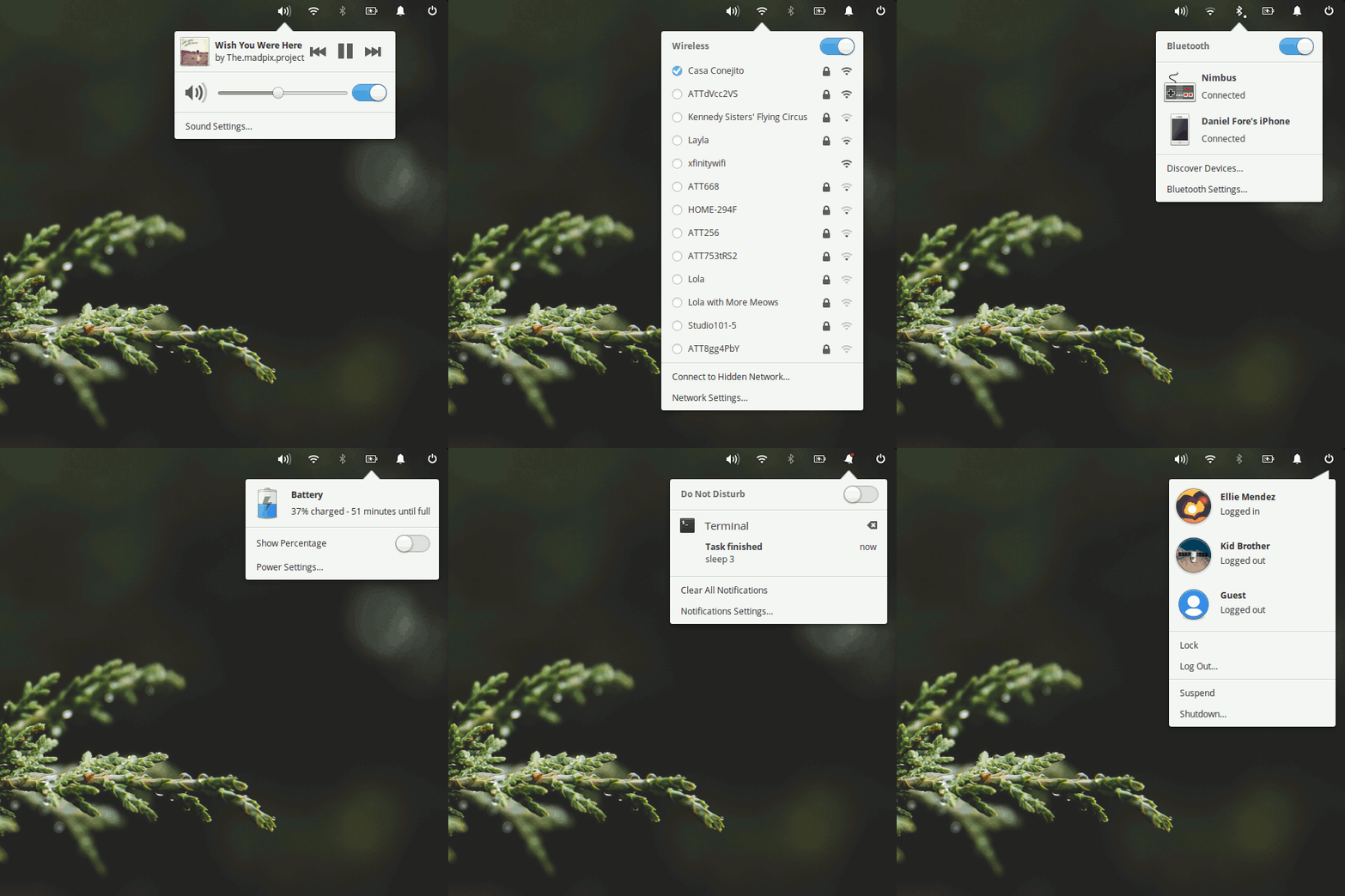
There is a panel at the top of the screen. This is similar to the macOS panel in that it houses status indicators and their menus to the right, but does differ in a few ways.

The indicators at the right are well-designed and well-thought-out. Session controls (like switching users, shutting down, etc.) are all in a single indicator instead of split between a user menu and the Apple menu. The sound indicator not only gives you volume controls for output and input, but lets you control media apps with track info, album artwork, play/pause, and back/forward. Other indicators include the power indicator (which names and shames energy-sucking apps, similar to macOS), the network indicator, Bluetooth (which allows for one-click pairing/disconnecting devices), and the Notification Center, which houses timed out notifications similar to macOS.
The clock is in the center of the panel and houses a quick calendar popover for checking dates without opening an app.
The Applications Menu lives at the far left of the panel. Apps don’t put their menu up here; most apps use more contextual actions instead of a menu bar, but if they do provide a menu bar it lives in the app window itself.
The Applications Menu

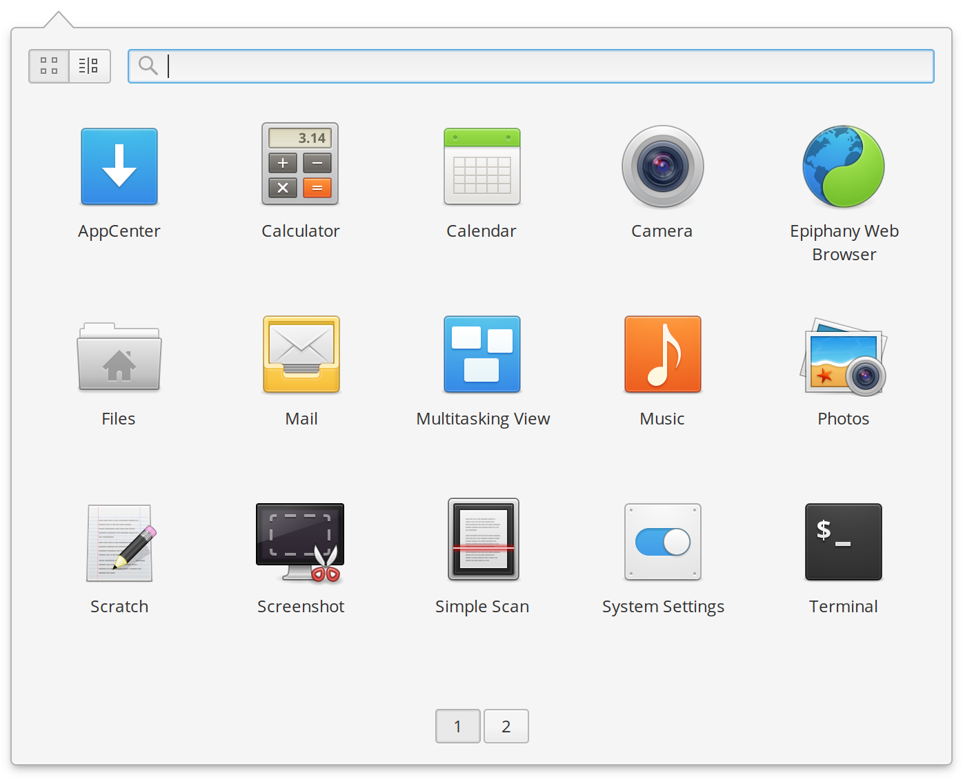
The Applications Menu, like macOS Launchpad, has a grid of icons and a fast search. However, there are some extra features here like a categorized view and the ability to directly perform apps’ actions such as “Private Browsing” in the browser either by searching or right clicking the application icon. It’s really best to think of it more as a combination of Launchpad and Spotlight. Similarly, it can be launched from the keyboard with Command + Space.
A Quick Note about Default Apps
Many apps will feel familiar, or at least intuitive. System Settings is similar to what you’ll find in macOS, as are the browser (Epiphany instead of Safari), Mail, Files (instead of Finder), and Terminal apps (more on Files and Terminal in an upcoming “Developer Environment” post). While some apps like Music and Videos may look simpler than those in macOS, they’re packed with great features while still being easy to learn and use. Again, elementary OS is not trying to be a copy of macOS, so some things do differ. But generally you’ll find comparable functionality and design elements that feel familiar.
The Multitasking View

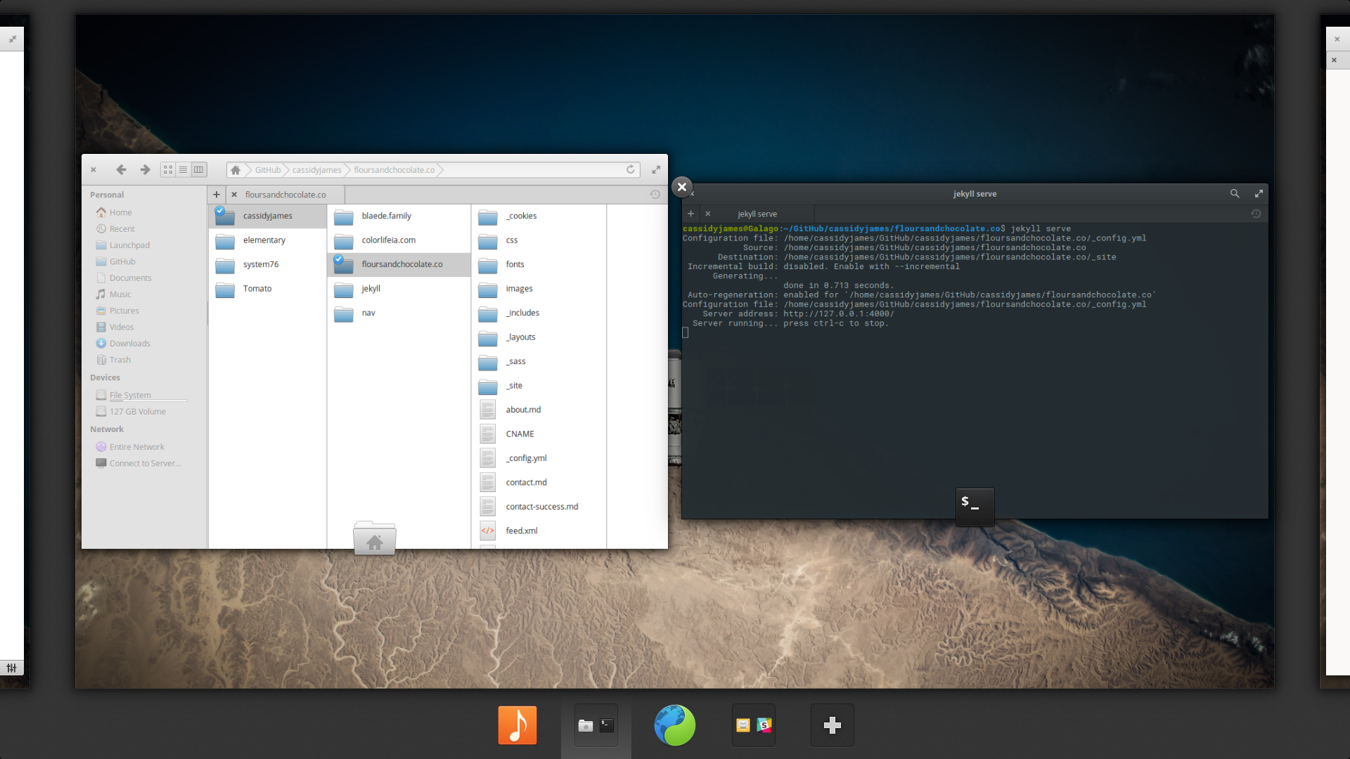
Lastly, something that several macOS switchers have pointed out they love is Multitasking View in elementary OS. You launch Multitasking View from the icon in the dock or with Command + S. It’s kind of like Mission Control in macOS, but more streamlined. At the bottom you get iconified versions of all the open workspaces, as well as an always-new one on the right. The windows on your current workspace shrink down to give you an overview (like Expose in macOS), and you can drag and drop apps between workspaces. Fullscreened apps get their own workspace, and there are a number of ways to switch between them with keyboard shortcuts.
Further Reading
For some more information (and all sorts of keyboard shortcuts), be sure to check out the official elementary OS Learning the Basics documentation!
If you’ve switched to elementary OS from macOS, feel free to share your favorite features or differences with us on social media.
Thank You
Thanks to all of our supporters, backers, and customers! Your contributions make elementary possible. If you’d like to help build and improve elementary OS, don’t hesitate to Get Involved.
We’re accepting limited sponsors for the elementary Blog. View our public analytics and learn more if you are interested.


