elementary OS 5 Juno is Here
Refinement, Productivity, & an Improved Developer Platform
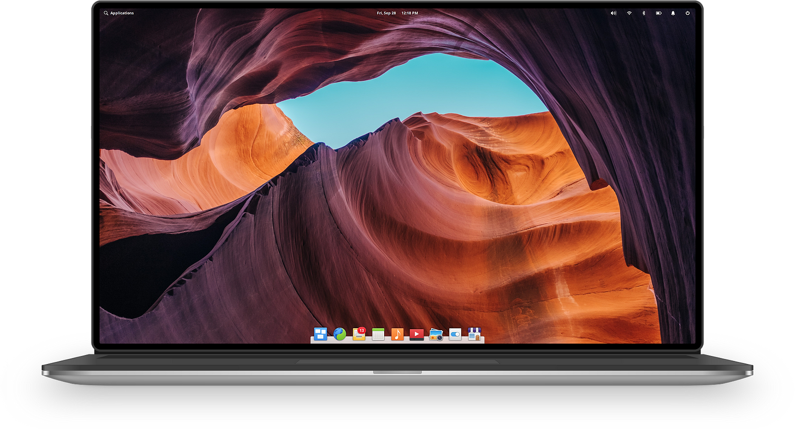
elementary OS is the fast, open, and privacy-respecting alternative to Windows and macOS. Over the past year we’ve been hard at work putting together a new major version of elementary OS, codenamed Juno. It is the culmination of a ton of updates and improvements with three major goals:
- Provide a more refined user experience
- Improve productivity for new and seasoned users alike
- Take our developer platform to the next level
Today we’re proud to officially release elementary OS 5.
Majorly Updated Apps
elementary OS is made up of two main parts: the “desktop” which includes the core user experience, look and feel, and system pieces; and the apps that come with the OS out of the box. elementary OS 5 Juno includes major updates across several of these core apps.
AppCenter: the Open, Pay-What-You-Want App Store
AppCenter is our built-in app store where users can download free and paid apps that are purpose-built for elementary OS. With AppCenter we’re doing things a bit differently from our competitors. First, every single app in AppCenter is open source because we firmly believe in the world-changing power of freely-licensed code and open source software. Second, all paid apps are offered with a developer-provided suggested price, but are ultimately pay-what-you-want. Users choose what to pay—if anything at all—when they download paid apps.
We use a pay-what-you-want model because it makes it incredibly easy for those who want and are able to fund development to do so, while keeping things accessible for individuals or organizations where the costs might be prohibitive. Our goal is a sustainable open source ecosystem of quality apps that people love.
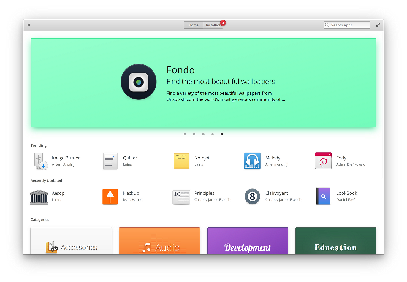
In the previous version of elementary OS, we saw AppCenter go from zero curated apps at launch to over a hundred. Our indie developer ecosystem took off, and those developers have been thrilled with the experience of delivering their pay-what-you-want apps directly to users. However, as we shared back in February, we do still have some work to make the ecosystem truly sustainable for our developers.
So for Juno, we’ve focused in on making it even easier for users who choose to support developers to pay them for their apps.
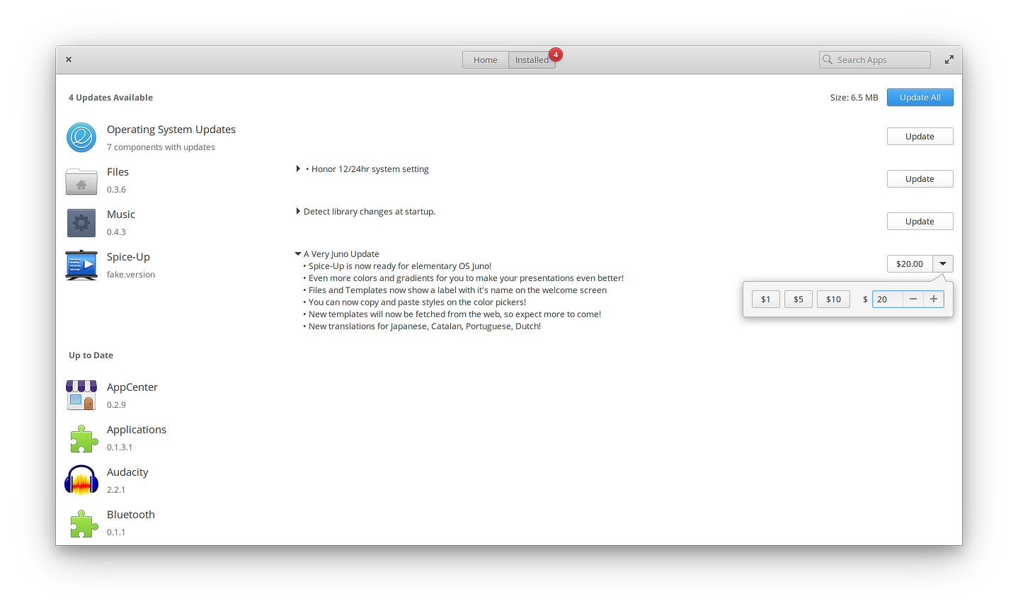
If a paid app has been downloaded for free in the past, it will now prompt again for a pay-what-you-want purchase when there is a non-security update. Security updates will still come through as usual, and users can always choose to pay $0. This gives users who initially downloaded a paid app for free another easy opportunity to fund development of that app. And for developers who provide increased value over the lifetime of an app, this helps increase the chances that their satisfied users will pitch in, even a little bit, at some point.
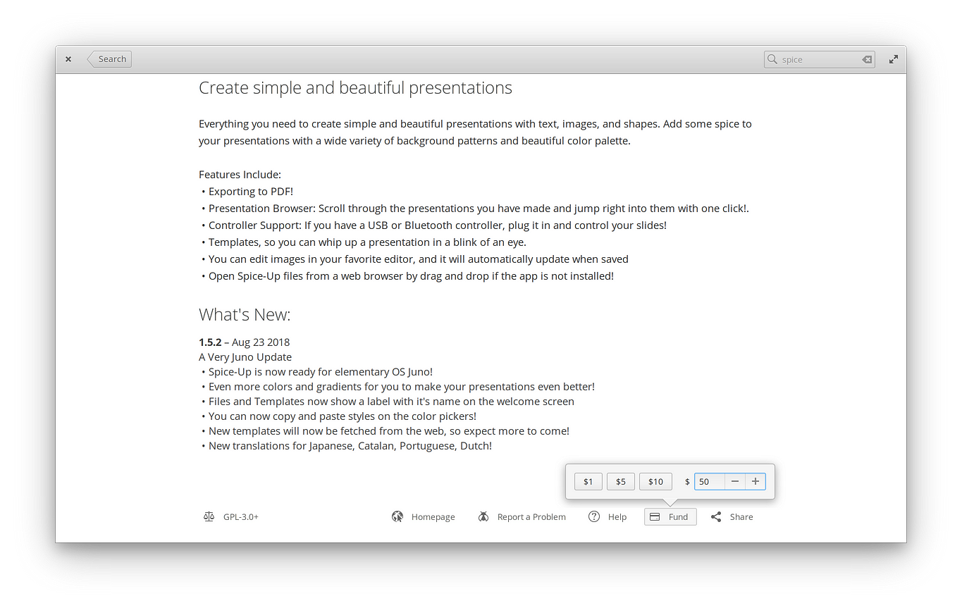
We’ve added a new “Fund” option in the footer of all paid apps, making it easier yet again for users to help directly support the development of an app they’ve already purchased or haven’t even installed. For the whole rundown, be sure to read our About AppCenter Payments post from earlier this year.
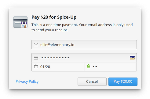
We’ve also revisited the payment dialog for purchasing apps: we’ve implemented better payment card formatting and validation to cut down on errors, we now hide payment details when the fields aren’t focused to cut down on shoulder-surfer surveillance, and we’ve made it more consistent with other authentication dialogs, and consequently clearer that this is a trusted and secure dialog that is in fact coming from elementary OS.
We’ve focused on small things, too: we show the download size of apps in their header so bandwidth-conscious users will know if they want to grab an app now, or when they’re on an unmetered connection; when a user goes to download an app that might contain explicit content, we give them a heads up; category colors have been refined and adapted to our color palette; icons are higher-resolution and pixel-perfect on both LoDPI and HiDPI displays; and categories now contain both more apps and more relevant apps.
In beta testing, we’ve received positive feedback about each of these improvements from both app developers and users. The next time you’re in AppCenter we hope you’ll purchase an app to help build this sustainable open source ecosystem with us.
elementary Code: Purpose-built for Developers
We wrote about Scratch becoming Code at the beginning of the year, and that’s now fully realized in elementary OS 5 Juno. Code in Juno received the most attention, refinement, and improvement over its counterpart in Loki compared to any other app. Developers: this one’s for you.
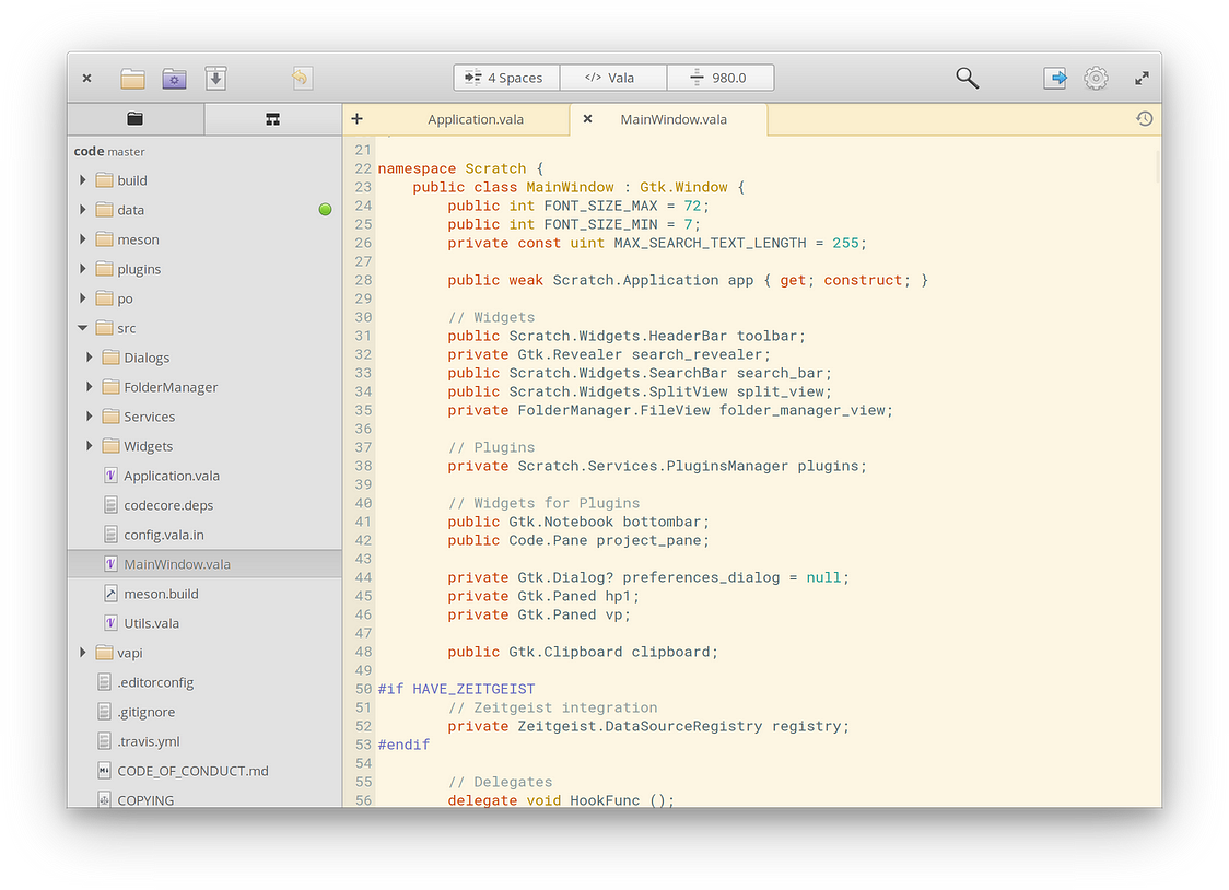
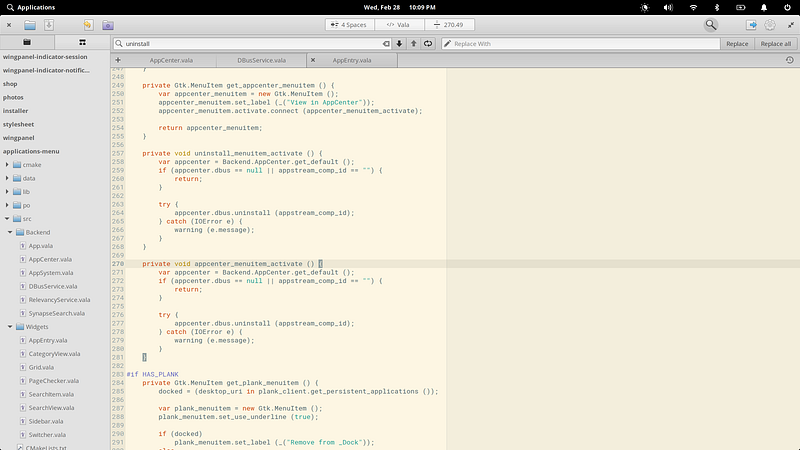
The major focus for Code is being purpose-built for writing and editing code, which has lead us to setting smarter defaults. Baseline features like line numbering, project folder management, Vala symbol introspection, and line wrapping all come by default. This has also allowed us to simplify some of the preferences when it doesn’t make sense to toggle certain features on or off in a code editor. The result is a much more full-featured and tailored app for developers.
One of the most visible new features is the status area in the header. This sports new quick controls for tab/space settings, language/syntax highlighting, and a quick go to line feature.
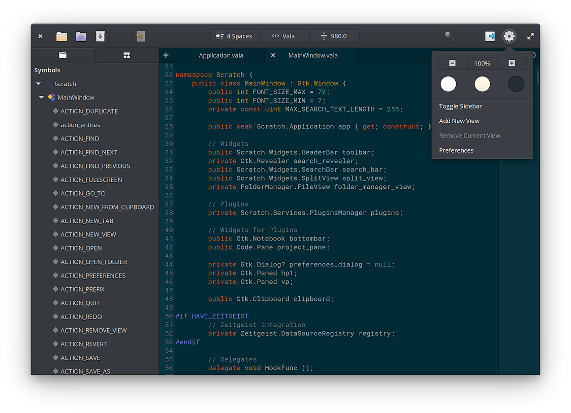
We added a much-requested new dark mode which switches both the app and the code view over to a dark style that’s easier on the eyes at night or in dark rooms. This comes with a brand new style and font size switcher accessible with one click in the header bar, plus a high contrast option which is great when you’re out in the bright sun. Tabs are also now drawn in an inline style so they better match the content and adapt to the chosen style instead of always being chrome-colored.
A lot of work went into plugins. We’ve cleaned up several duplicate plugins and refactored code, leading to a better performing and more maintainable base to build future improvements upon. We wrote a new EditorConfig plugin and enabled it by default, which should help quell the tab/space debate in shared projects.
While working on Juno, we encouraged people who typically used other editors like Atom, VS Code, or Sublime text to give elementary Code another try. With the refactoring and cleanup—and a lot of great work from the community—we were able to implement many of users’ favorite features. For example, there are new shortcuts and context menu items for toggling comments (Ctrl+/ or Ctrl+M), and sorting lines (F5). We drastically improved bracket completion, picking up a lot of the nuances from other editors. And we’re shipping tons of new language definitions, meaning even more languages will be recognized out of the box.
The folder manager—previously an optional plugin—is now built in to the core, allowing tighter integration. We’ve completely revamped it, packing in more features while ensuring it’s still easy to use. Handling files and folders is easier than ever: we added a simpler “Open in” menu that shows in-app locations (like a new tab), your system file manager (Files by default), and other apps that can handle the selected file type. For folders, this means you can pop them open in a file manager or the Terminal straight from the context menu. We’ve also moved the Contractor-powered “Other actions” here, centralizing all file-related actions to one sane contextual spot. Lastly, the sidebar is now toggleable per-window from the menu or with F9, helping you use your display real estate more efficiently.
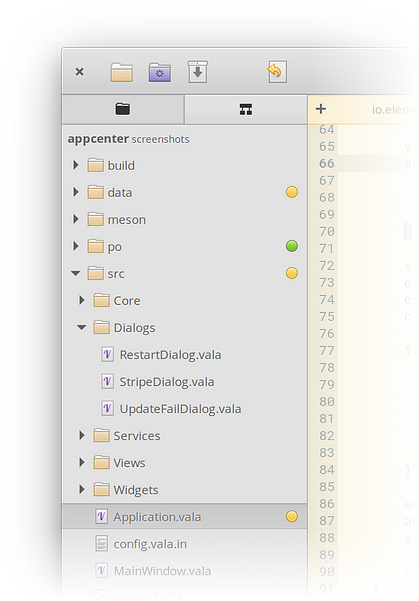
We’ve also baked all new Git integration into Code! If an open project folder is a Git repository, Code displays the branch name alongside it in the sidebar. Plus we add a status icon when there are new or changed files that haven’t been committed.
With the adoption of the folder manager into the core, we were able to add a few new handy ways to open project folders: straight from Welcome Screen (when no files are open), straight from the Terminal by passing in a directory, or right from Files in the context menu.
We also refined a lot of little things: the optional Mini Map is now using a purpose-built font, making it much more visible at a glance; we draw spaces for selected text and trailing whitespace by default; there’s a new animation for switching between project folders and symbols; and more options are visible without having to dive into a Preferences dialog.
If you’ve previously used Scratch and left it for a different editor, we encourage you to give Code a try. We think you’ll be thrilled with the absolute overhaul! And if you’ve never written an app before, you’ll be able to get off the ground running with the help of Code.
Files
In elementary OS , we encourage a workflow where users access content from the related apps instead of worrying about the intricacies of moving files around their device’s storage. However, some workflows require direct management, which is why we build Files, our file manager. Our goal with Files is to create a modern file browser that is fast, beautiful, and easy to work with. We also built it to fit into the elementary experience where there are crazy fast dedicated apps for viewing content, and thus don’t focus on previewing content within Files itself—it’s faster to just open the right app.
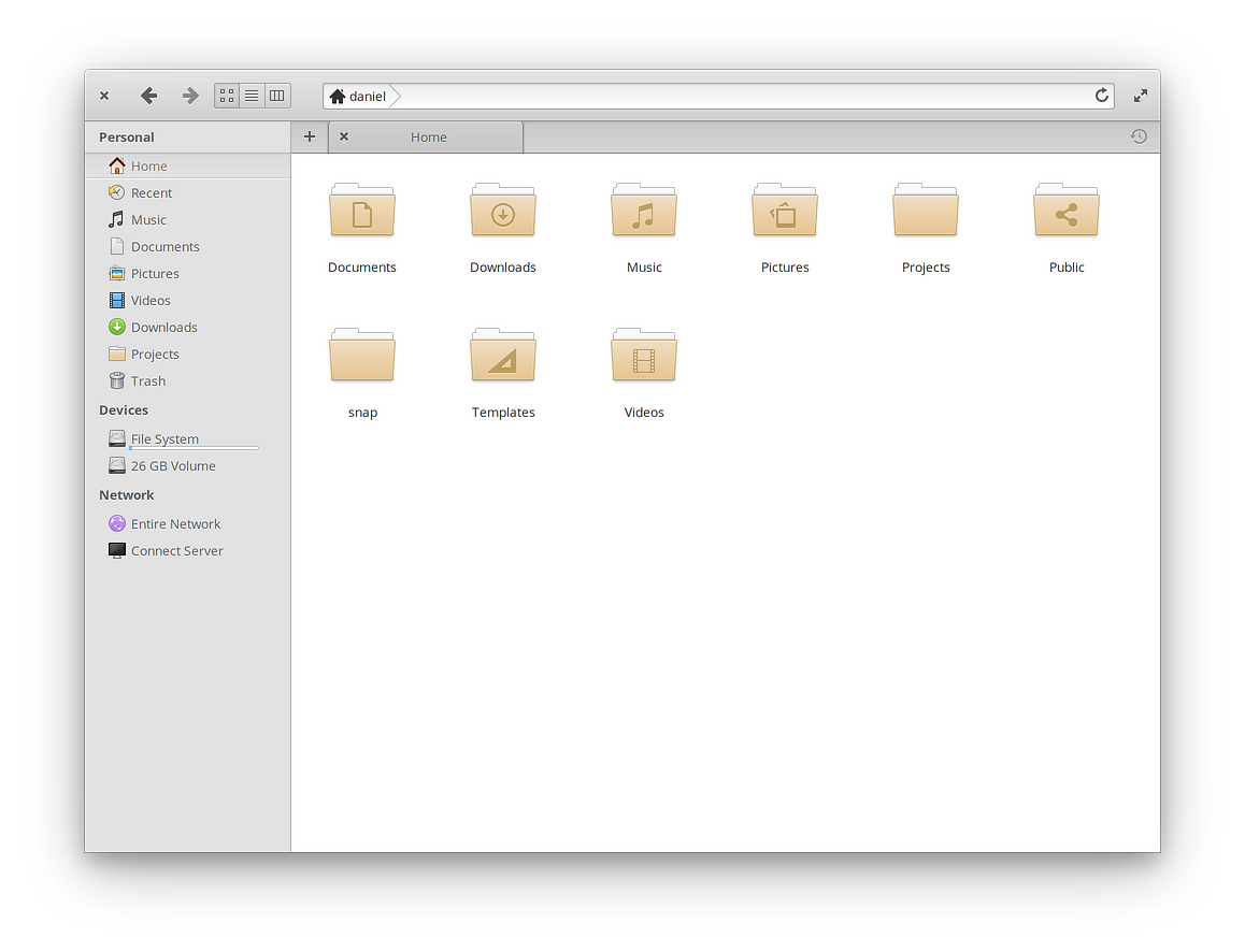
The first immediately new thing for Files in elementary OS 5 Juno is the new manila-colored folders. We switched from the previous blue folders throughout the OS for folders to be more neutral, plus to open up the possibilities for more meaningful use of color in the future. It’s definitely a change at first, but we think you’ll not only get used to it, but start to prefer the warmer and more muted tones.
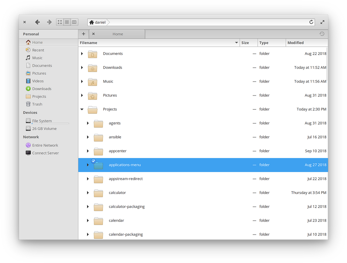
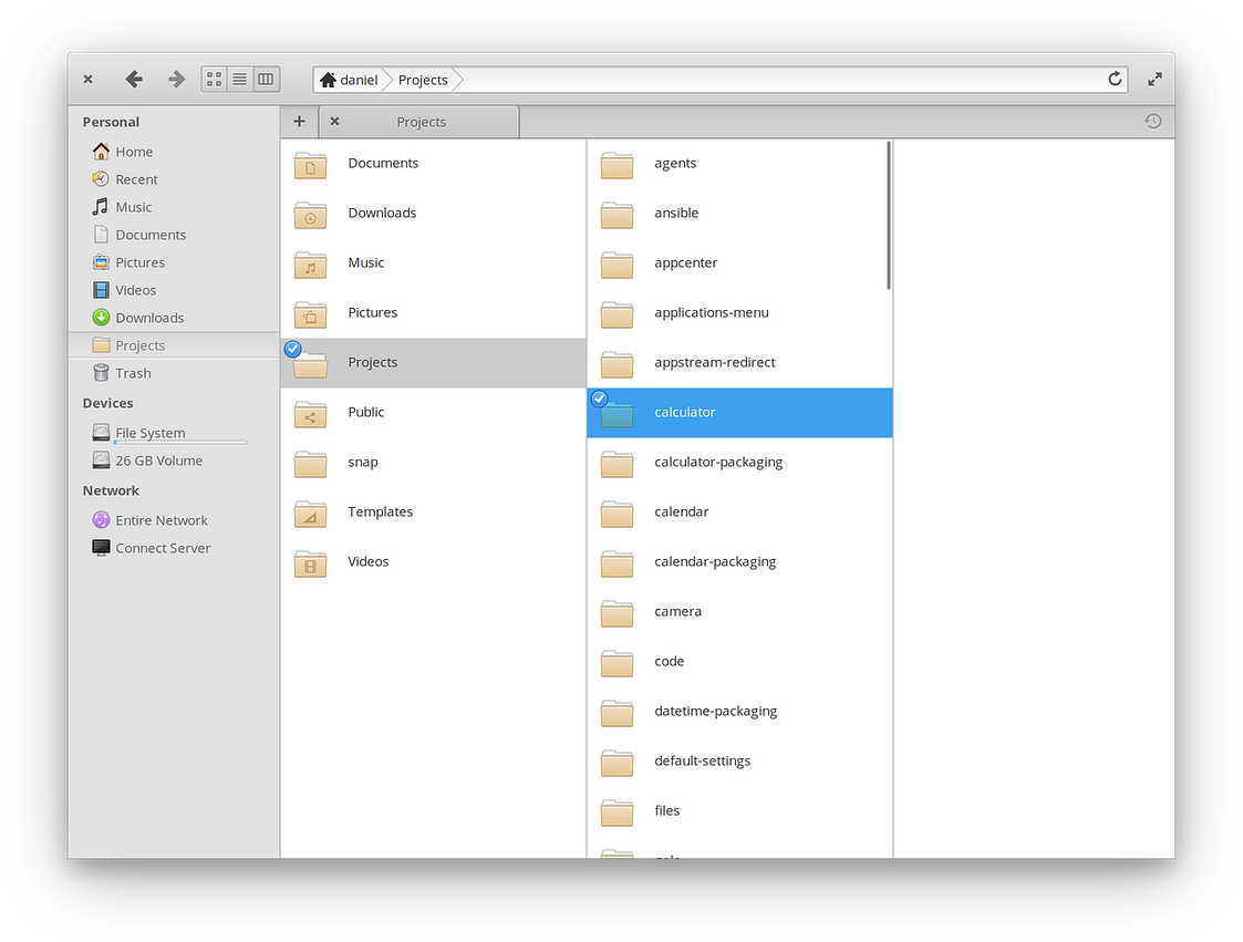
Overall, we cleaned up a lot in Files under the hood. We’re now using more standard libraries instead of internal functions, we’ve worked to make thumbnail previews faster and more reliable to update, and we’ve brought full HiDPI support to all views. And for those who like to type to browse, the smart breadcrumbs/location entry now appends slashes to folder names to make getting around even faster. Plus thanks to changes in both Files and the system stylesheet, we’ve also made it more clear which files and folders are currently selected.
Music
We’ve updated Music in elementary OS 5 Juno with streamlined controls and a refined interface all around. Album details, including the track listing and rating, now shows in a cleanly-designed sidebar.
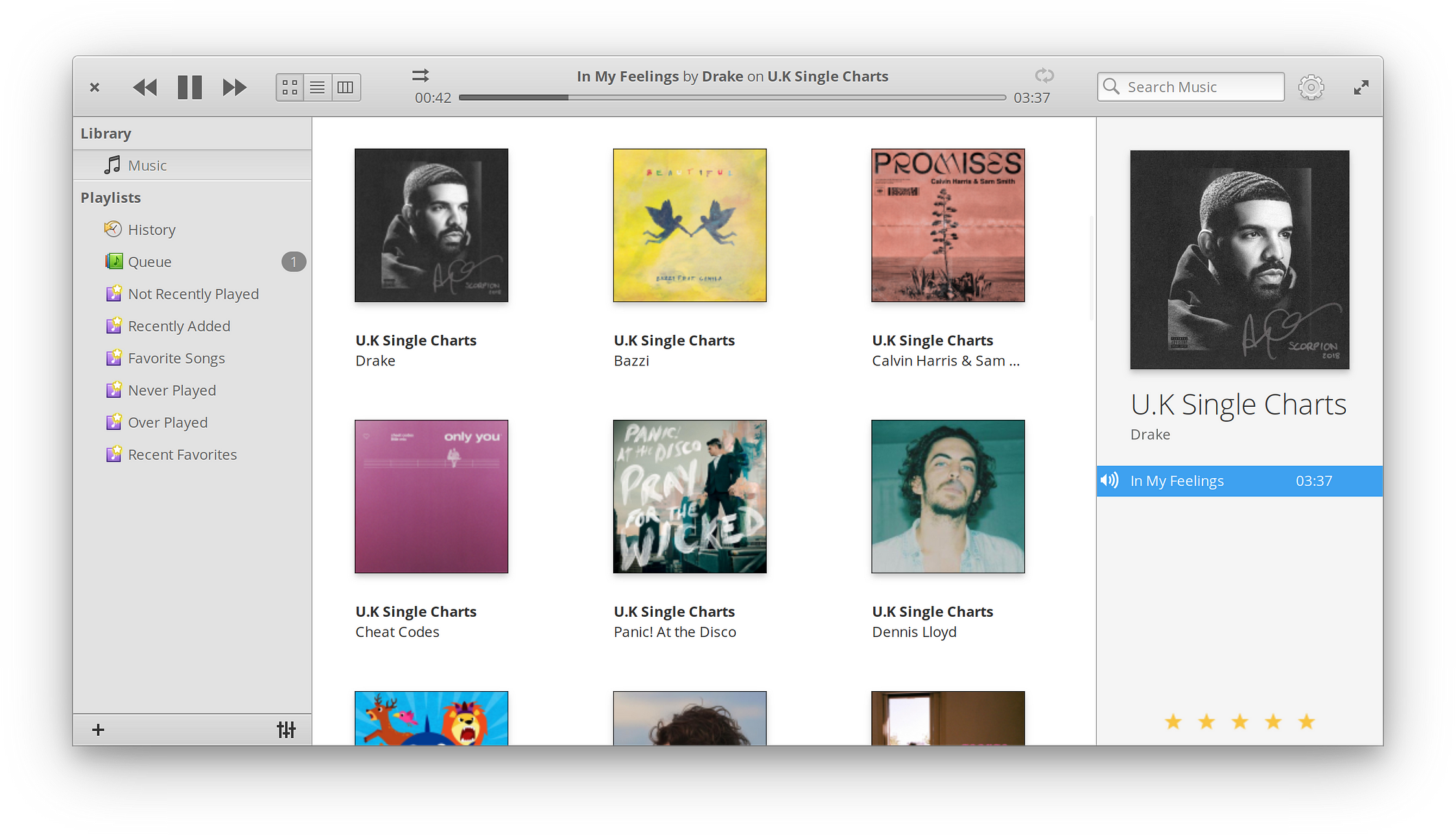
Under the hood, we’ve vastly improved stability and performance, meaning Music should let you jam out more smoothly than ever.
Photos
We’ve worked hard on both the visual and code side to make Photos the best yet. It now sports a beautiful new dark style, making it easier to browse, focus on, and edit your photos.
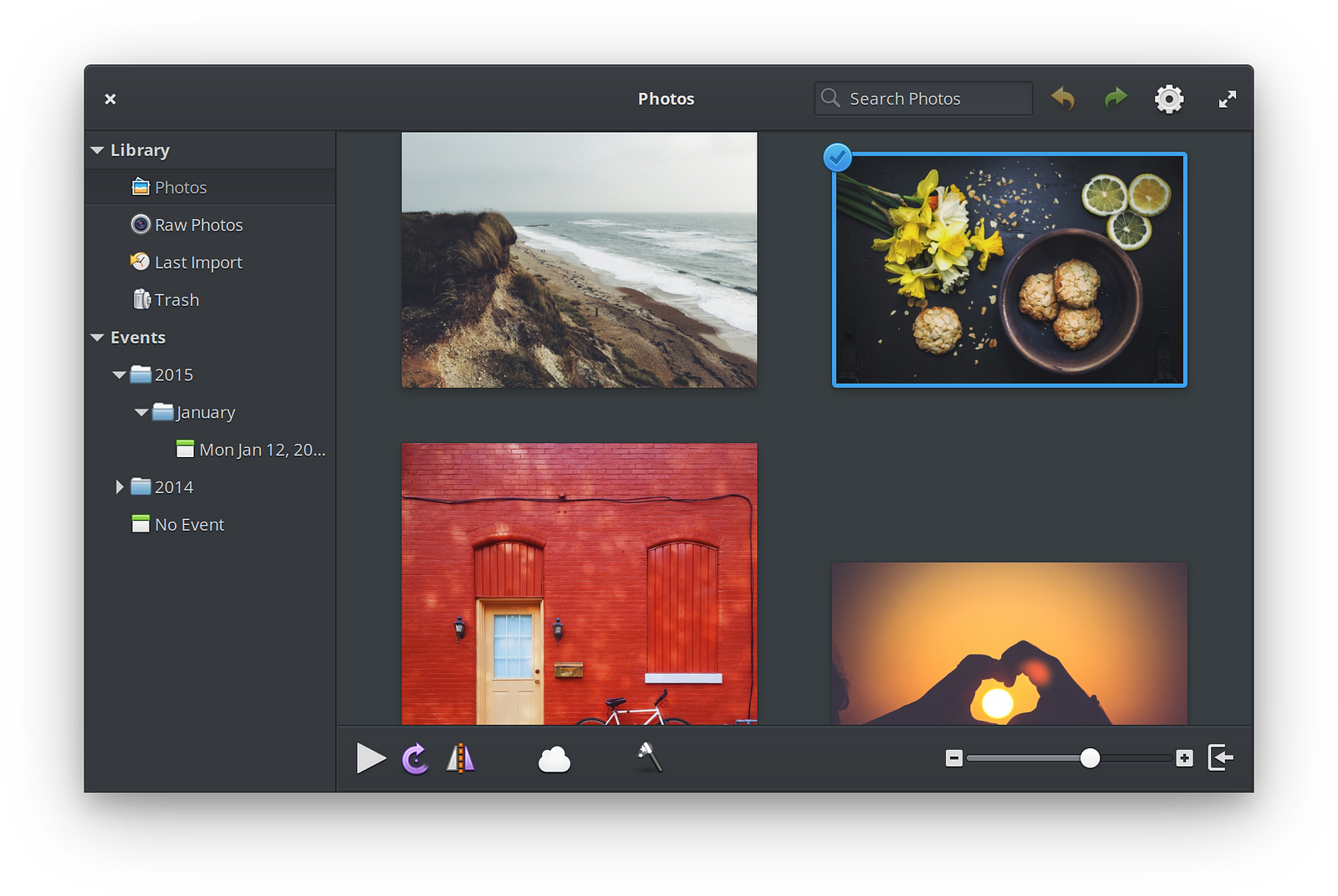
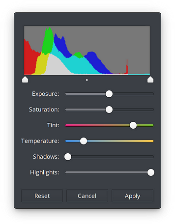
Under the hood, we’ve fixed several bugs and made it both cleaner and more consistent with our other apps. And when editing your photos, you’ll notice a redesigned adjustment dialog with colored sliders that show you how the adjustments will affect the color.
Terminal: Simply Smart
Terminal is an app that most users should never have to open—but for those who use it, it’s an incredibly important tool on the system, and one that is all-too-often ignored by other platforms. Terminal in elementary OS sports a simple look, but hosts smart features like Find, Smart Copy/Paste, Paste Protection, browser-class tabs with Undo Close Tab, and Process Completion Notifications. And in Juno, we’ve refined Terminal to be even more adaptable to developers’ needs and workflows.
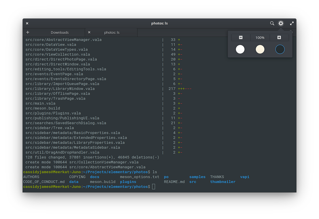
In addition to the beloved dark style, we’ve added two all-new color schemes to Terminal: Solarized Light, and High Contrast. These use the same quick switcher as Code, which comes with a new font size adjustment. All of which means Terminal is better whether you’re in a dark room, a brightly-lit office, or in direct sunlight—plus more accessible to those who need larger type or just want to show their work to someone across the room.
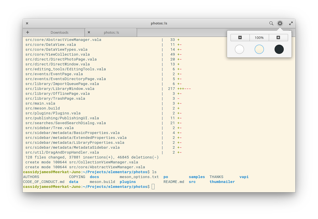
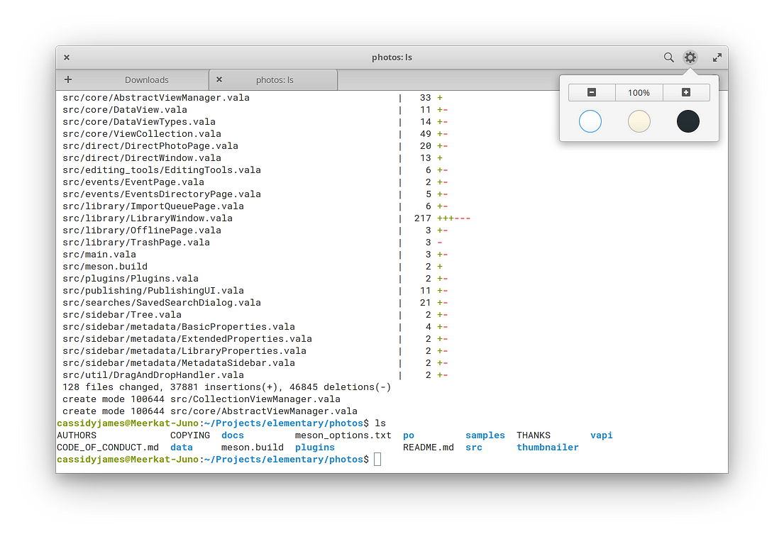
For users who know exactly what they’re doing, we’ve added a new checkbox in the Paste Protection dialog to toggle the protection off. We’ve also added a new Show in File Browser shortcut to the context menu to make it faster to jump into Files from the current working directory. And lastly, we’ve added a subtle colored success or error icon to the tabs of completed processes, better showing the state of your Terminal at a glance. All together, these changes make Terminal a more productive tool than ever before while still looking just as good.
Camera
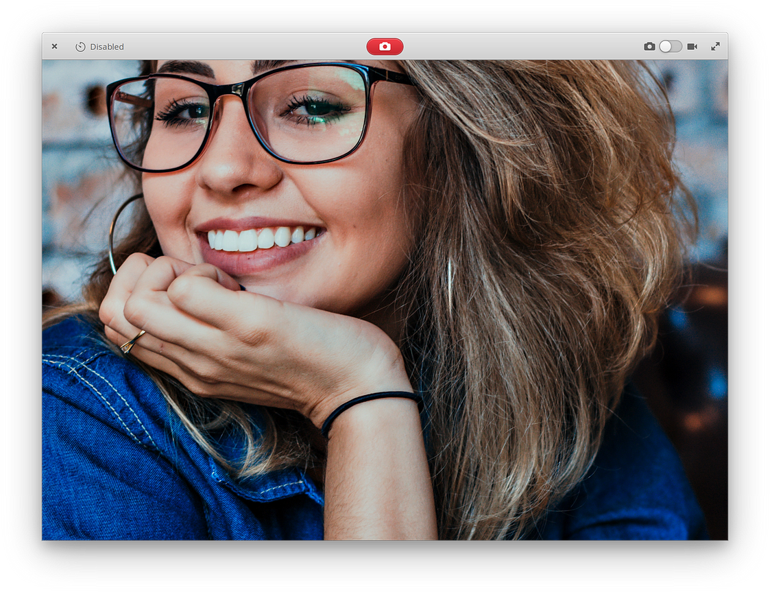
We’ve updated the controls in Camera to be even clearer and easier to use. We’ve changed from linked buttons to a new ModeSwitch to make it more obvious when the camera is in photo or video mode. We’ve also added a new timer with 3, 5, and 10 second options.
Epiphany: Browse with 100% More Syncing
Epiphany is the lightweight WebKit-based web browser that comes with elementary OS. It supports all the features you’d expect with HTML5, CSS3, and modern web standards baked in.
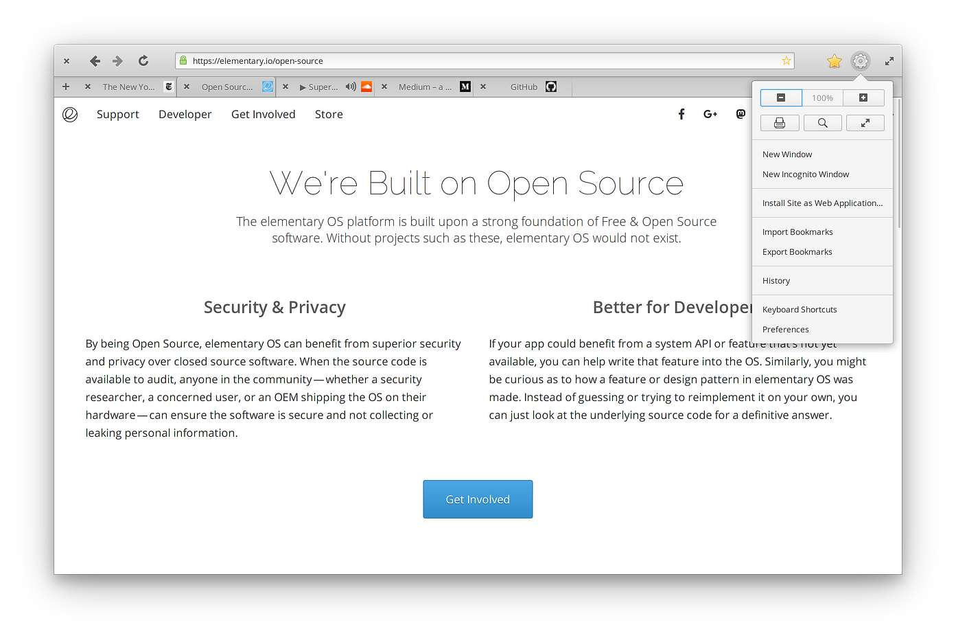
In elementary OS 5 Juno, Epiphany now sports Firefox Sync built-in meaning you can sync your bookmarks, passwords, and even open tabs between elementary OS and your mobile device or any other device running Firefox.
The user interface has also been refined with new bookmark management, new zoom and search controls in the menu, icons showing which tab is playing audio, and more.
Everything Else
We’ve updated all apps in elementary OS 5 Juno with new and improved translations, performance improvements, and bug fixes.

Desktop Features
Beneath the apps, the desktop powers core productivity features of elementary OS including window management, workspaces, and the system UI like the Panel at the top of the screen and Dock at the bottom. And in elementary OS 5 Juno, we’ve focused on making it more productive than ever.
Night Light
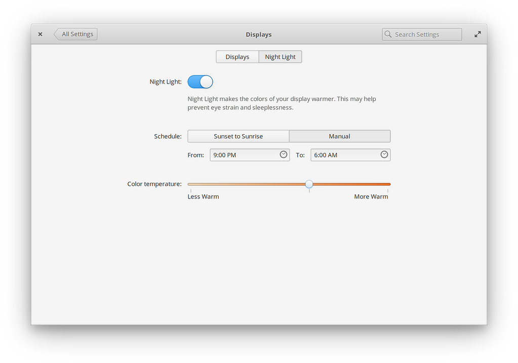
We’re happy to debut a brand new Night Light feature with both a manual timer and an automatic Sunrise to Sunset option. Night Light reduces the blue light output of your display, which may help to reduce eye strain and sleeplessness after using your device.
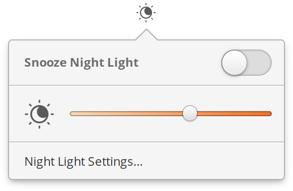
When enabled and during the set time, a new Night Light indicator appears in the Panel which can be used to adjust the display temperature or snooze Night Light until the next day. And like all Indicators, it provides a quick way to jump straight into the relevant screen in System Settings.
Adjustable Window Tiling
Tiling windows is a popular way to manage app windows, especially on larger displays. While elementary OS has always supported tiling, we’ve made it even better in Juno. First, there’s now a blue “feed-forward” preview that shows up to show you how an app will tile when you move it to the edge of the screen.
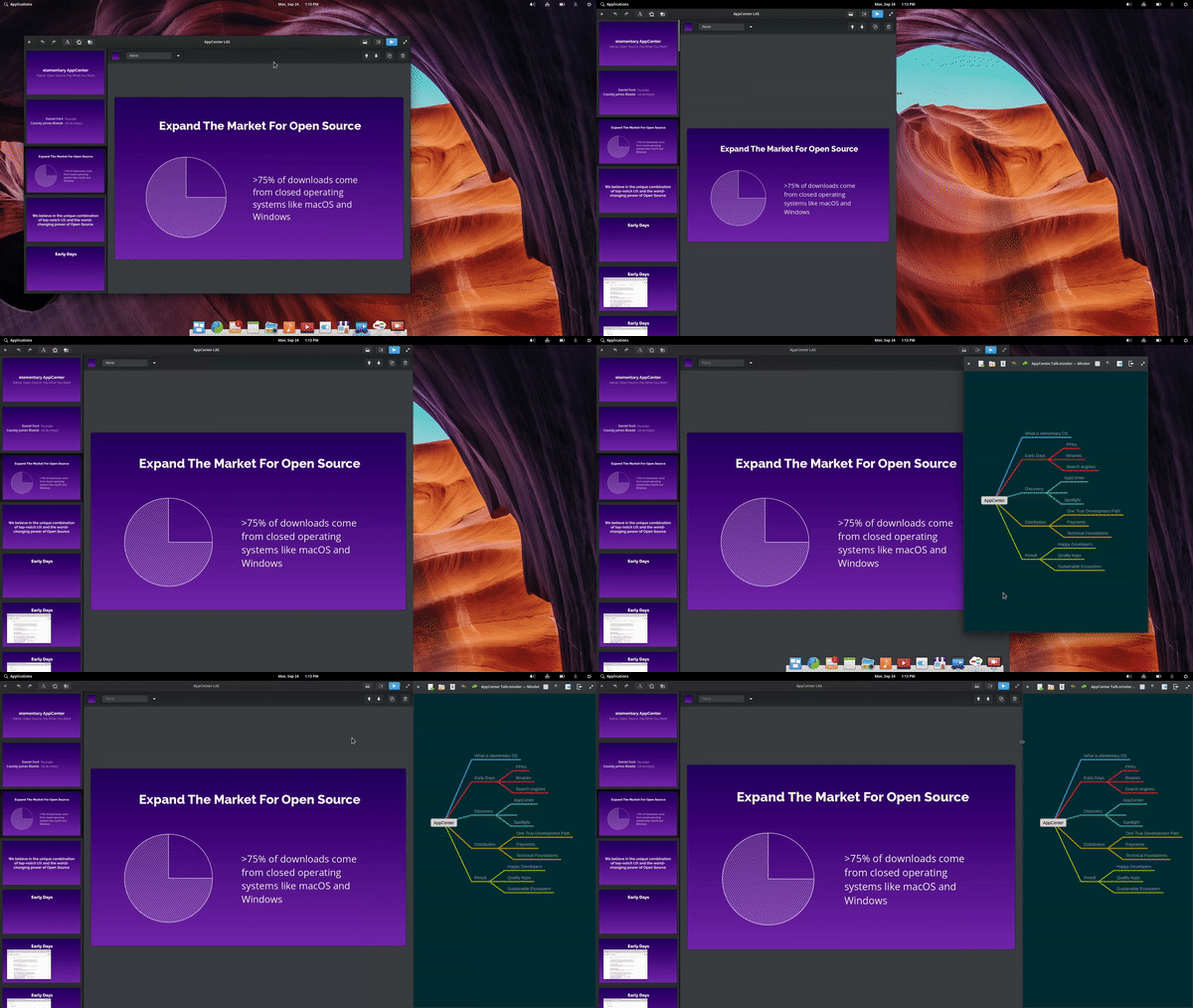
AppCenter apps Spice-Up and Minder being tiled side-by-side to better use the available space
And now if you tile two windows side-by-side, you can drag their shared edge to adjust how much space each takes. This is great for splitting your workspace between two Epiphany windows, Code and Terminal, a presentation and your notes, etc. when you find yourself jumping between two windows for one task.
Picture-in-Picture
For Juno, we’re introducing an all new Picture-in-Picture mode that makes it easier to keep tabs on a video or other window while working on something else.
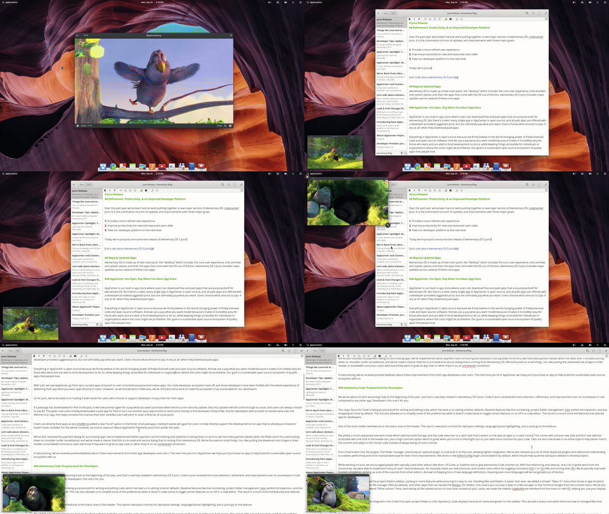
Just hit ⌘F, select the window or area you want to focus on, and a Picture-in-Picture preview pops up in the corner of your display. This preview is movable, resizable, always-on-top, and can move with you across workspaces. To close it, just hit the “X” at the top-left.
Panel, Applications Menu, & System Indicators
The top Panel in elementary OS is where we show system-wide status and settings, like volume, networking, and notifications. Its Applications Menu is also the place to go to list or search all apps and actions.
In Juno, the most immediately-obvious improvement is that we’ve added a new search icon to the Applications Menu. This helps inform users what they can expect behind that item, plus it helps balance the left side of the panel out a bit better with the right. We’ve also added a tooltip of “Open and search apps (⌘ + Space)” to provide more feedback if the user hovers over it for a moment. It also gives a bit of progressive disclosure of keyboard shortcuts, helping teach users faster ways to do things.
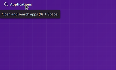
We’ve also ensured the Applications menu now only scrolls one page per trackpad swipe, making for a better experience on laptops.
Something you’ll notice with certain wallpapers is a new translucent light mode. Previously, the panel had four states: transparent dark, transparent light, translucent, and maximized. In elementary OS 5 Juno, we’re splitting translucent out into translucent dark and translucent light.
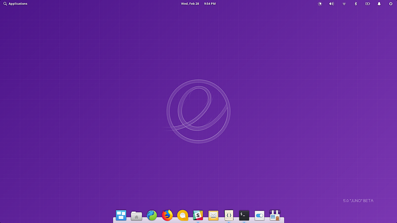
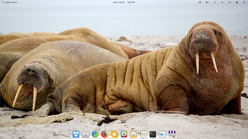
If the top of your wallpaper is busy (high variations in contrast), the panel draws a translucent background. Now in Juno, the panel will detect if it’s drawing on a mostly light or mostly dark area, and shade the panel and foreground appropriately. The result is a panel that more closely respects the user’s preference for a light or dark desktop.
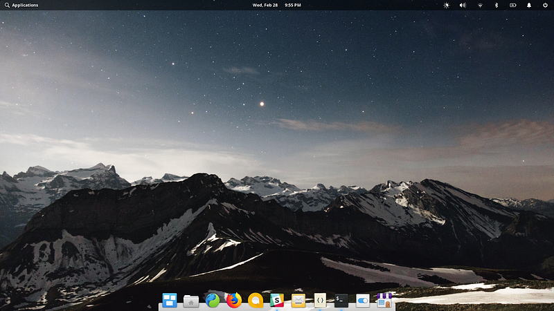
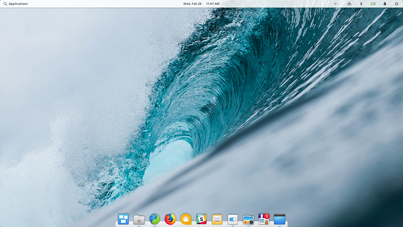
When an app is maximized or tiled, the Panel will still go into the full-black maximized state to put the focus on the app and let itself blend into the bezel.
We’ve also added the ability to drag from a blank spot on the Panel to un-maximize/un-tile an app window. Combined with the tiling improvements mentioned above, it’s faster and easier than ever to use multiple windows side-by-side when getting work done.
We’ve also refined many of the indicators in Juno. We’ve added several animations to icons when they change state: the notifications bell “rings” when a new notification comes in, plus Bluetooth, Night Light, and notifications icons get an animated slash when disabled.

We’ve tweaked the power indicator to better display the total battery percentage when your device has multiple internal batteries, and middle-clicking the indicator’s icon in the Panel toggles showing the battery percentage. We’ve updated the Date & Time indicator to emphasize today’s date, making it easier to tell the difference between today and any selected dates. We’ve added a quick link to User Accounts settings from the Session indicator to make it faster to change your name, set an avatar, or manage other users. Clicking on the large speaker or microphone icon in the Sound indicator now toggles its mute state. Lastly, we’ve improved performance across all indicators, especially for users with slower spinning disks.
Shortcut Overlay
elementary OS has always supported a large set of well-thought-out keyboard shortcuts for managing windows, navigating workspaces, and performing system actions. However, there was never a simple, centralized place within the OS to view all of these shortcuts. In elementary OS 5 Juno, we’ve fixed that with the brand new Shortcut Overlay.
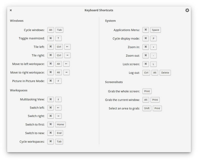
By default, Shortcut Overlay comes up when you tap the ⌘ key on your keyboard. This gives you a one-key introduction to (or reminder of) the major system-wide keyboard shortcuts in elementary OS. For users coming from Windows, this also gives them something when they tap their Windows key, helping guide them to the rest of shortcuts for the OS, including ⌘+Space for the Applications Menu.
One of the most handy parts, though, is the Keyboard Settings button at the top-right of the window. This lets you jump straight into the Shortcuts tab of the system keyboard settings where you can change all of the shortcuts for the entire system, and even create your own custom ones. And of course, whatever you change in System Settings is reflected in the Shortcut Overlay the next time you bring it up.
Screenshot
elementary OS comes with a deceptively simple Screenshot tool built-in to make saving and sharing screenshots of your screen, windows, or specific areas super quick. It supports transparency, includes window borders and shadows exactly as they’re drawn on the screen, and can conceal sensitive text in native apps by switching to a redacted typeface while capturing the screenshot.
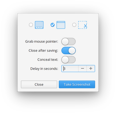
In elementary OS 5 Juno, we’ve refined the Screenshot tool even more to look better and be more productive.
First, we’ve switched Screenshot from a dark style to a light one. In elementary OS, transient elements like menus, popovers, and dialogs are given a flatter, white, somewhat paper-like style by default. This switch for Screenshot reflects that transient and lightweight nature, and makes it better fit in with other similar elements in elementary OS. In Juno, Screenshot also remembers your previous settings, making it more transient and state-saving than before. Lastly, we’ve replaced a lot of verbose copy with clearer and cuter icons, making it easy to choose between a screenshot of your whole display, the current window, or a custom area. If you’re unsure what an icon represents, you can always hover over it to see a tooltip.
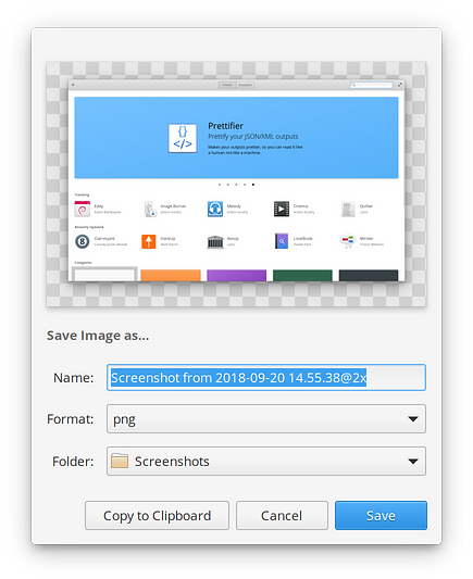
Once you’ve taken a screenshot, you get a preview where you can copy the screenshot to your clipboard or change the name, format, and location for the screenshot before saving. In Juno, we’ve added the display scaling factor to the filename by default so other tools can smartly scale it to the correct physical size.
Emoji 🎉
With Juno, elementary OS now supports rich, full-color emoji throughout the OS. We use the excellent open source Noto Color Emoji to support the entire Unicode emoji spec with one of the most widely-used and consistent emoji fonts.
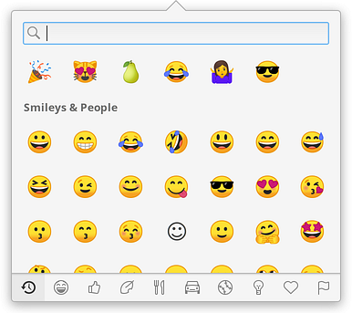
In supported text entries, you can use the context menu with a right- or two-finger-click and choose the new “Insert Emoji” item to get the new input method. You can also tap the Ctrl+; keyboard shortcut with any native app text entry in focus.

Look & Feel
We’ve always prided ourselves on the design of elementary OS. The very origins of elementary OS come from iconography and a bit of pixel-perfect-obsessive design. We don’t believe in drastic redesigns for the sake of redesigns—after all, good design is long-lasting—but we are constantly evolving, adapting, and improving the design of elementary OS. In Juno, we’ve continued that trend and refined the smallest details for a more pleasant experience.
Sound Design
For the first time, we’ve composed a unique set of sounds for various actions in elementary OS 5 Juno. Our goal was to use physical, real-world sounds that are audible and recognizable, but that wouldn’t be disruptive in most environments.
The notification sound is probably the most frequent and important. In Loki, this was a “pop” noise. For Juno, we’ve updated it to a lightweight bell ding. Since all notifications in elementary OS make a sound by default, we wanted to make sure it was light and unobtrusive, while still getting your attention. It also sounds just how the icon looks when it rings for a new notification coming in.
Next is what we call the “thud,” commonly known as a system bell. This is what you hear when elementary OS is telling you that you can’t do something, like backspace in an empty text entry or Alt+Tab with only one window open. In Loki this was an artificial “blip” or “drip” sort of noise. In Juno, this is now a physical, somewhat muted woodblock-sounding thud. It’s more gentle, while still clearly communicating that you’re hitting a limitation in some way.
Lastly, we’ve updated the volume indicator “pop” sounds. These let you know how loud the volume is, which is important to prevent you from blowing out a speaker, your ears, or the room full of coworkers when giving a presentation. The difference from Loki is subtle, but the new sound in Juno is fuller and sounds much better on higher end audio devices.
Iconography
elementary OS may have started over ten years ago as a set of icons, but we’re never done improving and refining them. In elementary OS 5 Juno, we’ve touched well over a thousand icons for more consistency in both form and color palette. This includes redesigns, new icons, updating icons to take advantage of the new palette and hinting icons to more sizes.
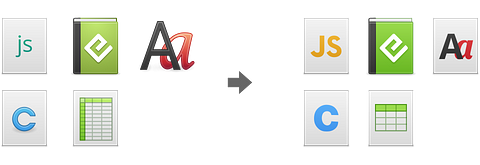
File type icons have especially seen some big changes in Juno. You can see that we’ve gone from a variety of styles with inconsistent colors to a more unified look with symbols that scale better to small sizes.

We’ve also introduced some new, development-related file type icons for things like translation files and programming languages.

There’s been a lot of work on increasing the consistency between icons at their various sizes and many icons are now fully-hinted in the six sizes we use across elementary OS.
Updating all of these icons has been a huge effort and we’d like to give special thanks to Micah Ilbery, Sam Hewitt, Simon Steinbeiß, and many others for all of their hard work.
Color
As of Juno, we also now have an official color palette that includes five shades per color. These colors are based in part off of the existing icon set, but have been tweaked to follow a more physics-accurate approach to light and shadow than simply modifying the brightness. The result is a more cohesive and realistic palette that is as versatile as ever.
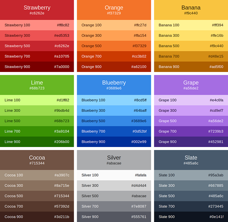
This new expanded palette means greater consistently between our iconography and our stylesheet, and gives our third-party app developers a much better framework for making their apps feel native to elementary OS. And as of Juno, the elementary palette will be pre-installed by default as a .gpl file and ready to use in Inkscape, GIMP, or other design tools.
System Stylesheet
The system stylesheet defines how all of the widgets like buttons, toolbars, and text entries are actually styled. If you’re familiar with web CSS, it’s a similar story for elementary OS: the code itself defines the widgets, while the stylesheet determines how they look. In elementary OS Juno we’ve refined the system stylesheet in several areas.
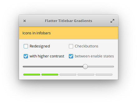
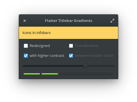
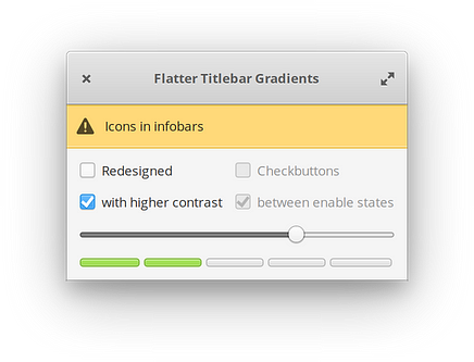
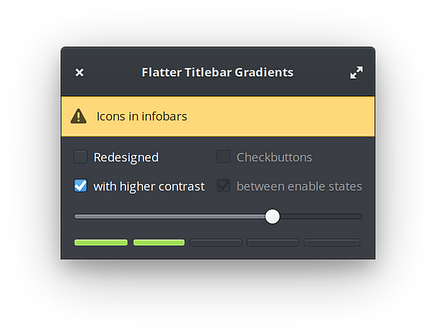
Top: A selection of widgets as seen in Loki | Bottom: Redesigns in Juno for higher contrast and clarity
The most prominent is an improved dark style: there’s now much better contrast throughout apps that opt into dark mode, like Photos or the new modes in Code and Terminal.
We’ve also subtly improved contrast across the board, expanded theme color support for app developers, added icons to infobars to help aid in recognition—especially for colorblind users, added new color support to scales (as seen in the new Photos adjustment dialog and Night Light sliders), and added several style classes for developers like Terminal, Accent, and ModeSwitch.
For a full rundown of stylesheet changes, you can see the commit history on GitHub.
Wallpapers
The elementary wallpapers are one of those little touches that gets noticed by nearly everyone who uses elementary OS. So of course we’ve updated our selection of default wallpapers in elementary OS 5 Juno with a few new backgrounds we think you’re really going to enjoy.


Special thanks to Unsplash and the photographers who upload their photos there!
Motion Design
Design isn’t just about static pixels on a screen; more than ever, motion plays a key role in digital design. In Juno, we’re using motion and animation to communicate in several new ways.
“Applet” style apps are a relatively new concept in elementary OS. With the introduction of AppCenter, several developers have released small apps that stick to the desktop and stay across all workspaces. While these apps use platform features that have existed for years, they do so more frequently and consistently than we’ve ever seen before. Since they’re always-on-bottom, it meant that opening them from AppCenter would look like nothing happened; they (properly, as requested) would open underneath AppCenter. It wasn’t until you’d close or move AppCenter that you’d see this new app you just installed. To alleviate this and give these applets a more first-class presentation on elementary OS, we now reveal applets when they open below other windows by briefly fading out other apps and raising the applet off the surface of the desktop. This little “tada!” moment shows the user where their new app is without being too disruptive to their current workflow.
A more subtle but probably more-frequently-seen animation in Juno is the new accent-colored overscroll feedback. Overscrolling occurs when a user attempts to scroll past the edge of a view, whether with a mouse, touchpad, or touch screen. In Loki, the view simply stopped when it hit the edge, and that was that. In elementary OS 5 Juno, we’ve added a subtle glow of the window’s accent color to let users know what’s happening. By default in Juno, this will be the common elementary-blue color that you’re used to seeing across the OS. But apps are able to set their own accent color (i.e. for highlights, focus indication, etc.), and this new overscroll glow will reflect that.

System Settings
Our approach to system settings in elementary OS is fairly reserved, but well-considered. We don’t like overloading users and our developers with near-infinite configuration toggles and fiddly knobs to change (and break) everything—that’s what the source code is for, after all. However, we do recognize when certain settings can aid in accessibility, internationalization, or hardware specifics.
In these cases, we roll improvements into System Settings once we are confident they are well-supported by not only elementary OS, but the third-party app ecosystem as well. Consequently, in elementary OS 5 Juno we’ve improved and added a lot within System Settings.
Desktop
The Desktop settings pane includes tabs for Wallpaper, Dock, and Hot Corners. In elementary OS 5 Juno, we’ve kept everything under Dock and Hot Corners, but improved the Wallpaper settings.
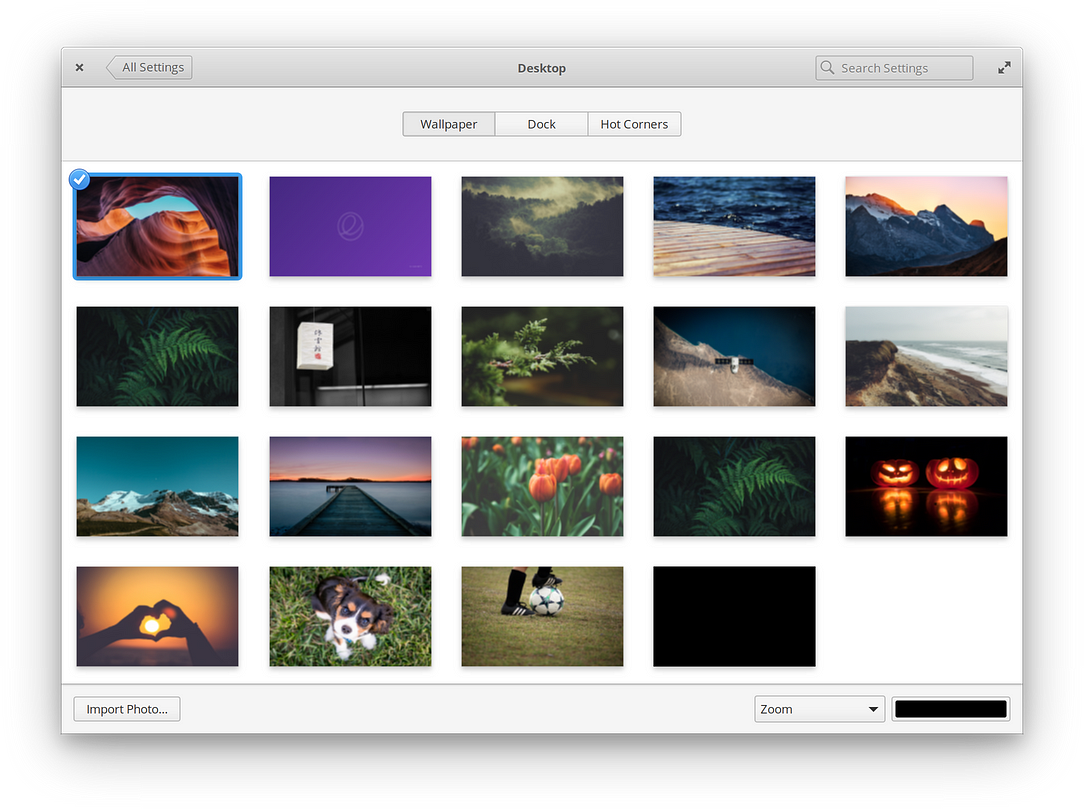
A subtle change that makes things more clear is a new “library” approach to wallpapers. Now setting a wallpaper (from System Settings or anywhere else in the OS) imports it into to your wallpapers library. This means it can be set, changed, and toggled back at any time super easily right from System Settings. Plus, it can be removed with right-click without affecting the original file that it was set from. This is a clearer approach to wallpapers that should keep the library clean and make it faster to set and change wallpapers.
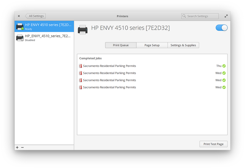
Printers
We’ve reworked a lot within Printers settings to make the layout more consistent with other settings, and to make getting around easier.
Bluetooth
In Juno, we’ve reworked the Bluetooth settings to be simpler and accomplish more right within the System Settings window without jumping out to other tools.
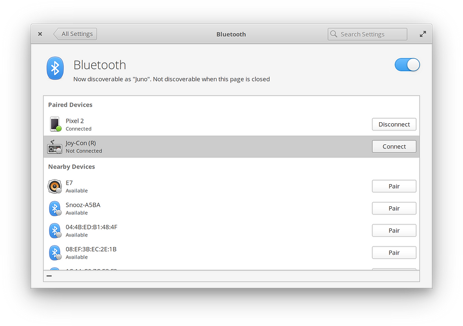
Now discovering, pairing, and managing devices can all be done right when you open the Bluetooth pane. Plus we smartly enable discovery of your device when the pane is open, and disable it as soon as you navigate away. The result is easier and faster pairing without leaving your device discoverable all the time—just when you need it.
About
It’s now much easier to find the right project to report an issue against on GitHub with the new Report a Problem dialog. This dialog splits components into useful categories and uses more human-readable names for system components.
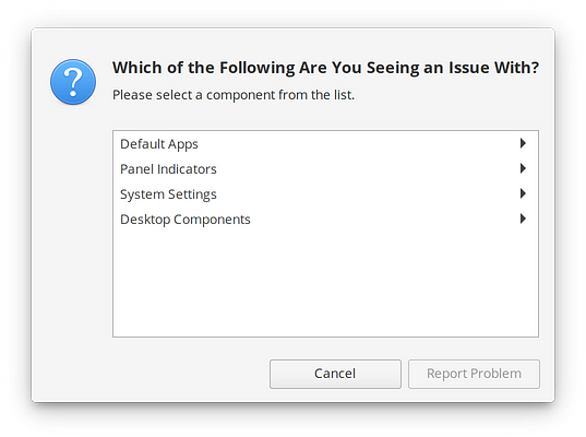
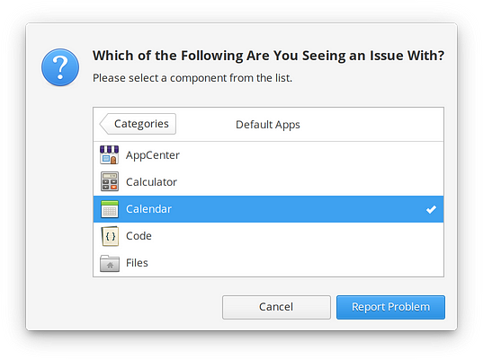
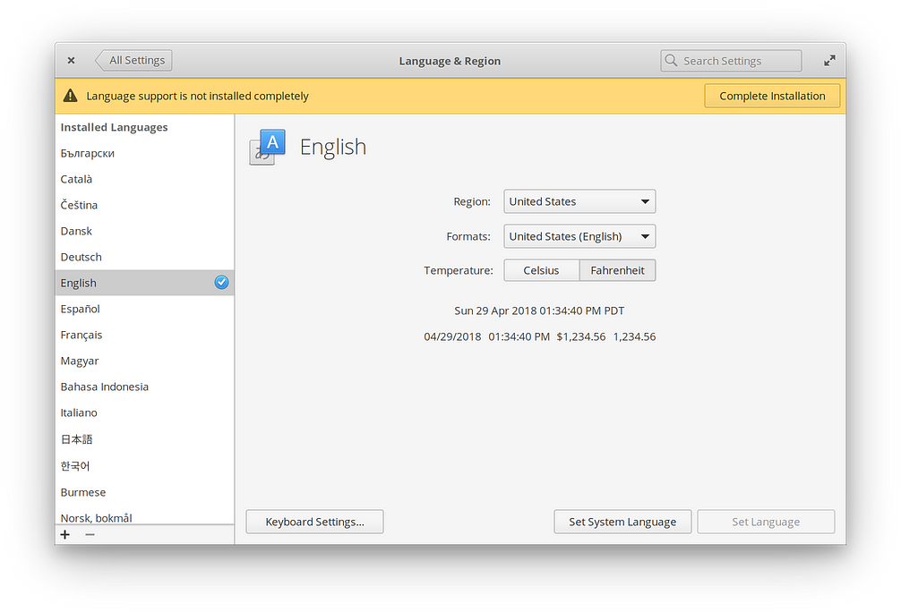
Language & Region
We’ve improved the design within the Language & Region settings. There’s also now an obvious link to keyboard settings (since the two are closely related) straight from here.
Displays
The Displays pane is where you can configure multiple displays, plus set things like resolution, rotation, and mirroring. In elementary OS 5 Juno we’ve added a handful of features and refined the settings.
First, we’ve added a setting for scaling factor. elementary OS automatically detects the resolution and size of your display and sets the scaling factor accordingly, but in some contexts the user may want to override this scaling. That’s why in addition to the default automatic behavior, we’ve added new LoDPI (1× scaling) and Pixel Doubled (2× scaling) settings to Juno.
We’ve also a rotation lock toggle for devices that have an accelerometer. This is great for tablet or 2-in-1 form factors where you might want to flip the screen around, but sometimes you want it locked.
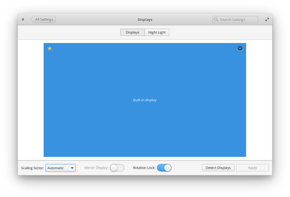
We’ve improved multi-display drag and drop layout in Juno, especially around display rotation. Things should be more consistent, more clear, and more accurate to the real world layout.
Of course we’ve also added a new Night Light tab to configure the aforementioned Night Light feature, including the color temperature and schedule.
Keyboard
Keyboards are very personal pieces of hardware; not only are there so many different languages, layouts, and key styles out there, but people tend to have strong opinions about how their input device should work. In elementary OS 5 Juno, we’ve worked hard on Keyboard settings to make the experience better for everyone.
To start, users coming from other platforms may be used to using the ⌘ key to display something like the Applications Menu. We’re happy to say that in Juno, you can now configure the ⌘ key behavior to show the new Shortcut Overlay, launch the Applications Menu, or do nothing as in Loki.
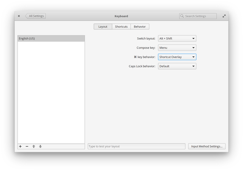
If you regularly type extended Latin or other special characters, you may be familiar with the Compose key. Now in Juno, you can choose from several different keys depending on your preference and what is convenient on your hardware, including Caps Lock, Menu, Right Alt, Right Ctrl, and Right ⌘.
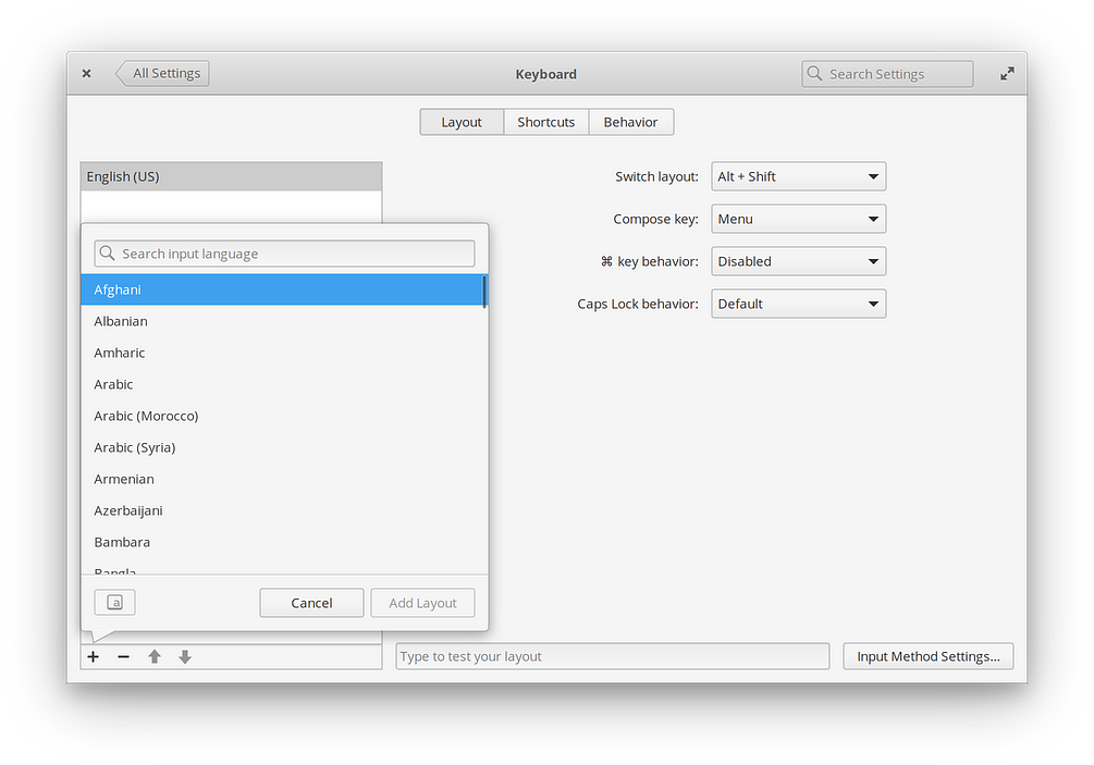
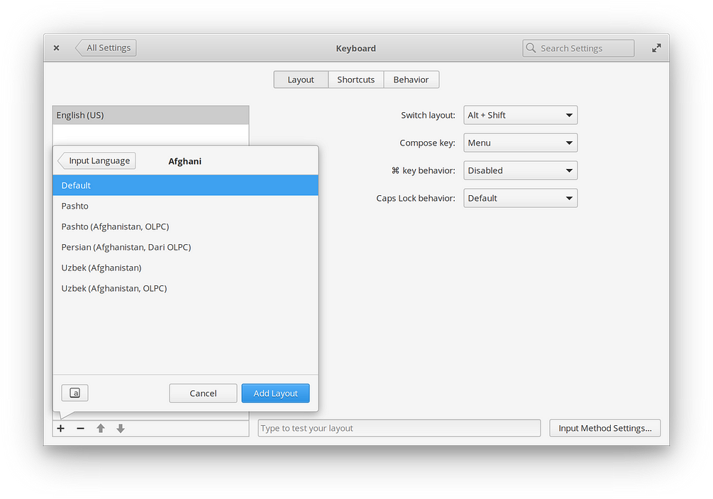
Thanks to some of the installer work done in collaboration with System76, we’ve also redesigned the keyboard layout chooser with new features like search and layout previews and without oversized and clumsy dropdown menus.
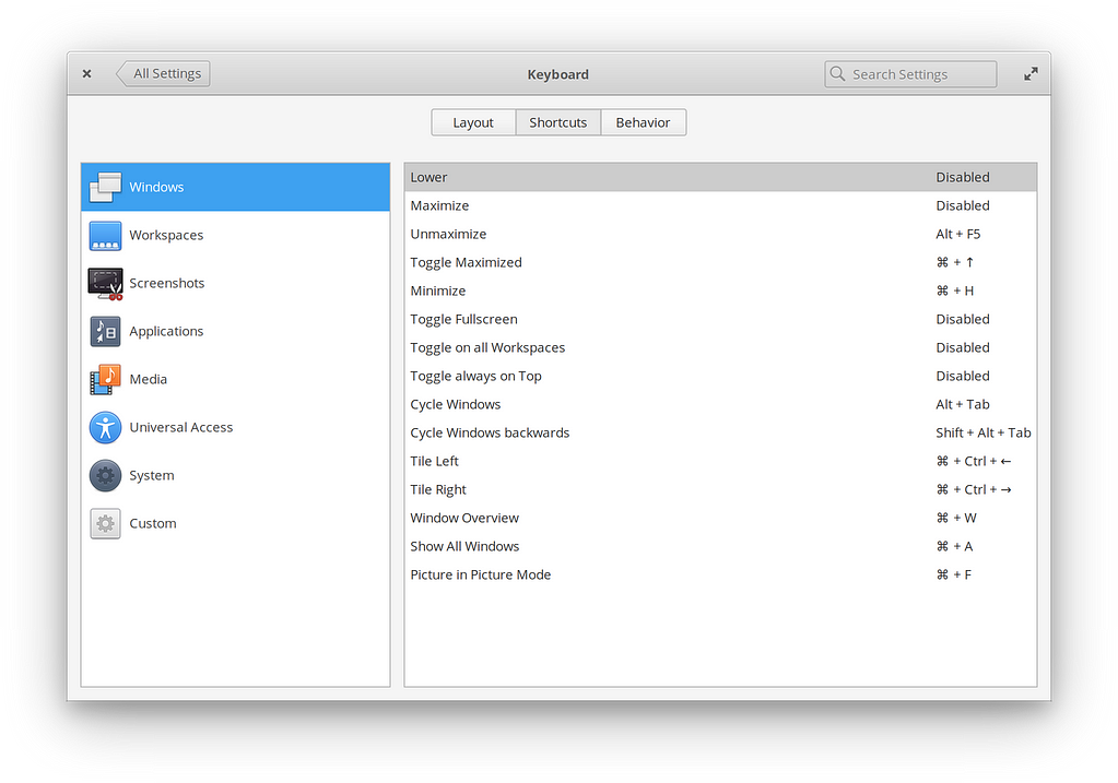
For Juno, we’ve also redesigned the Keyboard Shortcuts settings with new icons for categories, and we’ve removed confusing symbols like ⌥. We’ve also added new settings for shortcuts like cycling workspaces and zoom.
Mouse & Touchpad
Like keyboards, a mouse or touchpad is a very personal input device that can lead to different preferences or behaviors. In elementary OS Juno, we’ve added several more settings to help address this.
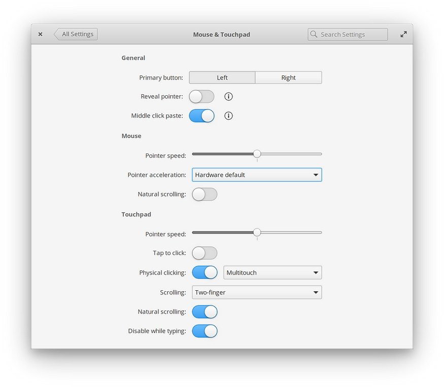
First, we’ve added a new option to enable or disable middle click paste. For longtime Linux users, this is a common feature as a bit of an extra text editing shortcut. But for users coming from other platforms, this might just get in their way, so now it can be toggled on or off.
On devices with a touchpad (like a laptop), we’ve also added a setting to enable or disable the touchpad while typing. This is a highly-requested feature from people who play games on the touchpad, as previously in some games there would be a delay between pressing keys (like W, A, S, and D for moving around) and being able to use the touchpad. While this cuts down significantly on accidental cursor movement and clicks while typing, it can be frustrating for those games. So we’ve added a setting!
We’ve also added selectable mouse acceleration profiles in Juno, another common request from gamers and other users. Choose from the hardware default, no acceleration, or adaptive acceleration in a new dropdown.
Power
The power settings let you choose display, power button, suspend, and other power-related behaviors. In Juno, we’ve cleaned these settings up and improved the hardware detection to ensure we’re displaying the appropriate settings based on the exact hardware in your device.
Sound
We’ve completely redesigned the sound input and output settings for elementary OS Juno. It’s now simpler to choose devices, adjust balance, check your mic balance, and more.
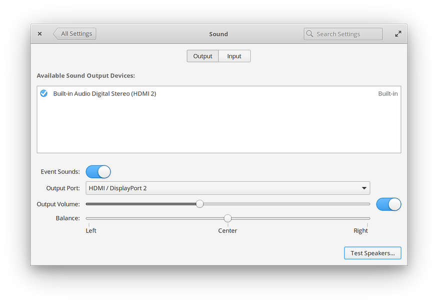
We’ve also added a new “Event Sounds” toggle, which lets you enable or disable the “thud” noise when you hit the end of a text entry or try to Alt+Tab with no available windows.
User Accounts
We’ve touched up the User Accounts settings in Juno. It’s now more clear how to change a password, and Guest Session settings are more consistent with other settings panes.
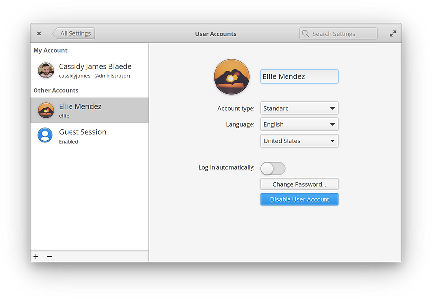
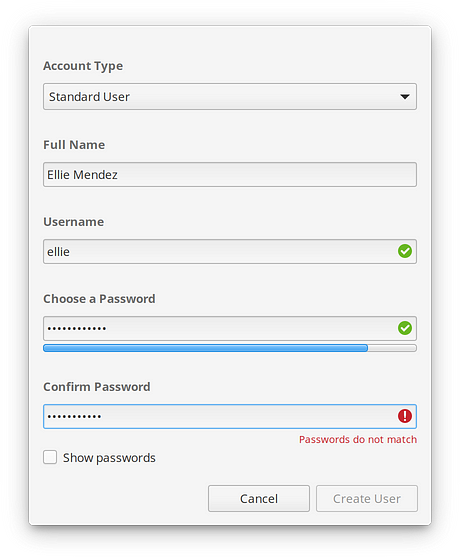
We also refined the new user creation. We’ve moved it to its own dialog and improved the layout to make it more clear and straightforward, with much better validation feedback and suggestions for creating stronger passwords.
Security & Privacy
Privacy and security are paramount to elementary OS. In Security & Privacy settings, we provide control over OS-wide history (used for extra functionality, like offering recently-used files in apps). Users can toggle OS-wide history with a switch, or pick and choose which apps are affected. Security & Privacy settings also give control over when the session locks, as well as an OS-wide firewall. With elementary OS 5 Juno, we’ve added even more features to help you safeguard your private data.
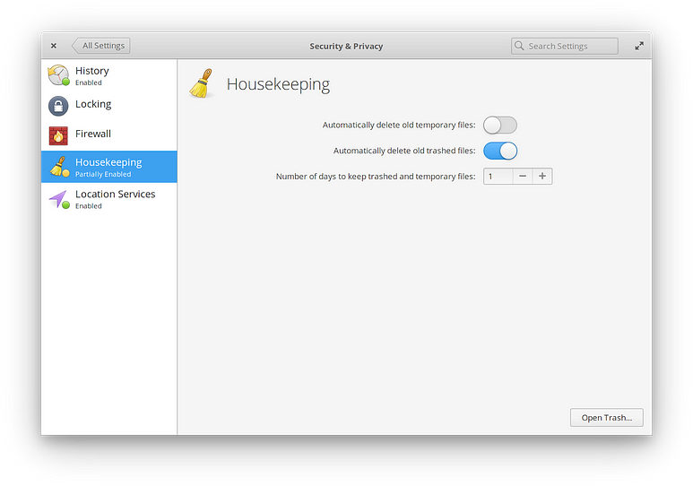
Housekeeping is a brand new optional feature in Juno to help keep your temporary and trashed files tidied up. Not only does this keep your device’s storage free, it can help ensure your private data doesn’t come back to haunt you.
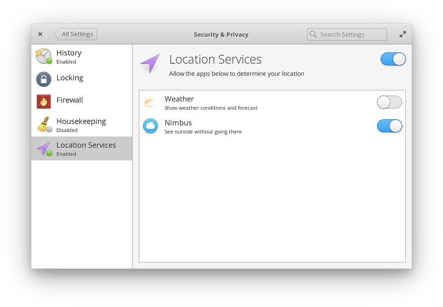
Now in Juno, when apps attempt to use your location, elementary OS displays a Location Services approval dialog with the app’s name and icon, plus the precision level that was requested.
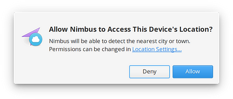
To manage these new permissions, we’ve added a brand new Location Services section to Security & Privacy. Here you can toggle Location Services for the whole system, or approve or deny specific apps.

Platform Improvements (i.e. for developers)
Juno is the first major release of elementary OS since accepting apps into AppCenter. As such, we’ve spent a lot of time working to improve the platform itself for those developers while always ensuring users are in control.
For elementary OS 5 Juno, we’ve slightly reworked notification behavior. In the Notifications indicator we’ve simplified the grouping, leaning on apps to properly use the API to communicate which app is sending the notification. Apps not properly using the API are grouped together under “Other” in the indicator, and may not send notifications unless the user has toggled the appropriate switch in System Settings → Notifications. Whereas before apps not using the API correctly would have free reign over notifications, this new default gives users more control over notifications and the apps that can send them. Plus, it incentivizes app developers to use the proper APIs so their notifications can come through and be grouped properly by default.
As mentioned in the System Settings section above, Juno comes with a brand new Location Services agent and settings. Apps must use the GeoClue service for location requests, which will automatically throw the Location Services dialog to users. And if a user denies the request, your app should handle that gracefully.
We’ve put a lot of work into Granite, our GTK-based widget and helper library. There are new widgets and style class constants, like the Mode Switch, Checkerboard style, Accent labels and icons, and more.
For even more developer-facing changes, check out these posts:
- Cleaning Up App Codenames
- All Aboard The Meson Future Hype Train
- Introducing Houston CI
- Updating Your Apps for Juno
…And More
With every release comes a smorgasbord of under-the-hood improvements, library updates, etc. and elementary OS 5 Juno is no exception. It comes with Linux 4.15, which brings improved hardware support and performance over previous versions. Mobile broadband device support has been added to the networking stack. Capnet Assist, our captive portal login helper, now uses configuration and detection from network manager; consequently, it’s more reliable and configurable.
We’ve also worked across the board in Juno to further improve HiDPI support. Icons and graphics should be crisper and more properly scaled across the whole OS.
We’ve made several improvements to the login and lock screen greeter: windows and menus now have shadows, we’re using an instance of the standard top Panel for better consistency, and scaling works better on HiDPI.
Lastly, with the Juno development cycle we’ve adopted more cross-desktop standards improved the cross-distro support for several components. This came with a lot of help from Fedora maintainers and developers. The result is more reusable code for other desktops and users of other distros like Fedora, Arch, openSUSE, etc.

Download elementary OS 5 Juno
You’ve made it all the way here! elementary OS 5 Juno is available right now for a pay-what-you-want purchase and download at elementary.io. For installation instructions, recommended system specifications, and more, see our Installation Guide.
Thank You
Last but absolutely not least, we’d like to thank every single person who has contributed to elementary OS in one way or another. Thank you to everyone who has bought an app on AppCenter. Thank you to all of the developers releasing their apps on AppCenter. Thank you to our supporters on Bountysource and Patreon. Thank you to each and every one of you who has purchased a copy of elementary OS. Thanks to all of you who have supported us by buying merch from our store.
Every single contribution—be it coding, translations, funding, design, app development, support, or hype—helps make all of this possible, and we wouldn’t be here without you. Juno is such an incredible release, and it’s here thanks to all of our supporters. ❤
We’re accepting limited sponsors for the elementary Blog. View our public analytics and learn more if you are interested.


